Colors in art are a big deal, right? They aren’t just there to look pretty. Artists use them to make us feel things, to tell stories, and to get their point across. This article is all about the darker shades and what they really mean in art. We’ll look at how black, blues, purples, and earthy tones have been used throughout history and what they can represent. It’s pretty interesting stuff.
Key Takeaways
- Dark colors meaning in art goes beyond just appearance; they carry deep symbolic weight.
- Black can represent a range of emotions and ideas, from sadness and death to power and elegance.
- Deep blues and purples often connect to royalty, wisdom, spirituality, and mystery.
- Earthy tones like browns and greens are linked to stability, nature, and grounding.
- Artists use dark colors strategically to create mood, emphasize subjects, and evoke strong emotional responses from viewers.
The Allure Of Dark Hues In Art
Colors are more than just pretty shades; they carry a whole lot of feeling and meaning, especially in art. Think about it – a bright yellow can make you feel cheerful, while a deep red might stir up passion or even anger. It’s pretty amazing how our brains react to different hues without us even realizing it. This emotional connection is something artists have played with for ages, using color to tell stories and evoke specific moods in their work. It’s not just about making something look good; it’s about making it feel something.
Understanding Color’s Emotional Resonance
Colors have this incredible ability to tap into our emotions. They can bring back memories, influence our mood, and even affect how we perceive the world around us. For instance, cool colors like blues and greens often bring a sense of calm and peace, while warm colors like reds and oranges can feel energetic and exciting. Artists use this knowledge to guide our feelings as we look at their creations. It’s like a silent conversation between the artwork and the viewer, all happening through the language of color.
Beyond Aesthetics: The Power of Dark Colors
While bright colors often grab our attention, dark hues have their own special kind of power. They can add a sense of drama, sophistication, and depth that lighter colors just can’t match. Dark colors aren’t just about sadness or gloom; they can also represent strength, mystery, and elegance. Think about how a little black dress can make someone feel powerful and chic, or how a deep navy can convey a sense of calm authority. In art, these darker shades can create a mood, add weight to a subject, and draw the viewer into a more intimate experience with the piece. They have a way of pulling you in, making you look closer and feel more.
The way artists choose and combine colors can completely change the message and feeling of a painting. It’s a subtle but incredibly effective way to communicate complex ideas and emotions without using a single word.
Exploring the Depths of Dark Color Meaning in Art
When we talk about dark colors in art, we’re opening up a whole world of symbolism. Each dark shade has its own story to tell:
- Black: Often linked to mystery, power, and formality, but also to mourning and the unknown. It can be used to create strong contrasts and define shapes, giving a piece a sense of solidity or emptiness.
- Deep Blues: These shades can evoke feelings of serenity, stability, and wisdom. They often bring a sense of calm and introspection, like gazing into a deep ocean or a starry night sky.
- Rich Purples: Historically associated with royalty and luxury, deep purples can also suggest spirituality, creativity, and a touch of magic. They have an air of sophistication and intrigue.
- Earthy Browns: These colors ground us, connecting us to nature, stability, and reliability. They can feel warm, comforting, and honest, like the soil beneath our feet.
Understanding these meanings helps us appreciate the layers of thought and intention that go into creating art. It’s fascinating to see how artists use these dark palettes to create such a wide range of effects, from the intensely dramatic to the quietly contemplative. The impact of black in art signifies mystery and power is undeniable, shaping how we interpret a piece.
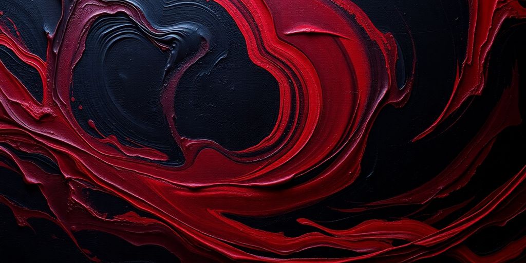
Black: A Spectrum of Meanings
Black. It’s a color that really gets people talking, isn’t it? We often jump to thinking about sadness or maybe even something spooky, but black is so much more than that in the art world. It’s like a chameleon, shifting its meaning depending on how and where an artist uses it. Think about it – black can be super elegant, like a fancy suit, or it can feel really powerful, like a storm cloud gathering. It’s a color that commands attention and can make other colors pop. Artists have been playing with black for ages, using it to create drama, add depth, and even to protect or signify something important. It’s not just about what’s not there; it’s about the presence black itself brings to a piece.
The Many Sentiments of Black
When we see black, our minds often go to a few common ideas. It’s frequently linked to endings, like the end of a day or the end of a life, which is why it’s a traditional color for mourning in many cultures. But it’s not always about feeling down. Black can also represent a kind of quiet strength, a resilience that doesn’t need to shout to be heard. It’s the color of the night sky, full of potential and mystery, and it can feel very grounding, like the rich soil that helps plants grow.
Beyond Sadness: Black’s Strength and Protection
Let’s move past the gloomy stuff for a second. Black can actually be a symbol of protection. Think of it like a shield, absorbing negativity and keeping something safe within. In some African cultures, for example, black is worn to honor ancestors and represents dignity and strength. It’s a way of saying, “We are here, we are strong, and we remember.” It’s a powerful statement of identity and resilience, showing that even in difficult times, there’s an inner fortitude.
Elegance, Power, and Mystery in Black
Black has this amazing ability to convey a sense of sophistication and luxury. It’s often chosen for formal events because it just looks classy. But it’s not just about looking good; black can also signify authority and power. When an artist uses a lot of black, like Caravaggio did, they can create a really intense mood. It draws your eye, makes you focus, and adds a layer of intrigue. It’s that feeling of the unknown, the mysterious element that makes you want to look closer and figure things out.
Black is a color that doesn’t just sit there; it actively shapes how we perceive everything else around it. It’s a foundational color that can make the brightest colors shine even brighter.
Unveiling the Symbolism of Deep Blues and Purples

Let’s chat about deep blues and purples in art. These colors aren’t just pretty; they carry a lot of weight and history. Think about how these shades make you feel – often, they bring up feelings of calm, richness, or even a touch of magic.
The Royal Touch of Purple
Purple has a long history of being linked to royalty and luxury. This wasn’t just because it looked fancy. Historically, making purple dye was super difficult and expensive. It took a lot of work and rare materials, so only the wealthiest people, like kings and queens, could afford to wear it. Because of this, purple became a symbol of high status, nobility, and even wisdom. It’s a color that suggests imagination and a bit of mystery, too. It’s like wearing a crown, but with paint!
Deep Blues: Wisdom and Serenity
Deep blues, on the other hand, often bring a sense of calm and stability. Think about the vast ocean or the night sky – they’re both deep blues and feel incredibly peaceful. In art, this translates to feelings of wisdom, trust, and loyalty. It’s a color that can make you feel grounded and thoughtful. It’s no wonder many institutions use blue; it just feels dependable and serene. It’s a color that invites contemplation and a quiet sort of strength.
Mystical Depths in Indigo and Violet
When you get into the really deep blues and purples, like indigo and violet, things get even more interesting. These shades often hint at the mystical and the spiritual. They can represent a connection to something greater, a sense of intuition, or even the unknown. It’s like looking into a deep well of knowledge or a starry night sky – there’s a sense of wonder and possibility. These colors can add a layer of intrigue and depth to a piece, inviting viewers to ponder the less tangible aspects of life. They remind us that there’s more to see than what’s on the surface, and that’s pretty cool.
These colors, with their rich historical ties and emotional depth, offer artists a powerful way to communicate complex ideas and feelings without saying a word. They can transform a simple canvas into a story of power, peace, or the profound mysteries of existence.
The Impact of Earthy Tones
Earthy tones, like browns and deep greens, really bring a sense of the natural world into art. They’re not just colors; they’re like a warm hug from the planet itself. Think about it – these shades connect us to the ground beneath our feet, giving a feeling of stability and comfort. They can make a piece feel really grounded and honest, almost like a familiar old friend.
Browns: Grounding and Stability
Brown is the color of soil, wood, and stone. It’s what keeps us rooted. In art, it often signifies reliability, security, and a no-fuss approach. When an artist uses a lot of brown, they might be trying to convey a sense of dependability or a connection to something solid and real. It’s the color of a sturdy wooden table or a well-worn leather chair – things you can count on. It’s also associated with warmth and coziness, making spaces feel inviting and safe. This color really helps to create a sense of belonging and ease.
Greens: Nature’s Calm and Renewal
Green is pretty much synonymous with nature, right? It’s the color of new leaves in spring, lush forests, and peaceful meadows. In artwork, green often brings feelings of calm, balance, and renewal. It can represent growth, health, and a fresh start. Using different shades of green can evoke a sense of tranquility, like looking out at a peaceful landscape. It’s a color that feels alive and rejuvenating, reminding us of the natural world’s ability to heal and refresh.
The Richness of Deep Reds and Burgundies
While we often think of earthy tones as muted, deep reds and rich burgundies definitely fit into this category, bringing their own kind of grounded intensity. These colors can represent the richness of the earth, like fertile soil or the deep hues of autumn foliage. They carry a sense of warmth, passion, and even a touch of luxury, but in a way that still feels connected to something natural and substantial. Think of the deep color of aged wine or the bark of an old tree – they have a depth that feels both powerful and comforting. They can add a sophisticated, grounded energy to a piece, making it feel both vibrant and deeply rooted.
How Artists Harness Dark Colors
Artists are like visual storytellers, and dark colors are some of their most powerful tools in their narrative toolbox. They don’t just fill space; they shape the entire mood and message of a piece. Think about how a splash of deep indigo can make a scene feel vast and mysterious, or how a rich brown can ground a composition and give it a sense of history. It’s all about using these hues intentionally to guide the viewer’s eye and stir specific feelings.
Creating Dramatic Visuals
Dark colors are fantastic for building drama. They can create really striking contrasts, making lighter elements pop and drawing your attention exactly where the artist wants it. This is often achieved through techniques like chiaroscuro, where bold shifts between light and shadow are used to sculpt forms and add a sense of volume. It’s like turning up the spotlight on certain parts of the story.
Enhancing Emotional Impact
Beyond just looking good, dark colors have a way of tapping into our emotions. A deep, somber tone can evoke feelings of introspection or melancholy, while a rich, dark jewel tone might suggest luxury and power. Artists use this emotional connection to make their work more relatable and impactful, allowing viewers to connect with the piece on a deeper level. It’s a way to communicate without words, really.
Drawing Attention to Key Elements
Sometimes, the best way to make something stand out is to surround it with darkness. Artists often use dark backgrounds or borders to frame a subject, making it the undeniable focal point. This technique helps to isolate the important parts of the artwork, ensuring that the viewer doesn’t miss the main message or the most significant details. It’s a clever way to direct the viewer’s gaze and emphasize the core of the artistic expression.
Contemporary Interpretations of Dark Colors
It’s pretty cool how artists today are still playing with dark colors, giving them new life and meaning. They’re not just sticking to the old rules; they’re mixing things up and showing us that these deep shades can mean so many different things. It’s like they’re taking the historical symbolism and giving it a modern twist, making it relevant for us right now.
Modern Artists and Their Dark Palettes
Lots of artists are really leaning into darker palettes these days. Think about painters who use deep indigos and rich burgundies not just for drama, but to explore feelings of introspection or even quiet strength. They might use a lot of black, not to signify sadness, but to create a sense of sophisticated power or to make other colors really pop. It’s a way of saying that dark doesn’t always mean negative; it can be really grounding and elegant too.
Reimagining Traditional Meanings
We’re seeing a lot of artists challenge the old ideas about what dark colors represent. For instance, a deep forest green might not just mean nature anymore; it could represent a complex inner world or a sense of mystery. Purple, once strictly for royalty, might be used to evoke a sense of spiritual connection or even a bit of playful rebellion. It’s all about how the artist chooses to use the color and what they want to communicate with it. The context and the artist’s intent are key.
The Enduring Influence of Dark Color Symbolism
Even with all these new interpretations, the old symbolism still hangs around, influencing how we see these colors. When an artist uses a lot of black, we might still feel that sense of authority or mystery, even if they’re not intending it that way. It’s like a subconscious connection we have to these shades. This blend of old and new is what makes dark colors so fascinating in art today. It’s a conversation between history and the present, and it’s really exciting to see where artists take it next. We can learn a lot about black as a color by looking at how it’s used across different eras and by different artists.
So, What’s the Takeaway?
It’s pretty cool how colors, especially the darker ones, can say so much without a single word, right? We’ve seen how black and other deep shades can mean everything from serious power to a bit of mystery, and sometimes even a touch of sadness. But it’s not just about what they can mean; it’s about how artists use them to make us feel something specific. Think about it next time you see a painting or even a movie poster. These colors aren’t just there to fill space; they’re part of the story. It’s exciting to know that there’s this whole hidden language in art, and now you’ve got a little more insight into it. Pretty neat stuff!
Frequently Asked Questions
What is color symbolism in art?
Color symbolism is like a secret code in art where colors stand for different ideas or feelings. Artists use it to make their paintings more meaningful, like using blue to show sadness or red to show anger. It’s a way to communicate without using words.
What does the color black symbolize?
Black can mean a lot of different things. Sometimes it means sadness or death, but it can also mean elegance, power, or mystery. It really depends on the artwork and the artist’s intention.
Do colors mean the same thing everywhere?
Yes, colors have different meanings in different places. For example, white might mean purity in one culture, but mourning in another. Artists consider these cultural differences when they choose their colors.
How do artists use dark colors in their work?
Artists use dark colors to create a strong mood, like making a scene feel dramatic or mysterious. They can also use dark colors to make certain parts of the painting stand out, like a bright object against a dark background.
What do deep blues and purples usually represent?
Deep blues and purples often represent royalty, wisdom, and a sense of calm or spirituality. They can make a painting feel rich and important, or even a bit magical.
What feelings do earthy colors like brown, green, and deep red bring?
Browns make us think of the earth, stability, and feeling grounded. Greens remind us of nature, growth, and peace. Deep reds and burgundies can suggest richness, passion, or even a sense of importance.