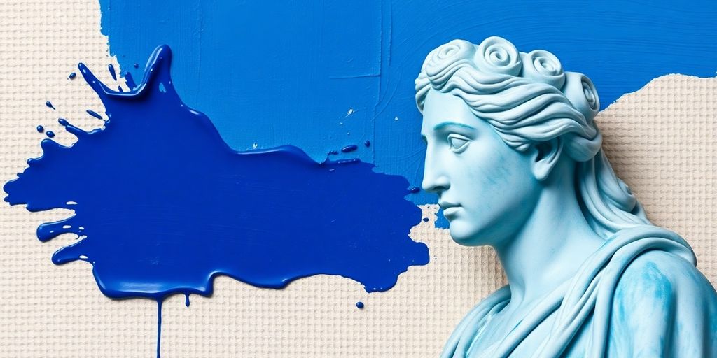
The color blue, with its vast range of shades, has always held a special spot in art and culture. It shows up everywhere, from the endless sky to deep oceans, and it carries a lot of different meanings. This article will look into the color blue meaning in art, exploring its journey through history, its cultural importance, and how artists have used it to express ideas and feelings.
Key Takeaways
- Blue’s presence in art goes way back, showing up in ancient times and gaining value as pigments became more available.
- Culturally, blue means a lot of things, from royalty and religion to feelings of calm or sadness.
- Artists have used blue to create depth and spiritual feelings, with famous examples like International Klein Blue changing modern art.
- In nature, blue is all about the sky and sea, connecting to feelings of peace and stability, but also sometimes sadness.
- New ways of making blue pigments are changing how we see and use this color today, focusing on being eco-friendly and innovative.
The Deep Roots of Blue in Art History
Ancient Origins and Early Meanings
Okay, so blue wasn’t always the everyday color we know now. Back in ancient times, finding natural blue pigments was a real challenge. Early civilizations, like the Egyptians, really valued blue. They used it in jewelry and decorations, seeing it as a symbol of royalty and power. Imagine how special it must have been, since it wasn’t easy to come by! It’s interesting to think about how something we take for granted now had such a different meaning way back then.
The Scarcity and Value of Early Blue Pigments
Blue pigments were super rare, which made them incredibly expensive. Lapis lazuli, a beautiful blue stone, had to be imported from Afghanistan. Can you imagine the cost and effort involved? Because of this, blue became associated with wealth and status. Only the rich and powerful could afford to use it in their art and clothing. It’s kind of wild to think that a color could be such a status symbol. This scarcity really shaped how blue was perceived and used in early art. The history of blue is quite fascinating.
Blue’s Journey Through Time
Blue’s story is one of transformation. As time went on, things started to change. The discovery of new sources and the development of synthetic pigments made blue more accessible.
Here’s a quick look at how blue evolved:
- Ancient times: Rare and precious, linked to royalty.
- Middle Ages: Used in religious art, symbolizing the heavens.
- Renaissance: Became more common as trade routes expanded.
Over time, blue went from being a luxury to a more widely available color. This shift had a big impact on art and culture. Artists started experimenting with blue in new ways, and it became an important part of the color palette.
And now, we have so many shades of blue to choose from! It’s amazing to see how far blue has come and how its meaning has changed over the centuries.
Unveiling the Cultural Significance of Blue
Blue in Royalty and Religion
Okay, so blue wasn’t always the everyday color we know now. Back in the day, getting your hands on blue pigment was a big deal. Think royalty and religion. Because it was so rare and expensive, blue became associated with wealth, power, and even holiness. You’d see it in royal robes, religious paintings – basically, anywhere they wanted to show off something super important. It’s kind of wild to think about how a color could be a status symbol, right?
The Psychology and Symbolism of Blue
Ever wonder why we say someone is "feeling blue" when they’re sad? Well, the psychology of color is pretty fascinating. Blue often gets linked to feelings of calmness, peace, and stability. But it’s not all sunshine and rainbows; it can also represent sadness, loneliness, or even coldness. Think about a vast, empty ocean – beautiful, but maybe a little intimidating, too. It’s all about context, I guess. The symbolism of blue is pretty interesting.
Expressions and Idioms Featuring Blue
Blue isn’t just a color; it’s woven into our language. Think about all the sayings we have that use the word "blue."
- "Out of the blue" means something unexpected.
- Having the "blues" means feeling down.
- "True blue" means loyal and faithful.
It’s amazing how a single color can carry so much meaning in our everyday conversations. These expressions show how deeply ingrained blue is in our culture and how we use it to describe our feelings and experiences. It’s more than just a color; it’s a way we communicate.
Blue’s Artistic Evolution and Impact
Simulating Depth and Dimension with Blue
Blue has this amazing ability to create the illusion of depth in art. Think about landscapes – artists often use lighter, cooler blues in the distance to make mountains seem farther away. It’s all about how our eyes perceive color and how blue tends to recede visually. This technique isn’t just about realism; it’s about creating a mood, a sense of vastness, or even mystery. It’s a simple trick, but it can totally transform a painting. The use of blue in landscapes is a testament to its versatility.
The Spiritual Resonance of Blue in Art
Blue often carries a spiritual weight in art. It’s linked to the heavens, to divinity, and to the infinite. You see it in religious paintings, where blue robes might signify purity or a connection to the divine. But it’s not just about religion; blue can also represent inner peace, contemplation, or a search for something beyond the material world. It’s a color that invites reflection and introspection.
International Klein Blue and Modern Art
Okay, International Klein Blue (IKB) is a whole other level of blue obsession. Yves Klein patented this super-intense, matte blue, and it became his signature. He wanted to create a color that was pure emotion, without any distractions. IKB is so vibrant, it almost vibrates off the canvas. It’s been hugely influential in modern art, pushing artists to think about color in new and radical ways. It’s a reminder that color itself can be the subject of art, not just a tool to represent something else.
IKB is more than just a color; it’s an experience. It’s meant to overwhelm the senses and transport the viewer to another state of consciousness. It’s a bold statement about the power of color to evoke emotion and transcend the ordinary.
Here are some ways IKB impacted modern art:
- Challenged traditional notions of representation.
- Emphasized the emotional power of color.
- Inspired artists to explore new chromatic depths.
The Enduring Allure of Blue in Nature and Emotion
Blue in the Sky and Sea
Blue is everywhere, right? I mean, just look up! The sky’s vast expanse is usually some shade of blue, and then there’s the ocean, stretching out as far as you can see. It’s no wonder blue is so deeply ingrained in our minds. It’s a constant reminder of the natural world around us. Think about it: how often do you see a blue sky and not feel at least a little bit better? It’s like nature’s way of giving us a visual hug. The ocean’s depths hold a similar fascination, a mysterious world beneath the surface that we can only glimpse.
Connecting Blue to Calmness and Stability
There’s something inherently calming about blue. Maybe it’s because we associate it with the sky and the sea, both of which evoke feelings of peace and tranquility. It’s like when you’re stressed, and someone tells you to take a deep breath – looking at something blue can have a similar effect. It’s no surprise that blue is often used in bedrooms and offices to create a relaxing atmosphere. It’s a color that just seems to promote a sense of stability and order. It’s like a visual anchor in a chaotic world. You can see how blue is linked to trustworthiness.
The Dual Nature of Blue: Peace and Sadness
But here’s the thing about blue: it’s not all sunshine and rainbows. It also has a darker side, a connection to sadness and melancholy. Think of the phrase "feeling blue" – it’s practically synonymous with being down in the dumps. Maybe it’s because blue can also represent isolation and loneliness. It’s a color that can evoke a sense of longing, a yearning for something that’s just out of reach. It’s this duality that makes blue so fascinating. It’s a color that can be both comforting and unsettling, peaceful and sad. It’s a reminder that life is full of complexities, and that even the most beautiful things can have a touch of sadness to them.
Blue is a bit of a chameleon. It can be bright and cheerful, like a summer sky, or deep and somber, like a stormy sea. It’s a color that reflects the full range of human emotions, from joy to sorrow. And that’s what makes it so compelling. It’s a color that tells a story, a color that resonates with our own experiences.
Here are some common associations with the color blue:
- Calmness
- Sadness
- Trust
- Stability
Innovations in Blue Pigment Production
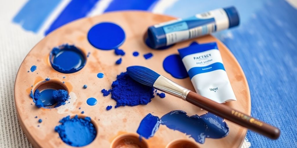
The Development of Synthetic Blue Pigments
Okay, so, before synthetic pigments, getting a good blue was a serious pain. Think crushing up rare stones and hoping for the best. But then, science happened! The creation of synthetic blue pigments totally changed the game, making vibrant and lasting blues accessible to everyone.
- Prussian Blue was discovered by accident.
- Cobalt Blue offered a stable, vivid hue.
- French Ultramarine provided a high-quality blue without the expense of natural materials.
Contemporary Production of Blue
These days, we’ve got blues coming out of labs that are brighter, more stable, and less toxic than ever before. One cool example is YInMn Blue, which was also discovered by accident! It’s super vibrant and durable, which is awesome for everything from art to industrial applications. Plus, there’s a big push for making these pigments in a more eco-friendly way. The introduction of new blue pigments has expanded the palette available to artists and designers.
Sustainable Practices in Blue Pigment Creation
Speaking of eco-friendly, bio-indigo is becoming a big deal. It’s made from plants, which is way better for the environment than traditional indigo dyes. Companies are working hard to reduce waste and use sustainable farming methods.
Modern innovations have made it possible to produce bio-indigo in laboratories, maintaining the vibrant hue without the need for harmful chemicals. This approach not only caters to the fashion industry’s demand for eco-conscious products but also offers a pure, natural dye that meets high-quality standards. The adoption of bio-indigo emphasizes the shift toward more sustainable options in the global textile market.
Here’s a quick look at the shift:
| Practice | Benefit |
|---|---|
| Bio-indigo | Reduced chemical waste |
| Sustainable farms | Lower environmental impact |
| Lab production | Pure, high-quality, natural dye options |
Exploring the Versatility of Blue’s Meaning
Blue is one of those colors that just gets you, you know? It’s everywhere, from the sky above to the deepest parts of the ocean. But it’s not just about location; it’s about what blue makes us feel and what it represents in different situations. Let’s unpack some of the cool ways blue shows up in our lives.
Blue’s Unique Character Across Tones
One of the coolest things about blue is how it holds its own, no matter the shade. Think about it: a light, airy sky blue still feels distinctly blue, and a deep, mysterious navy? Still blue! It’s like blue has this core identity that shines through, no matter how you tweak it. Other colors change a lot more when you lighten or darken them, but blue? It just stays true to itself. It’s like that reliable friend who’s always there for you, no matter what.
Blue as a Symbol of Depth and Aspiration
Blue often makes us think of big, important things. It can represent depth, like the ocean’s depths, or aspiration, like reaching for the sky. It’s a color that conveys mood and depth, often representing the infinite and the divine. It’s no wonder so many people pick blue as their favorite color! It’s got this built-in sense of wonder and possibility. Here’s a quick look at some common associations:
- Depth: Oceans, vastness, the unknown
- Aspiration: Skies, dreams, goals
- Calmness: Serenity, peace, tranquility
- Trust: Reliability, security, confidence
The Iconic Color for Synesthesia
Okay, this is where it gets really interesting. For people with synesthesia, blue can be an iconic color. Synesthesia is when you experience things through mixed senses, like seeing colors when you hear music. And for many synesthetes, blue is a go-to color that pops up in their unique perceptions. It’s like blue is the color of ‘being in a dimension apart’, a color that captures the essence of their unique sensory experiences. It’s a testament to blue’s versatile and evocative nature.
Blue has an obvious presence, both in our external world and on our interior ‘mindscape’. Interestingly, ‘blue’ has also come to have an iconic place on the inner landscape of the synesthete. It’s a color that transcends the ordinary, connecting to something deeper and more personal.
Wrapping Up Our Blue Journey
So, we’ve taken a little trip through the world of blue, haven’t we? It’s pretty cool how this one color can mean so many different things, from feeling a bit down to being super calm, or even showing off something really important. Artists have used blue for ages to tell stories and make us feel stuff, and it’s still doing that today. It just goes to show, a color isn’t just a color; it’s a whole vibe, a piece of history, and a way to connect with others. Pretty neat, right?
Frequently Asked Questions
Why was the color blue so special and expensive for artists a long time ago?
Blue pigments were hard to find and make in the old days. Think about how rare certain gems are today; blue was like that for artists. So, when they did use blue, it showed that the art was really important or made for someone rich and powerful.
What kind of feelings does the color blue usually bring out in people?
Blue often stands for things like peace, calm, and feeling steady, like the big sky or the deep ocean. But it can also mean sadness, like when someone says they’re ‘feeling blue.’ Artists use these different feelings to tell a story or set a mood in their work.
Has blue always been a color for important people or religious art?
Yes, blue has been used a lot in art for religious and royal stuff. For example, in old paintings, the Virgin Mary often wears blue clothes to show how important and pure she is. Kings and queens also wore blue to show their power and fancy status.
How do artists use blue to make their paintings look deeper or more meaningful?
Artists use different shades of blue to make things look like they have depth, meaning they look 3D instead of flat. They also use blue to make you feel certain emotions or to show spiritual ideas, like the vastness of the heavens.
What is International Klein Blue, and why is it important?
International Klein Blue, or IKB, is a super bright and deep blue color that a French artist named Yves Klein created. He used this special blue to make people think about things that aren’t physical, like feelings or spiritual ideas, making it a big deal in modern art.
Are new kinds of blue colors still being made today?
Nowadays, we can make blue colors in ways that are better for the Earth. Scientists and artists are always finding new ways to create blue pigments that are safe and long-lasting, which means we’ll keep seeing amazing blue art for a long time.