Colors are more than just pretty things to look at; they actually say a lot. Artists use them to show feelings, tell stories, and give us a peek into their minds. It’s like a secret language. This article looks at how different shades mean different things in art and how artists use them to connect with us.
Key Takeaways
- Colors directly connect with our emotions, influencing how we feel when we look at art.
- Artists use specific colors and palettes to express their personal feelings, cultural background, and ideas.
- Understanding shades meaning in art can help you use color more effectively in your own creative projects.
- The availability and cost of pigments throughout history significantly impacted the colors artists could use and the art they created.
- Color psychology plays a role in how art connects with viewers and can be a tool for artists to grow and evolve their style.
The Emotional Palette: How Shades Speak Volumes
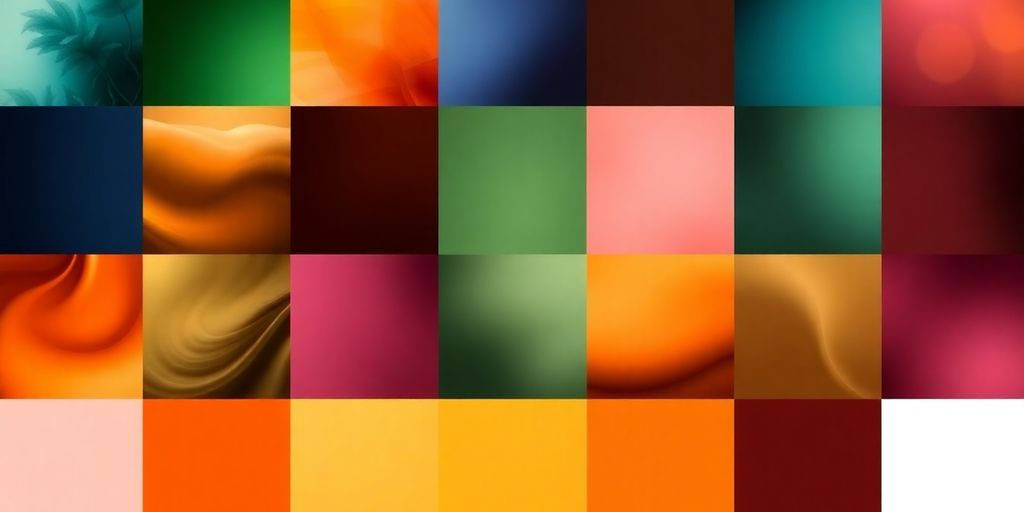
Colors are like a secret language, aren’t they? They just have this way of hitting us right in the feels, no words needed. Think about it – a splash of bright yellow can instantly lift your mood, making you feel sunny and cheerful. Then there’s deep blue, which can bring on a sense of calm or maybe a touch of melancholy. It’s pretty amazing how shades can speak volumes about what we’re feeling or what an artist wants us to feel.
Colors as a Direct Line to Our Feelings
It’s almost like colors have their own personalities. They can be loud and energetic, or quiet and thoughtful. This emotional connection is something artists tap into all the time. They choose colors not just because they look good, but because of the vibe they create. It’s a way to communicate beyond just what’s depicted.
Decoding the Language of Hues
So, how do we figure out what a color is trying to tell us? Well, there are some general ideas, like warm colors (reds, oranges) often bringing energy and passion, while cool colors (blues, greens) tend to be more calming. But it’s not always that simple. The context matters a lot!
- Red: Can mean passion, but also anger or danger.
- Blue: Often brings peace, but can also suggest sadness.
- Yellow: Usually happy and bright, but sometimes it’s a warning.
- Green: Think nature and growth, but also envy.
Personal Meanings Behind Every Shade
Beyond these general associations, each of us has our own personal history with colors. Maybe a certain shade reminds you of a happy childhood memory, or perhaps another brings up a less pleasant one. These personal connections are just as important as the widely accepted meanings. When an artist uses a specific color, it might be for a reason that’s deeply personal to them, adding another layer of richness to their work. It’s a fascinating way to connect with art on a deeper level, almost like getting a little peek into the artist’s world. You can explore how different colors affect your own feelings and even your creative process by trying out new palettes, maybe starting with something simple like exploring color pairings.
The way colors make us feel is so powerful. It’s not just about what we see, but what we experience internally. Artists use this to their advantage, guiding our emotions through their choices.
Unveiling the Artist’s Inner World Through Color
Color as a Signature Style
Think about your favorite artists. Chances are, you can picture their work not just by the subject matter, but by the colors they tend to use. That’s because an artist’s color choices often become a kind of personal signature. It’s like their unique way of signing their name onto the canvas, but with hues instead of ink. Maybe they lean towards warm, earthy tones that feel grounded and comforting, or perhaps they favor bold, contrasting colors that grab your attention and spark energy. This consistent use of certain colors or color combinations can really tell us something about their personality and how they see the world.
Expressing the Unspoken Through Palettes
Sometimes, feelings are too big or too complex to put into words. This is where color really shines. Artists can use their chosen palettes to communicate emotions that might otherwise stay hidden. A wash of soft blues and grays might convey a sense of quiet contemplation or even sadness, while a burst of vibrant yellows and oranges could express pure joy and excitement. It’s a visual language that speaks directly to our own emotional experiences. By carefully selecting and arranging colors, artists can create entire moods and atmospheres, inviting us to feel along with them.
Cultural Echoes in Color Choices
It’s fascinating how colors can carry different meanings depending on where you are in the world. What might be a color of celebration in one culture could signify mourning in another. Artists, consciously or not, often weave these cultural associations into their work. This adds another layer of meaning, connecting their personal expression to a broader shared understanding. For example, the use of deep reds might evoke passion and love in some contexts, while in others, it could represent power or even danger. It’s a subtle way artists can tap into shared human experiences and cultural understandings.
Color is a powerful tool for artists to express themselves. It’s not just about making things look pretty; it’s about conveying a message, an emotion, or a story. When you look at a piece of art, pay attention to the colors. What do they make you feel? What do you think the artist was trying to say?
Here are a few ways artists use color to show us their inner world:
- Personal Feelings: Using bright colors for happy moments and muted tones for sad ones.
- Cultural Background: Incorporating colors that have special meaning in their heritage.
- Storytelling: Using a specific color repeatedly to represent an idea or a memory.
- Experimentation: Trying out unusual color combinations to create a unique mood or effect.
Harnessing Color’s Power in Your Own Creations
Ready to bring your own artistic visions to life? It’s easier than you think to tap into the power of color and make your creations truly sing. Think of color as your personal assistant, helping you communicate exactly what you want to say without a single word.
Connecting with Your Emotions Through Color
Start by tuning into how you feel. What colors pop into your head when you think about joy, calm, or even a bit of mischief? Don’t overthink it; just let your gut feelings guide you. Your emotional state is a fantastic starting point for choosing your palette. If you’re feeling energetic, maybe bright yellows or oranges will work. If you’re seeking peace, soft blues and greens might be the way to go. It’s all about finding hues that match your inner vibe.
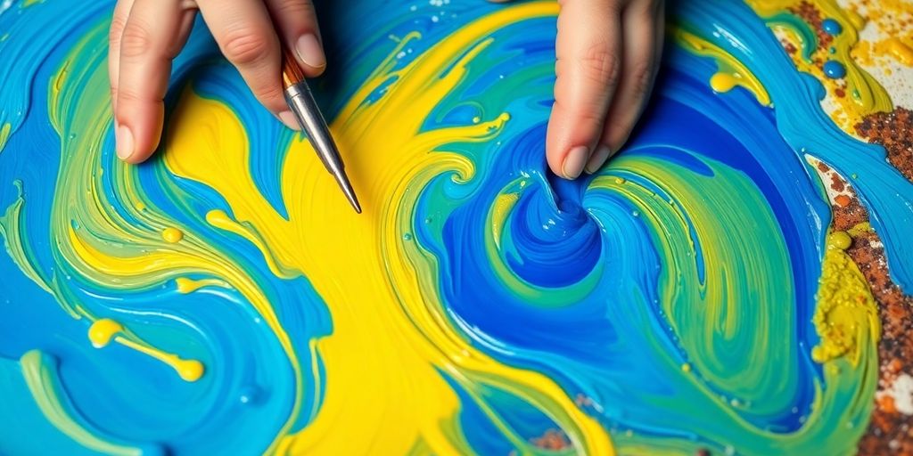
Experimenting with Color Pairings
This is where the real fun begins! Grab some paints, pencils, or even just a notebook, and just play. Try putting colors next to each other that you normally wouldn’t. See what happens when you pair a deep purple with a bright teal, or a soft pink with a muted olive green. You might be surprised by the results.
Here are a few ideas to get you started:
- Try complementary colors (opposites on the color wheel) for a vibrant pop.
- Experiment with analogous colors (next to each other on the wheel) for a harmonious feel.
- Don’t shy away from unexpected combinations – they can lead to something truly unique.
Remember, there are no strict rules here. The goal is to discover what looks and feels good to you. It’s your art, after all!
Finding Inspiration in the World Around You
Look everywhere! Nature is a masterclass in color. The way the sky shifts from dawn to dusk, the subtle greens in a forest, or the bold patterns on a butterfly’s wings – it’s all inspiration waiting to be noticed. Even a busy city street or a well-designed website can offer fantastic color ideas. Keep a little notebook or use your phone to snap pictures of color combinations that catch your eye. You can even explore resources like ArtfulSpaces lessons for guided inspiration. Soon, you’ll have a whole collection of color ideas ready for your next project.
The Fascinating History of Color in Art
It’s pretty amazing to think about how far we’ve come with colors in art. For ages, certain shades were super hard to get, making them really special. Take blue, for instance. Back in the day, the only way to get a good blue was by grinding up lapis lazuli, which was a rare and pricey stone. Cleopatra herself apparently used it as eyeshadow! Later, Egyptians figured out how to make the first synthetic blue pigment, Egyptian blue, around 3500 BCE. It was used a lot, but then the recipe got lost, making blue paint rare again for a long time. This meant that if you saw a lot of blue in older art, it was probably made by a famous artist or someone with deep pockets.
Purple has a similar story. It was linked to royalty because the dye came from a specific type of snail. You needed a ton of these snails, and the process of extracting the color was really involved. This made purple incredibly exclusive, and that association with royalty stuck. It wasn’t until the 1850s that a scientist named William Henry Perkin accidentally discovered a synthetic purple dye called mauveine while trying to make medicine. This invention totally changed things, making purple accessible to everyone and opening up a whole new world for artists. These kinds of pigment discoveries really shaped what artists could create and how they captured the spirit of their times. It’s fascinating how the availability of colors influenced art history, and you can even learn more about these kinds of art lessons at ArtfulSpaces.
The Rarity and Value of Pigments
Ancient Blues and Royal Purples
How Pigment Availability Shaped Art
Color Psychology: A Tool for Connection and Growth
Color psychology is pretty neat, right? It’s all about how colors can really mess with our feelings and how we see things. Think about it – a bright yellow room might make you feel cheerful, while a deep blue one could make you feel super calm. Artists have been using this for ages to get their message across without saying a word. It’s like a secret language that connects directly to our brains and hearts.
Connecting with Your Audience Through Color
When you’re creating art, understanding how colors affect people is a big deal. If you want your piece to feel energetic and exciting, you might lean towards reds and oranges. Want something more peaceful? Blues and greens are your go-to. It’s not just about what you feel, but how you want the person looking at your art to feel too. It’s a way to build a bridge between your vision and their experience. For example, many brands use specific colors to make you feel a certain way about their products, which is a whole other fascinating area of color psychology.
Deepening Self-Awareness with Color
But it’s not just about the audience; it’s about you, too! Paying attention to the colors you’re drawn to can tell you a lot about your own inner state. Are you feeling a bit down and reaching for bright, cheerful colors? Or maybe you’re feeling introspective and choosing muted tones? Keeping a little color journal can be super helpful here. Just jot down what colors you used in your work and how you felt while using them. It’s a simple way to get to know yourself better through your creative process.
Color as a Catalyst for Artistic Evolution
As you play around with different colors and notice their effects, your art will naturally start to change and grow. You might discover new combinations that surprise you or find that your go-to colors shift over time as your own experiences change. It’s a constant learning process. Don’t be afraid to experiment! Try out some new palettes, see what happens, and trust your instincts. You might just surprise yourself with what you discover about color and about your own creative spirit.
Exploring Color Across Different Artistic Mediums
Different art forms really let color shine in unique ways, don’t they? It’s fascinating to see how artists play with hues across various mediums to get their message across.
The Painter’s Canvas of Emotion
For painters, color is like their direct line to feelings. Think about Van Gogh’s bold yellows or Rothko’s deep color fields – they used color to show intense emotions, sometimes even things they couldn’t put into words. A bright, warm palette might scream joy or passion, while cooler, softer tones could whisper melancholy or peace. It’s amazing how a few brushstrokes can create such a strong emotional response. You can explore how different color combinations affect the mood of your own work by trying out some simple, step-by-step art lessons on platforms like ArtfulSpaces.
Photography’s Play with Light and Color
Photographers have a special relationship with color, often working with light and how it hits surfaces. They can tweak colors in editing to create a certain vibe or tell a story. A slightly desaturated look might feel nostalgic, while punchy, vibrant colors can make a scene feel really alive and energetic. It’s all about how they manipulate light and color to guide our eyes and feelings.
Color in Sculpture and Textile Arts
And it’s not just painting and photography! Sculptors might use color to highlight a form’s shape or give it a sense of movement. Imagine a sculpture painted in contrasting colors – it really makes you notice the curves and edges. Textile artists, on the other hand, get to play with dyes and threads, creating intricate patterns and textures that are a feast for the eyes. The way colors blend and interact in fabric can be just as powerful as a painted masterpiece.
So, What’s the Takeaway?
Well, we’ve seen how colors aren’t just pretty to look at; they’re like a secret language artists use to share their feelings and ideas. From the fiery passion of red to the calm of blue, each shade has its own story. It’s pretty cool how artists pick these colors, sometimes based on how they feel, other times on what colors mean in different places. It’s like a personal signature, right? Thinking about it, our own color choices say a lot about us too. So next time you’re looking at art, or even just picking out your clothes, remember that colors are doing more than just filling space. They’re communicating. Keep playing with color in your own life, and see what stories you end up telling!
Frequently Asked Questions
How do colors make us feel?
Colors can make us feel different things. For example, red might make you feel excited or angry, while blue can make you feel calm or sad. Artists use these feelings to tell stories or show moods in their art.
How do artists show their feelings with colors?
Artists choose colors based on what they want to express. If an artist is feeling happy, they might use bright colors like yellow. If they are feeling thoughtful, they might use cooler colors like blue or green. Sometimes, colors are part of their personal style, like a signature.
Do colors mean the same thing everywhere?
Yes, colors can have different meanings in different places. For example, white might mean happiness in one culture and sadness in another. Artists might use these meanings to connect with people from different backgrounds.
How can I use colors in my own art?
You can try using colors that match how you feel. If you feel energetic, try bright colors. If you feel calm, try softer colors. Playing with different color combinations can also help you discover new ideas for your art.
Why were some colors rare in the past?
In the past, some colors were very hard to find and expensive to make. For example, blue and purple were once rare. This meant that only wealthy people or famous artists could use them, which made those colors very special.
Where can I find inspiration for colors?
Looking at the colors in nature, like sunsets or forests, can give you ideas. Also, paying attention to the colors you see in everyday life, like in your clothes or room, can help you understand how colors affect you and inspire your art.