Unlocking the Mood: How Living Room Color Psychology Shapes Your Space
Imagine stepping into a living room and instantly feeling a sense of calm wash over you. Or perhaps another room invigorates you with energy and creativity. The secret isn’t just in the furniture or the layout; it’s often hidden in the colors that surround you. Living room color psychology explores the profound impact different hues have on our emotions, behaviors, and overall well-being within the heart of our homes. Choosing the right colors can transform your living room into a sanctuary of relaxation, a vibrant hub for social gatherings, or a space that sparks inspiration and productivity. But how does it all work?
The Psychology of Color: A Primer
Color psychology is the study of how colors influence our perceptions and behaviors. While individual experiences and cultural backgrounds can shape personal preferences, certain color associations are deeply ingrained in human psychology. These associations stem from nature, history, and even our own biology.
For example, blue is often associated with the sky and the ocean, evoking feelings of serenity, stability, and trust. Red, on the other hand, is a high-energy color linked to passion, excitement, and even danger. Understanding these basic associations is the first step in harnessing the power of living room color psychology.
Decoding the Color Spectrum for Your Living Room
Let’s dive into specific colors and how they can impact the atmosphere of your living room:
Blue: Calm and Collected
Blue is a classic choice for living rooms, particularly for creating a relaxing and inviting space. Its calming properties can help reduce stress and promote a sense of tranquility. Light blues are airy and refreshing, while deeper blues offer a sense of sophistication and stability. Consider using blue as an accent wall color or incorporating it through soft furnishings like pillows, throws, and rugs.
Green: Nature’s Embrace
Green is closely associated with nature, growth, and harmony. It’s a versatile color that can bring a sense of balance and renewal to your living room. Soft greens are calming and restorative, while brighter greens can add a touch of energy and vibrancy. Incorporate green through plants, artwork, or even a statement piece of furniture. [internal_link] Using plant life is a great way to incorporate this!
Yellow: Sunshine and Optimism
Yellow is the color of sunshine and happiness. It can instantly brighten up a room and create a cheerful and inviting atmosphere. However, be cautious when using yellow, as too much can be overwhelming or even agitating. Use yellow as an accent color to add pops of energy and warmth, or opt for softer, muted yellows for a more subtle effect.
Red: Passion and Energy
Red is a bold and stimulating color that evokes feelings of passion, excitement, and energy. It’s a great choice if you want to create a dynamic and attention-grabbing living room. However, red can also be overwhelming, so it’s best used sparingly. Consider using red as an accent color in artwork, throw pillows, or decorative accessories. Avoid painting an entire room red, as it can be too intense and lead to restlessness.
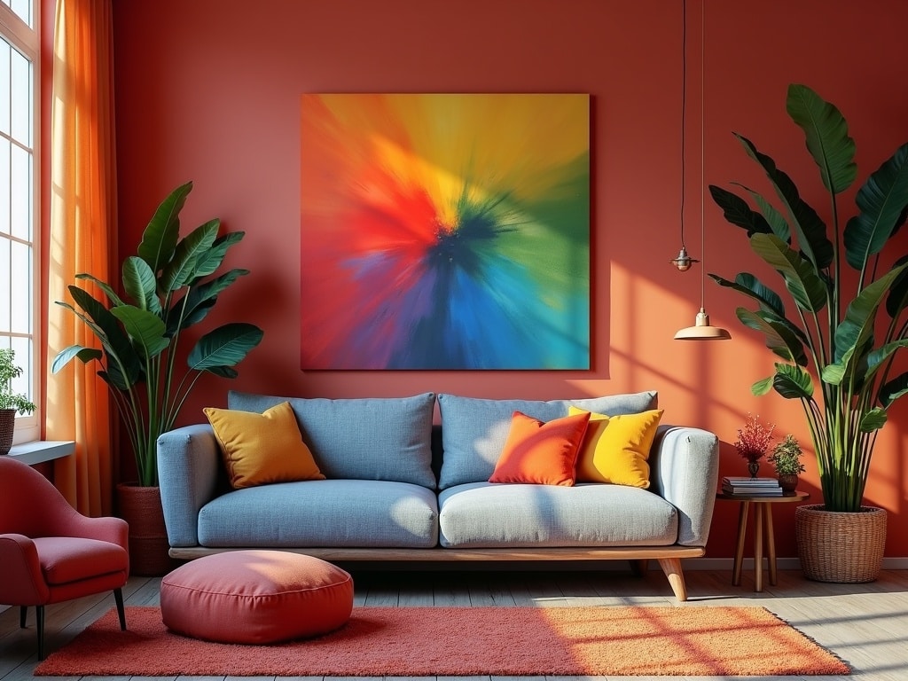
Orange: Warmth and Sociability
Orange is a vibrant and welcoming color that combines the energy of red with the cheerfulness of yellow. It’s associated with warmth, enthusiasm, and sociability, making it a great choice for living rooms where you want to encourage conversation and connection. Use orange as an accent color to add a touch of playfulness and warmth, or opt for softer, muted oranges like terracotta or peach for a more subtle effect.
Purple: Luxury and Creativity
Purple is a sophisticated and mysterious color associated with royalty, luxury, and creativity. It’s a great choice if you want to create a living room that feels elegant and inspiring. Lighter purples like lavender are calming and romantic, while deeper purples like eggplant are more dramatic and luxurious. Use purple as an accent color in artwork, upholstery, or decorative accessories.
Neutral Colors: The Foundation for Everything
Neutral colors like white, gray, beige, and brown provide a versatile backdrop for any living room design. They create a sense of calm and balance and allow other colors to take center stage. White is clean and bright, creating a sense of spaciousness. Gray is sophisticated and versatile, providing a neutral canvas for pops of color. Beige and brown are warm and inviting, creating a cozy and comfortable atmosphere.
Beyond the Hue: Understanding Color Temperature and Value
It’s not just the specific color that matters; the temperature and value also play a significant role in how a color impacts your living room.
Color Temperature: Warm vs. Cool
Colors can be divided into two main categories: warm and cool. Warm colors (reds, oranges, yellows) tend to be energizing and stimulating, while cool colors (blues, greens, purples) are calming and relaxing.
Consider the overall mood you want to create in your living room when choosing a color temperature. If you want a cozy and inviting space, opt for warmer colors. If you want a more serene and relaxing atmosphere, choose cooler colors.
Color Value: Light vs. Dark
Color value refers to the lightness or darkness of a color. Light colors tend to make a room feel more spacious and airy, while dark colors can make a room feel more intimate and cozy.
Consider the existing lighting in your living room when choosing a color value. If your room is naturally dark, opt for lighter colors to brighten it up. If your room is naturally bright, you can use darker colors to create a more dramatic and inviting atmosphere.
Practical Tips for Applying Living Room Color Psychology
Now that you understand the basics of living room color psychology, here are some practical tips for applying it to your own space:
- Consider the size of your room: Light colors can make a small room feel larger, while dark colors can make a large room feel more intimate.
- Think about the natural light: Natural light can affect the way colors appear in your living room. Test paint samples in different lighting conditions before making a final decision.
- Don’t be afraid to experiment: Color is a powerful tool, so don’t be afraid to experiment and find what works best for you.
- Use color to create focal points: Use a bold color on an accent wall or a statement piece of furniture to draw the eye and create a focal point in your living room.
- Tie colors together with accessories: Use throw pillows, rugs, and artwork to tie the colors in your living room together and create a cohesive look.
- Consider your personal preferences: Ultimately, the best colors for your living room are the ones that you love and that make you feel good.
Color Combinations: Creating Harmonious Palettes
Choosing the right color combinations is just as important as choosing the right individual colors. Here are a few popular color palettes for living rooms:
- Monochromatic: Using different shades and tints of the same color. Example: Different shades of blue for a calming effect.
- Analogous: Using colors that are next to each other on the color wheel. Example: Blue, blue-green, and green for a harmonious and natural look.
- Complementary: Using colors that are opposite each other on the color wheel. Example: Blue and orange for a vibrant and energetic contrast.
- Triadic: Using three colors that are equally spaced on the color wheel. Example: Red, yellow, and blue for a bold and playful look.
Living Room, Living Mood
By understanding the principles of living room color psychology and carefully considering your personal preferences, you can transform your living room into a space that reflects your personality, enhances your mood, and supports your well-being. So, take a closer look at your living room, consider how the colors make you feel, and start experimenting with the power of color to create the perfect atmosphere for your home.