Hey everyone! So, I’ve been thinking a lot about how light actually affects our art. It’s not just about making things visible, right? It’s about the feeling, the mood, and how people see what you’ve made. This whole topic of light color meaning in art is pretty interesting, and I wanted to break down some of the basics. We’ll look at different kinds of light, how it plays with materials, and some cool ways artists use it. Plus, we’ll touch on color theory because, well, light and color go hand-in-hand. Let’s get into it!
Key Takeaways
- Light isn’t just for seeing; it sets the mood and influences how we feel about a piece.
- Different light sources, like natural sun or studio lamps, give different effects.
- How light hits surfaces—shiny, matte, or see-through—changes how we see colors and textures.
- Artists use light direction and brightness to guide your eye and create depth.
- Understanding color properties like hue, intensity, and value helps you use light color meaning in art effectively.
The Magic of Light in Art
Light is more than just what lets us see; it’s a powerful tool that can totally change how a piece of art feels. Think about it – a bright, sunny scene versus a dimly lit, mysterious room. The light itself tells a story and sets a mood before you even notice the details. It’s like the silent narrator of your artwork, guiding the viewer’s feelings and perceptions.
Understanding Light’s Emotional Resonance
Light has a way of tapping into our feelings. Warm light, like a sunset or a cozy lamp, can make us feel comfortable and happy. On the other hand, cool light, like the shade on a cloudy day or moonlight, can bring a sense of calm or even a bit of melancholy. Artists use this to their advantage, playing with different light temperatures and intensities to create specific emotional responses in their audience. It’s all about how that light makes you feel.
How Light Shapes Our Perception
Beyond just emotion, light literally shapes how we see things. It defines shapes, creates textures, and tells us about the space an object occupies. Without light, we wouldn’t have form or depth. Even subtle changes in how light hits a surface can make it look completely different. It’s fascinating how something so invisible can have such a visible impact on our world and our art.
The Artful Dance of Light and Shadow
This is where things get really interesting. The interplay between light and shadow, often called chiaroscuro, is what gives artwork its drama and dimension. It’s not just about the light itself, but also about the absence of it. These dark areas can be just as important as the bright ones, creating contrast and drawing the eye to specific points. Learning to manage this dance is key to making your art pop.
The way light falls on a subject can reveal its form, texture, and even its history. It’s a constant conversation between illumination and obscurity, shaping our visual experience in profound ways.
Exploring Different Light Sources
Light isn’t just about seeing; it’s about feeling. Different light sources bring totally different vibes to your artwork, and knowing how to use them can really make your pieces pop. It’s like choosing the right music for a scene – it completely changes the mood.
The Gentle Touch of Natural Light
Think about sunlight streaming through a window. It’s soft, it shifts throughout the day, and it has this amazing way of making colors look so true. Natural light can give your work a really organic, peaceful feel. It’s great for portraits or landscapes where you want that authentic, lived-in look. Plus, it’s free!
- Morning Light: Often cooler and softer, great for serene scenes.
- Midday Sun: Harsher, with stronger shadows, can add drama.
- Golden Hour (Sunrise/Sunset): Warm, soft, and directional, perfect for creating a cozy or nostalgic mood.
The Controlled Power of Artificial Light
Artificial lights, like studio lamps or even your desk lamp, give you way more control. You can decide exactly where the light comes from, how bright it is, and even its color. This is super handy when you need a specific effect or when natural light just isn’t cooperating. You can really sculpt your subject with artificial light.
- Spotlights: Create sharp highlights and deep shadows, good for dramatic effects.
- Softboxes/Umbrellas: Diffuse light, creating softer shadows and a more even look.
- LED Panels: Offer adjustable brightness and color temperature, giving you lots of flexibility.
Harnessing Directional and Diffused Light
This is where things get really interesting. Directional light, like a single spotlight, carves out strong contrasts, making forms really stand out and giving your work a sense of depth. It’s all about those sharp highlights and dark shadows. On the other hand, diffused light, like on an overcast day or through a frosted glass, is much gentler. It softens shadows and reduces harsh contrasts, leading to a more subtle and often calming atmosphere. Understanding the difference between these two types of light is key to controlling the mood and form in your art.
Whether you’re aiming for a dramatic, high-contrast look or a soft, ethereal glow, the source and quality of your light will guide the viewer’s eye and shape their emotional response to your piece. It’s a powerful tool in your creative arsenal, and exploring it can lead to some truly exciting discoveries in your art. Check out some amazing examples of how artists use light in their work at ArtfulSpaces.
Light’s Interaction with Materials
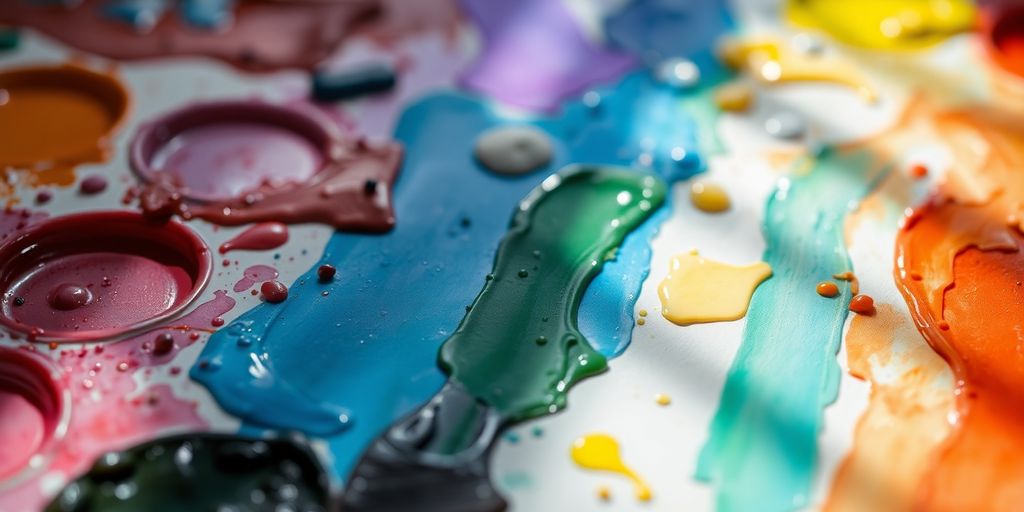
Light doesn’t just illuminate; it interacts with the very stuff you’re painting or sculpting, and that interaction is a huge part of how we see and feel your art. Think about how light behaves differently on a shiny metal surface versus a piece of rough, unvarnished wood. It’s all about how the material either bounces light back at us or soaks it up.
Reflective Surfaces and Dazzling Highlights
When light hits something smooth and shiny, like polished metal, glass, or even a wet surface, it bounces off in a very organized way. This is what creates those bright, sharp spots we call highlights. They can really make an object pop and give it a sense of being solid and real. You can use these highlights to show the form of an object or to draw the viewer’s eye to a specific spot. It’s like giving your artwork a little wink!
Matte Surfaces and Subtle Absorption
On the flip side, you have matte surfaces – think of canvas, paper, or unpolished stone. These materials tend to absorb more light and scatter it in all directions. This results in softer shadows and fewer harsh reflections. It’s a gentler kind of light that can create a more subdued or atmospheric feel. If you want your piece to feel calm and inviting, working with matte surfaces is a great way to go. It’s all about that subtle play of light and shadow.
The Enchantment of Transparent and Translucent Materials
Then there are materials that let light pass through them, like glass, water, or thin fabrics. Transparent materials let light go straight through, so you can see what’s on the other side, often with some bending or distortion. Translucent materials, however, scatter the light as it passes through, giving you a hazy view. This can create really beautiful, ethereal effects, adding layers of depth and mystery to your work. It’s a bit like magic, watching how light transforms these materials and affects what we see. You can explore how light changes color depending on the angle you view it from, a cool effect known as goniochromism, which you can learn more about here.
The way light interacts with your chosen materials is a silent conversation. It dictates the mood, defines the form, and guides the viewer’s journey through your creation. Paying attention to these subtle exchanges can truly make your artwork sing.
Mastering Light Manipulation Techniques
So, you’ve got the basics of light down, but how do you really make it sing in your art? It’s all about playing with the controls, like a seasoned DJ mixing tracks. You can totally change the vibe of a piece just by tweaking how light hits your subject. Think about it: a single scene can feel cozy and intimate with soft, diffused light, or it can become dramatic and intense with sharp, directional beams. It’s like having a superpower for setting the mood!
Setting the Mood with Light Sources
Your choice of light source is your primary tool for creating atmosphere. Are you going for something gentle and inviting, or something more mysterious and moody? Different light sources have different personalities:
- Natural Light: Think soft, diffused window light. It’s great for portraits and still lifes where you want a gentle, natural feel. It changes throughout the day, so you can capture different moods just by waiting for the right moment.
- Artificial Light: This gives you more control. You can use spotlights for dramatic effects, softboxes for even illumination, or even colored gels to tint the light. This is where you can really experiment with color theory for painters.
- Directional Light: This is your go-to for creating strong contrasts. Imagine a single spotlight hitting an object – you get bright highlights and deep shadows, which really define form and add a sense of drama.
- Diffused Light: This is the opposite of directional. It spreads out evenly, softening shadows and reducing harsh contrasts. It’s perfect for creating a calm, serene feeling.
Don’t be afraid to mix and match! Sometimes a bit of directional light with some softer fill light can create a really dynamic and interesting effect.
Playing with Light Direction and Intensity
Once you’ve picked your light source, it’s time to get hands-on. Where you place the light and how bright it is makes a huge difference. Try lighting your subject from different angles – from the side, from above, even from below – and see how it changes the shapes and shadows. Intensity is just as important. A bright light will create strong highlights and dark shadows, while a dimmer light will give you more subtle gradations. It’s all about finding that sweet spot that best tells your story.
Guiding the Eye with Light and Dark
Light isn’t just for illumination; it’s also a powerful tool for directing your viewer’s attention. Think of it like a spotlight on a stage. You can use bright areas to draw the eye to your focal point and use darker areas to push other elements back. This contrast between light and shadow, often called chiaroscuro, is a classic technique for adding depth and drama to your work. By strategically placing your highlights and shadows, you can lead the viewer through your artwork, creating a visual journey that feels intentional and engaging.
Color Theory and Light’s Influence
Hue, Intensity, and Value: The Properties of Color
Think about color like this: it’s not just one thing, right? It’s got layers. We talk about hue, which is basically the color’s name – red, blue, green, you get it. Then there’s value, which is how light or dark that hue is. Is it a pale sky blue or a deep navy? That’s value at play. And finally, intensity, or saturation, which is about how pure or muted the color is. A bright, fiery red has high intensity, while a dusty, desaturated red has low intensity. Understanding these three properties is super helpful because they all work together, and light really plays a big role in how we see them. For instance, the way light hits a surface can totally change its perceived value and intensity. It’s like the light is painting the color itself!
Light is the ultimate influencer of how we perceive color. Without light, color as we know it wouldn’t exist. It’s the interaction between light, the object, and our eyes that creates the vibrant world we see. So, when you’re thinking about color in your art, always remember that light is your silent partner, shaping every hue, value, and intensity you choose.
Additive vs. Subtractive Color Models
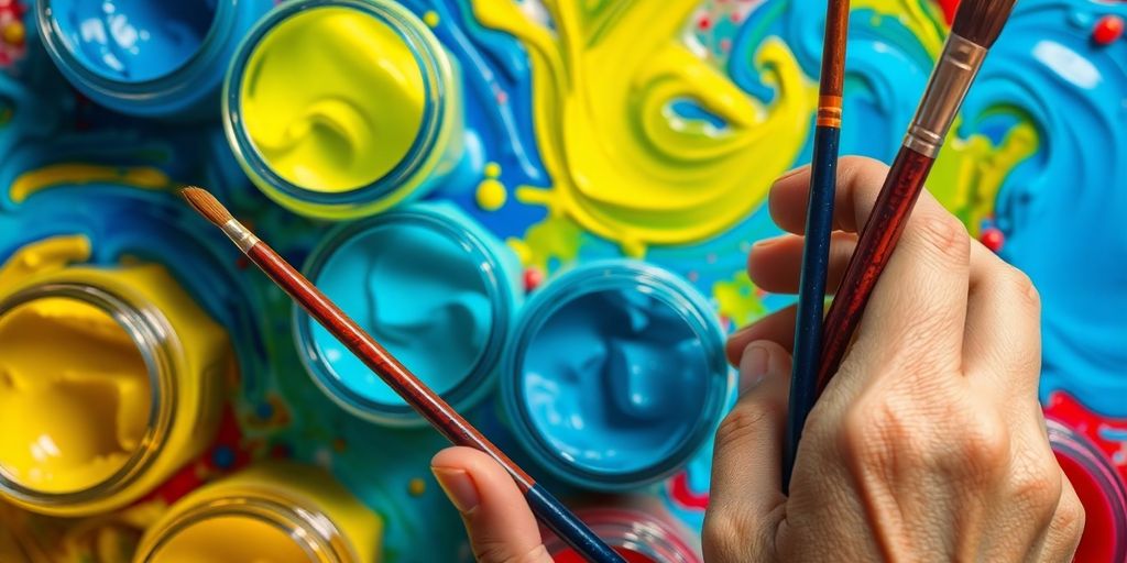
So, we’ve got two main ways color works, and it’s good to know the difference, especially when you’re mixing paints versus thinking about screens. The additive model is all about light. When you mix red, green, and blue light together, you get white light. This is what happens on your TV or computer screen. The subtractive model, on the other hand, is what we usually deal with when we’re painting. Here, you’re mixing pigments. When you mix colors like cyan, magenta, and yellow (the primaries for pigments), you’re actually subtracting light. For example, yellow pigment absorbs blue light and reflects red and green light, which our eyes see as yellow. It’s a bit of a mind-bender, but knowing this helps you understand why mixing colors in paint can be so different from how colors appear on a screen. It’s all about how light is being added or taken away color is entirely dependent on light.
Harmonizing Colors with the Color Wheel
The color wheel is such a handy tool for artists, seriously. It shows us how colors relate to each other, and it’s the basis for creating color harmonies. Think about complementary colors – those directly opposite each other on the wheel, like red and green. When you put them next to each other, they really pop and create a vibrant contrast. Then you have analogous colors, which are neighbors on the wheel, like blue, blue-green, and green. These tend to create a more peaceful, unified feel. Using these relationships helps you build palettes that just feel right, whether you’re going for something bold and energetic or calm and serene. It’s like having a cheat sheet for making your colors sing together!
Inspiration from Master Artists
Looking at how the masters handled light can really spark some ideas for your own work. It’s like getting a peek behind the curtain to see how they created those amazing effects. Think about artists like Caravaggio, for instance. He was a total pro at using chiaroscuro, which is basically just a fancy word for strong contrasts between light and dark. His paintings often feel super dramatic and emotional because of how he used light to spotlight certain figures or objects, leaving the rest in deep shadow. It really pulls you into the scene, doesn’t it?
Then you have artists like James Turrell, who works with light in a completely different way. His installations aren’t about painting with light, but more about making light itself the subject. He plays with how light fills a space and how it affects our perception of color and even our own bodies. It’s a more immersive experience, making you feel the light rather than just see it.
Here are a few things to consider when studying these artists:
- Focus on the source: Where does the light seem to be coming from in their work?
- Notice the shadows: How do the shadows define shapes and create mood?
- Observe the highlights: Where does the light hit most intensely, and what does that draw your attention to?
Studying how different artists use light can open up a whole new way of thinking about your own pieces. It’s not just about making things visible; it’s about guiding the viewer’s eye and conveying a feeling. Don’t be afraid to experiment with different lighting setups in your studio to see what happens.
It’s amazing how much you can learn from these artists. They show us that light isn’t just something that illuminates; it’s a tool that can shape our entire experience of a piece of art. You can find some great examples of how artists use light in illustrations on sites like ArtfulSpaces.
Practical Tips for Your Art
Now that we’ve explored the theory behind light and color, let’s get practical! It’s time to take what we’ve learned and actually use it in our own art. Don’t be afraid to play around; that’s how the magic happens.
Experimenting with Light Setups
Setting up your own lighting can really change how your artwork looks. Try different things to see what works best for your style.
- Natural Light: If you can, use a window. The light changes throughout the day, so pay attention to how it affects your piece at different times. Morning light is often softer and warmer than midday light.
- Artificial Light: Lamps are great for control. You can move them around, change their intensity, and even use different colored bulbs. A simple desk lamp can create dramatic shadows, while a softer, diffused light from a floor lamp might give a gentler feel.
- Mixed Lighting: Sometimes, combining natural and artificial light can give you unique results. Just be mindful of how the different color temperatures interact.
Considering Your Audience’s Response
Think about how the light you use will make people feel when they look at your art. Light isn’t just about seeing; it’s about emotion. Warm, soft light can make a scene feel cozy and inviting, while harsh, directional light might create a sense of drama or tension. Consider what kind of mood you want to set for your viewers. Do you want them to feel calm, excited, or maybe a little bit mysterious? The way light falls on your subject can guide their emotional journey through the piece. You can even use light to hint at the time of day or the weather, adding another layer of storytelling to your work. Learning about color harmony can also help you pair light and color effectively to achieve your desired mood.
Creating Depth and Form with Light
Light is your best friend when it comes to making your artwork look three-dimensional. It’s all about how light and shadow play together.
- Highlights: These are the brightest spots where light hits directly. They tell you where the light source is coming from and give surfaces a sense of shine or roundness.
- Shadows: These are the areas where light is blocked. They give objects volume and help define their shape. Soft shadows blend gradually, while hard shadows have sharp edges, both creating different effects.
- Mid-tones: These are the areas between the highlights and shadows. They help transition smoothly between the light and dark areas, making the form look more believable.
Playing with the direction and intensity of light is key. Try lighting your subject from the side, from above, or even from below. Each angle will reveal different aspects of its form and create a unique mood. Don’t be afraid to exaggerate shadows or highlights a bit to really emphasize the three-dimensionality of your subject.
Keep Playing with Light!
So, we’ve talked a lot about how light can totally change the feel of your art. It’s not just about making things visible, right? It’s about setting a mood, telling a story, and really connecting with whoever sees your work. Don’t be afraid to mess around with different light sources, play with shadows, and see what happens. Every artist figures this stuff out by trying things, and you will too! Keep experimenting, keep creating, and let the light guide your brush.
Frequently Asked Questions
How does light affect the mood of a painting?
Light plays a big role in how we feel when we look at art. Bright, warm light can make a picture feel happy and energetic, while dim, cool light might make it feel calm or even a little sad. Artists use light to guide your eyes and make you feel certain emotions.
What’s the difference between natural and artificial light in art?
Think about a sunny day versus a cloudy one. Natural light changes throughout the day and can make colors look different. Artificial light, like lamps or studio lights, gives artists more control to create specific looks, like bright, sharp shadows or soft, even light.
How does light interact with different materials like shiny metal or clear glass?
Yes! Shiny things like metal or glass bounce light and create bright spots called highlights. Dull things like paper or fabric soak up light, making colors look softer. See-through things like colored glass can bend light, making it look magical.
How can artists use light and shadow to make their art look real?
Artists use light to make things look 3D and create a sense of depth. By making some areas brighter and others darker, they can make objects pop out or seem far away. It’s like using shadows to sculpt the scene.
How does light influence the colors we see in art?
Color theory helps artists understand how colors work together. Light affects color because when light hits an object, the object absorbs some colors and bounces others back to your eyes. This is why a red apple looks red – it’s reflecting red light!
What are some simple ways I can experiment with light in my own art?
You can try shining a light on an object from different sides to see how the shadows change. Also, try using different colored lights to see how they make the object’s colors look. Experimenting is the best way to learn!