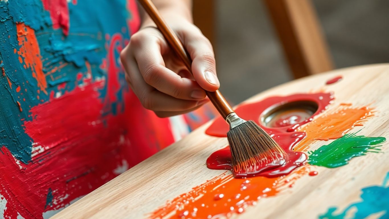
We all know colors can make us feel things, right? Like a bright yellow room just feels happier, or a dark blue one feels more serious. But in painting, it’s way more than just picking a mood. Artists use color in painting meaning to tell stories, create depth, and even make us feel things we didn’t expect. It’s like a secret language. Let’s break down how artists use this powerful tool to communicate, and how you can start using it in your own work.
Key Takeaways
- Color choices in painting are a form of communication, conveying emotion and meaning beyond just aesthetics.
- Understanding color theory basics like hue, value, and saturation helps in decoding the emotional impact of a painting.
- Cultural backgrounds and personal experiences heavily influence how colors are perceived and the meanings they carry.
- Artists use limited palettes, complementary or analogous schemes, and neutrals strategically to impact the viewer and the artwork’s message.
- Light, texture, and composition all work with color to shape the overall meaning and viewer experience.
Decoding Color in Painting Meaning: Reading Emotion Through Hue
I used to stare at my palette like it was judging me. Too many choices. Then I learned that color isn’t just "pretty"—it’s how you steer feeling. Color reads emotionally because colors live next to other colors, not in isolation. Once that clicked, my paintings stopped fighting me.
Warmth, Chill, and the Space Between
Warm colors (reds, oranges, yellows) tend to feel close, energetic, and human. Cool colors (blues, greens, violets) feel airy, distant, or calm. But the magic is in the “between”—where a red leans cool or a blue leans warm. Temperature shifts inside the same hue can change the mood fast.
- Use warm/cool contrast to guide attention: a warm accent in a cool scene often becomes a natural focal point.
- Pair a warm light with cool shadows, or flip it, to set mood (sunset warmth vs. rainy-day coolness).
- Neutral “bridge” colors (grayed greens, muted violets) help two loud temperatures get along.
- Skin, clouds, stone—most subjects mix temperatures. A single-temperature face looks flat; slip in a cooler halftone or warm rim light and it breathes.
Quick test: place two swatches of the same color family side by side—one slightly warmer, one slightly cooler. The warmer one will feel nearer, even if the value is the same.
Value Shifts That Turn Mood Up or Down
Value (light vs. dark) sets the emotional volume before color even enters the room. Squint at any painting you love—the value plan is doing heavy lifting.
- High-key (mostly light values): airy, gentle, open. Think foggy mornings or soft portraits.
- Low-key (mostly darker values): intimate, tense, grounded. Great for night scenes or quiet interiors.
- Compressed range (all mid-values): calm, restrained, understated. Useful for memory-like images.
- Full range (deep darks to crisp lights): drama and clarity. Good for bold narratives and strong form.
Practical moves:
- Do 3-value thumbnails before color. Label them: light, mid, dark. Keep it simple.
- Squint and check that your focal point has a clear value contrast with its surroundings.
- Snap a grayscale photo of your work-in-progress to catch value drift.
- When you add white, watch saturation and temperature; you may need a tiny warm or cool nudge to keep it alive.
Saturation as an Emotional Volume Knob
Saturation is intensity. Highly saturated paint can feel loud and electric; desaturated passages feel quiet and reflective. Big tip: let saturation breathe—if everything shouts, nothing stands out.
Ways to control saturation without making mud:
- Mix with a near-complement, not the exact opposite, so you mute gently and keep the color’s character.
- Create a neutral from your palette (a balanced gray) and stir in a touch to soften intense passages.
- Build a long mixing chain (color A → A+complement → A+gray) and pick the stop that feels right.
- Glaze a transparent, slightly cooler or warmer layer to tone down a color without flattening it.
- Surround a small saturated note with calm neutrals so it pops without going neon.
Troubleshooting:
- If a color looks harsh, it might be a value issue, not just saturation—check the grayscale.
- Mud often comes from too many paints in one pile; limit mixes to two, maybe three.
- Keep a clean brush for bright accents so yesterday’s leftovers don’t dull today’s moment.
In the end, temperature sets the vibe, value sets the backbone, and saturation sets the punch. When those three are working together, you don’t have to explain the feeling—the painting does it for you.
Color in Painting Meaning Across Cultures and Contexts
Color is a moving target. What feels joyful in one place can read as grief in another. Colors don’t speak the same language everywhere. When you plan a palette, you’re juggling cultural symbolism, personal history, and the moment your viewer is living through right now.
When White Mourns and Red Celebrates
We often treat color meanings like a fixed rulebook, but it’s more like local slang. A few quick contrasts:
- White: weddings and purity in much of the West; mourning in parts of East Asia.
- Red: luck, weddings, and prosperity in China and much of South Asia; passion, danger, or warning in many Western contexts.
- Green: nature and growth in the West; sacred and paradisiacal in many Islamic traditions.
- Black: elegance and formality in fashion; grief and solemnity in the West; also protective or powerful in various African ritual contexts.
- Gold: wealth nearly everywhere; divine light in Byzantine and Orthodox icon painting.
The material matters too. Matte white reads humble; glossy white can feel clinical. A dusty brick red suggests earth, while a lacquered crimson shouts celebration.
Before you pick a “meaningful” hue, ask: who might read this red, and how?
Local Traditions That Shift a Palette’s Story
Meanings get even more specific at the neighborhood level. Think festival colors, textiles, and architecture:
- Oaxaca’s papel picado and marigold trails make saturated oranges and purples feel like remembrance and joy, not sorrow.
- Maasai shúkà cloth uses strong reds as presence and protection on the savannah.
- Cycladic islands pair whitewash with Aegean blue—cooling glare, signaling sea and sky.
- Byzantine and Orthodox icon gold isn’t just fancy—it implies unearthly space.
- Indigenous Australian ochres carry land, ceremony, and kinship through color and pattern.
If you’re practicing studies to test which meanings land with your audience, try short prompts or quick exercises from these simple art lessons. Build muscle memory first; let theory catch up.
Blending Personal Mythology With Shared Meanings
Your story matters, too. Maybe teal means safety because it was your grandmother’s door color. That private code can live beside public meanings—you just have to guide the viewer.
Try this process when a painting needs both intimacy and clarity:
- List your personal color associations without judging them.
- Look up how those colors read in the cultures you’re referencing or showing to.
- Keep the message consistent through value and saturation—mute a hue if its cultural meaning feels too loud.
- Add context clues: titles, motifs, or small symbolic objects that point the viewer in the right direction.
- Test with three people from different backgrounds; note where readings clash and adjust one variable (temperature, chroma, or placement) at a time.
The goal isn’t to please everyone. It’s to make deliberate choices, leave room for layered readings, and avoid accidents you didn’t mean to make.
Purposeful Palettes That Tell the Story
Color choices aren’t random; they carry plot, pacing, and tone. Color picks are choices about story, not just pretty paint. When you set a palette on purpose, you control the emotional temperature and the level of contrast your viewer feels before they even read the subject.
Limited Choices, Bigger Impact
Cutting down options sounds boring, but it actually makes painting faster and clearer. A tight palette forces you to mix, and those mixes create family ties across the whole piece.
- Start with three primaries (warm/cool bias helps), plus one dark workhorse and a light modifier (white or a pale yellow).
- Make quick swatches of every 2‑color mix, then add a touch of the third to see your neutrals.
- Decide on a value plan first: dark shape, mid mass, light accent. Let color serve that map.
- Pre‑mix small “strings” for shadows, mids, and lights so you don’t chase color mid‑stroke.
- If the painting stalls, shift temperature, not hue—warm the shadows, cool the lights, or vice versa.
I’ve had paintings snap into focus just by refusing to add a new tube color. The limitations keep the mood steady and the story clean.
Complementary Sparks Versus Analogous Calm
Complementaries (blue–orange, red–green, yellow–violet) bring snap and energy. They can shout if you let both go full blast, so control the ratio.
- Use an 80/20 split: one color owns the stage, the other is the accent.
- Push value: let one sit darker and the other lighter so they don’t fight.
- Build bridges with grays made from the pair; it stops the “sports team” look.
Analogous setups (neighbors on the wheel) feel gentle and steady. They risk flatness if everything blends too well.
- Pick a lane: three neighbors only, like blue–blue‑green–green.
- Add a tiny temperature twist (a warm green next to a cool green) to keep it alive.
- Drop one small counter‑note—a dull red‑brown line, a slate gray shape—to give the eye a place to land.
Try two thumbnail studies of the same scene: one complementary, one analogous. The subject stays the same; the message changes.
Neutrals That Let Bold Colors Breathe
Neutrals aren’t background extras; they set the pace. They calm busy passages, frame the focal point, and make saturated hits feel earned.
- Three ways to build useful neutrals: mix complements, stir all three primaries, or lean on earths (raw umber, yellow ochre) plus white.
- Place neutrals around your focal color, not on top of it—keep the bright note clean.
- Vary edges in the neutral zones (soft, lost, crisp) to suggest air and space without more chroma.
Think of neutrals as the quiet in a song—the pause that makes the chorus hit harder.
If a painting feels loud everywhere, it’s usually missing a neutral resting spot. Add one calm area, and the bold parts start to speak in complete sentences.
Light and Surface: How Context Shapes Color
Light decides how every color reads. It’s not a small factor. It’s the whole stage your colors perform on. Change the light or the surface and your reds mellow, your blues sharpen, and your neutrals either sing or sink.
Sunlight, Studio Lamps, and Screen Glow
Morning sun makes everything warmer; cloudy days flatten contrast; north-facing windows stay steady and cool. Lamps skew things their own way, and screens are a different beast altogether because they glow from within.
- Sunlight basics: sunrise/sunset warms; midday can wash out; overcast softens edges and reduces glare.
- Bulb choices: 2700K is cozy-warm; 4000–5000K feels neutral; check CRI (aim 95+) so reds don’t die and greens don’t go weird.
- Don’t mix bulb types in one room if you want stable color. One temperature, one story.
- Screens are additive color. Calibrate monthly and dim brightness so your digital painting doesn’t print a full stop darker.
- Watch for metamerism: two swatches that match under one light but mismatch under another. Test your palette under daylight, your studio bulbs, and evening room light.
- Simple habits: keep a gray card on your table, paint near neutral walls, and photograph work under the same light you painted it in.
Paint for the light your art will live in, not just the light you happen to have today.
Texture Moves Color From Seen to Felt
Surface changes how light bounces. That bounce changes saturation, value, and even mood. Thick paint throws tiny shadows; matte paint scatters light and softens everything.
- Gloss vs. matte: gloss looks deeper and darker, matte looks lighter and quieter. Pick one finish or commit to intentional contrast.
- Impasto: ridges catch highlights and cast micro-shadows, so a single color reads as three. Brush direction matters more than you think.
- Scumbling: a dry, light, opaque pass across texture catches only the high points—instant haze, chalk, or dust without repainting the base.
- Ground matters: a thirsty ground (raw canvas, absorbent gesso) can dull color; a sealed ground keeps chroma punchy. Test both.
- Additives and “special” paints: metallics, interference, and pearlescents shift with viewing angle. Fun, but a little goes a long way.
- Varnish is a finish line and a color switch: gloss unifies and enriches darks; satin balances; matte calms reflection but can milk out blacks. Always test a corner.
Glazing Layers That Make Hues Sing
Glazing stacks thin, transparent layers so light travels through color and bounces back. It’s how you get that quiet glow you can’t fake with a single opaque mix.
- Set the value first. A lean underpainting or block-in keeps the roadmap clear so you don’t chase mud.
- Choose transparent pigments for the glaze: quinacridones, phthalos, alizarin substitutes, dioxazine violet. Opaques (many cadmiums) are better as base layers.
- Mix the glaze thin. Oils: a small touch of linseed or stand oil plus solvent. Acrylics: gloss medium works well. Watercolor: more water, steady hand.
- Lay it and leave it. Over-brushing clouds the layer. Feather only the edges with a soft brush.
- Let it dry fully between passes. Oils need time; acrylics need minutes; watercolor needs bone-dry paper.
- Stack temperatures with intent: warm over cool for ember-like depth, cool over warm for smoky space. Watch your values so you don’t drift too dark.
- Mind the rules of your medium: in oils, fat over lean; in acrylics, avoid too much water on non-absorbent grounds; in watercolor, protect highlights early.
If a glaze goes too strong, wipe back while it’s fresh or knock it down with a light scumble after it dries. No drama, just another layer of story.
Composition You Can Navigate by Color
Color isn’t just decoration—it’s your GPS for the viewer’s attention. Use color to aim the eye, pace the story, and set the heartbeat of the piece.
Focal Points That Pop Without Shouting
You don’t need neon everywhere. Choose one area to carry the punch, then support it with quieter choices around it. Think clarity, not volume.
- Pick a “hero” hue and keep it cleaner or brighter than the rest.
- Save your strongest light–dark break (the sharpest value contrast) for the focal area.
- Sharpen edges where you want attention; soften and merge edges elsewhere.
- Surround the focal color with calmer neighbors—muted hues or neutrals—to make it read louder without yelling.
- Add a tiny complementary accent near the focal spot for a quick spark.
- Simplify background shapes so they don’t compete.
If everything is loud, nothing stands out.
Depth Cues: Warm Advances, Cool Recedes
Temperature shifts work like stage lighting. Warm notes feel close, cool notes slip back. It’s simple, and it works.
- Push distant areas cooler and a touch lighter; pull foregrounds warmer and a bit darker.
- Drop saturation with distance; air and atmosphere mute things naturally.
- Sneak a warm highlight forward (think warm light on a cheek) and a cool shadow back to deepen space.
- Glaze a thin cool layer over backgrounds for instant distance; glaze a warm veil on foregrounds for presence.
- Avoid “cutout” edges by bridging temperatures where planes meet.
Color also carries mood while it sets space—if you’re shaping feeling too, it helps to think about emotion in art as you plan your temperature map.
Pathways Made With Repetition and Contrast
Give the eye stepping stones. Repeat a hue across the canvas, change its size or strength, and the viewer will travel that route without thinking about it.
- Choose one guiding color and place it in three to five spots from focal area to supporting areas.
- Vary the doses: a big note, a medium echo, a small whisper.
- Alternate contrast levels—high contrast to pull the eye forward, softer contrast to let it move on.
- Use rhythm: repeat, pause with a neutral, repeat again a bit brighter.
- Align color beats with edges, diagonals, or curves so hue and shape team up.
Mixing With Confidence, Not Fear
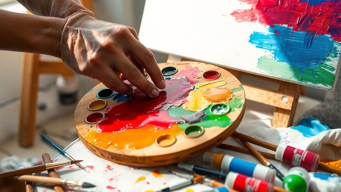
Color mixing can feel like cooking without a recipe—exciting one minute, chaotic the next. The good news: you don’t need perfect instincts, just a repeatable process and a little patience. Mixing is a skill you build, not a test you pass.
Test your mixes on a scrap before they hit the painting; cheap insurance and fast feedback.
Value-First Mixing That Nails Mood
Mood lives in value more than hue. Lock in value first, and your colors will carry the feeling you want.
- Squint at your reference or scene to simplify shapes and judge light vs. dark.
- Pre-mix a quick grayscale (three to five steps) so you have anchors for light, mid, and dark.
- Mix your color to match one of those value steps; check it by snapping a phone photo and switching to grayscale.
- Nudge value without wrecking chroma: darken with a darker neighbor (not always black), lighten with a carefully measured white plus a touch of the original color.
- Park small dabs of each mix on the canvas edge to see how they read in context.
Taming Saturation Without Losing Life
Over-saturated everywhere feels loud; desaturated everywhere feels sleepy. Aim for a rhythm.
- Neutralize with the complement instead of dumping in gray straight away; creep up on it.
- Build your own gray from two complements for a livelier neutral than tube gray.
- Swap in earth colors (yellow ochre, burnt sienna) to calm hot primaries without killing them.
- Keep one or two small ultra-bright accents; let the rest sit a notch lower so those accents glow.
- Remember that a muted color can look bright next to dull neighbors—use contrast to your advantage.
- In slow-drying mediums, glaze a transparent layer of pure color to revive a tired area.
Swapping Pigments to Avoid Mud
Muddy color usually comes from too many pigments, clashing biases, or opaque piles getting overworked. Pick cleaner pairs and respect each color’s undertone.
- For crisp greens: Phthalo Blue (GS) + a cool yellow (Hansa/Primary Yellow) stays clean; Ultramarine + Cad Yellow Deep leans olive.
- For bright violets: Quinacridone Magenta + Ultramarine beat Cad Red + Ultramarine, which turns brownish.
- For punchy oranges: Transparent Pyrrole Orange + a transparent yellow glaze cleaner than Cad Red Deep + Yellow Ochre.
- Choose single-pigment paints when you can (look for one pigment code on the label) to reduce accidental mixing chaos.
- Separate warm and cool mixing areas on your palette; wipe your knife and brush between mixes, even if it slows you down.
- If a mix goes dull, don’t keep stirring—add a fresh, higher-chroma version on top or beside it and let the eye mix the two.
Crafting Your Personal Color Language
Color gets personal fast. You pick a red for one painting and, before you know it, that same red keeps sneaking back into the next three. That’s not a coincidence; that’s the start of a pattern you can use on purpose. Your color voice isn’t “found”; it’s built—one choice at a time.
Spotting the Hues You Return to
You already have color habits. The goal is to see them, name them, then choose them on purpose.
Try this quick process:
- Pull 10–20 of your past pieces. Photograph them if they’re not all in one place.
- List the three most common hues showing up. Be honest about neutrals too—grays count.
- Circle the outliers that still feel right. Ask why they work: value? temperature? memory?
- Write a one-line color statement (plain English): “I like stormy blues with a warm spark.”
- Create a 5–7 color “home palette” from those notes. This is your baseline, not a cage.
- Look for your motif: a cool shadow note, a dirty pink highlight, a mustard underpainting.
- Track context: Do these colors show up when you’re tired, excited, painting at night?
- Test your hunch: Paint the same sketch twice—once with your usual palette, once without the usual hero color. What actually changes?
Keep what you notice and paint what you feel. The pattern will reveal itself if you let it.
Turning Happy Accidents Into Intent
We all spill, smudge, or overmix. The trick is keeping the good ones. When a surprise works—say, a weird teal next to a bruise-violet—bottle the process, not just the color.
Make accidents repeatable:
- Snap a photo with a note: pigments, medium, order of layers, brush type, paper/canvas.
- Swatch the mix right then. Write the ratio in “parts”: 3 parts ultramarine, 1 part burnt umber.
- Recreate it the next day with a timer. If you can do it twice, you can do it forever.
- Give the palette a name so you’ll remember why it exists (“Rain After Heatwave”).
If you think like a curator for a moment, your “keepers” start to talk to each other. That mindset overlaps with building a cohesive collection—only you’re curating your own color habits so the story holds together over time.
A few prompts when a surprise hits:
- What feeling did it solve? Calm, tension, clarity, grit?
- Which painting stage did it change? Underpainting, mid-layer, final pass?
- What would happen if you push its value lighter or darker by two steps?
Keeping Swatch Journals You’ll Actually Use
A swatch journal should be quick, messy, and searchable. If it’s precious, you won’t touch it. Think “field notes,” not coffee-table book.
Set it up so future-you can find stuff:
- One page per palette: 5–7 swatches from light to dark, with pigment codes and a 10-second note on mood.
- Three-speed tests: thin wash, mid mix, heavy application. Note drying shift if it’s a thing in your medium.
- Layer lanes: glaze Color A over Color B, then reverse. Circle the better stack.
- Real-world tests: one swatch under warm lamp, one in daylight, one in shade. Mark how the hue shifts.
- Tag it: “Grit reds,” “fog blues,” “skin tones v3.” Keep tags consistent so you can flip fast.
Helpful habits that stick:
- End each session with two tiny swatch boxes using the day’s mixes.
- Keep a “fail page” for mud: write what went wrong (too many complements, overmixing, bad value).
- Print a tiny grid template you can tape into any sketchbook for quick, uniform swatches.
You don’t need perfect notes. You need notes you’ll actually check before you paint. When your journal starts showing up in your choices—yep, that’s your color language getting clearer.
Keep Painting and Exploring!
So, we’ve talked a lot about how artists use color, from the basic ideas to some pretty cool examples. It’s clear that color is way more than just pretty shades on a canvas; it’s how artists talk to us, how they make us feel things, and how they show us the world in new ways. Don’t be afraid to try things out yourself. Grab some paints, play around, and see what happens. You might surprise yourself with what you discover. Keep looking at art, keep experimenting, and most importantly, keep making your own colorful creations. Happy painting!
Frequently Asked Questions
What is color theory in simple terms?
Color theory is like a set of rules for how colors work together. It explains how colors mix, what happens when you put them next to each other, and the visual effects they create. Think of it as learning the alphabet and grammar of colors before you start writing sentences with them.
How does color affect mood in art?
Colors can make us feel different things. For example, warm colors like red and orange might make you feel energetic or excited, while cool colors like blue and green can feel calming or even a little sad. Artists use these feelings, along with how bright or dark the colors are, to create a certain mood or atmosphere in their paintings.
Why did artists like Van Gogh use such bright colors?
Artists like Van Gogh used bright colors to show strong emotions and the energy they felt from nature. They would put colors that are opposite each other on the color wheel, like yellow and purple, right next to each other. This made the colors look even brighter and helped them share their feelings and personal view of the world, not just what they saw.
Is there a ‘right’ way to use color in art?
Nope, there’s no single ‘right’ way! While color theory gives us helpful ideas, artists have always found new ways to use color. The best way to use color depends on what the artist wants to say with their art. If the colors help the artwork achieve its goal, then they’re being used correctly.
How do contemporary artists use color today?
Modern artists use color in so many different ways! Some follow older methods, while others try new paints or digital tools. Many use color to talk about social issues or big ideas. Some artists even focus on how color itself affects our senses, using light and space to create amazing color experiences that aren’t just on a canvas.
How can I start using color more purposefully in my own art?
Start by paying attention to colors all around you – in nature, in everyday objects. Don’t be afraid to experiment by mixing colors and trying unusual combinations. Keep a sketchbook to note down color ideas. Most importantly, think about what you want to express with your colors and let that guide your choices. It’s your unique artistic voice!