Unlocking Productivity: How Office Decor Color Psychology Impacts Your Work
Imagine walking into an office where the walls are a jarring shade of neon orange, the carpets are a dizzying swirl of patterns, and the furniture clashes in a cacophony of hues. Sounds like a nightmare, right? The truth is, the colors that surround us in our workspace can significantly impact our mood, productivity, and even our overall well-being. Office decor color psychology isn’t just about aesthetics; it’s a powerful tool that businesses can leverage to create a more positive and productive work environment. This article delves into the fascinating science behind color psychology in office design, exploring how different colors affect our brains and behavior, and offering practical tips for creating a workspace that truly works for you.
The Science of Color Psychology: Beyond Just Preferences
Color psychology isn’t just about personal preferences; it’s rooted in the way our brains are wired to perceive and react to different wavelengths of light. Each color has a unique wavelength and frequency, which can trigger different emotional and physiological responses.
**Physiological Effects:Studies have shown that exposure to certain colors can actually affect our heart rate, blood pressure, and brainwave activity. For example, red can be stimulating and energizing, while blue can have a calming effect.
**Emotional Associations:Colors also carry strong emotional associations, often shaped by cultural and personal experiences. These associations can influence our mood, creativity, and even our decision-making processes.
**The Context Matters:It’s important to note that the effect of a color can vary depending on the context in which it’s used. The intensity of the color, its combination with other colors, and the overall design of the space can all influence its impact.
Decoding the Color Spectrum: What Each Hue Communicates
So, what exactly do different colors communicate, and how can you use this knowledge to your advantage in designing your office space? Let’s break down the color spectrum and explore the psychological effects of some of the most popular colors for office decor:
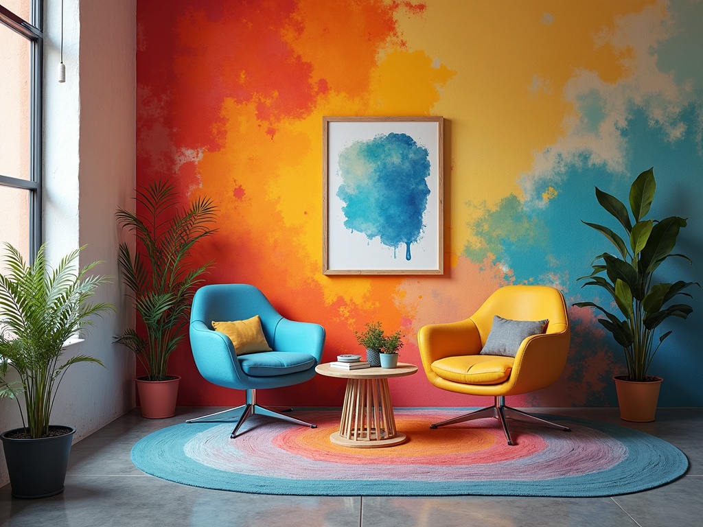
Blue: The Color of Calm and Focus
Blue is often associated with tranquility, stability, and trust. It’s a popular choice for offices because it can promote calmness, reduce anxiety, and enhance focus.
**Benefits:Improved concentration, reduced stress, enhanced communication.
**Best Uses:Conference rooms, individual workstations, areas where focus and clear thinking are essential.
**Cautions:Overuse of dark blue can sometimes feel cold or depressing, so it’s important to balance it with warmer tones.
Green: The Color of Nature and Balance
Green is strongly linked to nature, growth, and harmony. It’s a refreshing and restorative color that can reduce eye strain and promote a sense of well-being.
**Benefits:Reduced stress, improved focus, enhanced creativity.
**Best Uses:Break rooms, collaboration areas, spaces where employees need to relax and recharge.
**Cautions:Very bright greens can sometimes be overwhelming, so opt for softer, more natural shades.
Yellow: The Color of Optimism and Creativity
Yellow is a cheerful and energizing color that can stimulate creativity and promote optimism. It’s a good choice for spaces where brainstorming and innovation are encouraged.
**Benefits:Enhanced creativity, increased energy levels, improved mood.
**Best Uses:Creative studios, brainstorming rooms, areas where employees need a boost of energy.
**Cautions:Too much yellow can be overwhelming or distracting, so use it sparingly and balance it with more neutral tones.
Red: The Color of Energy and Action
Red is a powerful and stimulating color that can evoke feelings of excitement, passion, and energy. It’s often used to create a sense of urgency or to draw attention to specific areas.
**Benefits:Increased energy levels, enhanced motivation, improved focus.
**Best Uses:Accent walls, reception areas, spaces where quick decisions need to be made.
**Cautions:Red can be overwhelming or aggressive, so it’s best to use it in small doses and avoid it in areas where people need to relax or concentrate. [internal_link]
Orange: The Color of Enthusiasm and Sociability
Orange is a warm and inviting color that combines the energy of red with the cheerfulness of yellow. It’s often associated with enthusiasm, sociability, and creativity.
**Benefits:Enhanced creativity, improved communication, increased enthusiasm.
**Best Uses:Break rooms, collaboration areas, spaces where teamwork and social interaction are encouraged.
**Cautions:Orange can be overwhelming if overused, so balance it with more neutral tones.
Purple: The Color of Luxury and Wisdom
Purple is often associated with royalty, luxury, and wisdom. It can promote creativity, intuition, and a sense of calm.
**Benefits:Enhanced creativity, improved intuition, reduced stress.
**Best Uses:Executive offices, meditation rooms, spaces where employees need to think creatively and strategically.
**Cautions:Dark purples can sometimes feel somber, so opt for lighter, more vibrant shades.
Neutral Colors: The Foundation of a Balanced Workspace
Neutral colors like white, gray, beige, and brown provide a calming backdrop for more vibrant colors. They can create a sense of spaciousness, simplicity, and balance.
**White:Creates a clean, bright, and modern look.
**Gray:Provides a sophisticated and calming atmosphere.
**Beige:Offers a warm and inviting feel.
**Brown:Creates a sense of stability and grounding.
Applying Color Psychology in Your Office: Practical Tips
Now that you understand the basics of office decor color psychology, let’s explore some practical tips for applying this knowledge to your own workspace:
**Consider Your Brand:Choose colors that align with your brand identity and values. For example, a tech company might opt for a sleek and modern palette of grays and blues, while a creative agency might prefer a more vibrant and playful mix of colors.
**Think About the Function of Each Space:Tailor your color choices to the specific activities that take place in each area of your office. Use calming colors in areas where focus is important, and energizing colors in areas where creativity and collaboration are encouraged.
**Balance is Key:Avoid using too much of any one color, as this can be overwhelming or distracting. Strive for a balanced and harmonious color scheme that incorporates a variety of hues and tones.
**Don’t Forget About Lighting:Lighting can significantly impact the way colors appear. Natural light is always preferable, but if you’re relying on artificial light, make sure it’s warm and inviting.
**Incorporate Plants:Plants not only add a touch of nature to your office, but they also provide a pop of green that can reduce stress and improve air quality.
**Personalize Your Space:Encourage employees to personalize their workspaces with photos, artwork, and other items that reflect their personality and style. This can help them feel more comfortable and connected to their environment.
**Get Feedback:Before making any major changes to your office decor, solicit feedback from your employees. This will help you ensure that your color choices are well-received and that they’re actually creating a more positive and productive work environment.
**Start Small:You don’t have to overhaul your entire office at once. Start by making small changes, such as painting an accent wall or adding some colorful accessories.
Beyond the Walls: Color in Furniture and Accessories
While wall color is a significant factor, don’t underestimate the impact of color in your furniture, accessories, and artwork.
**Furniture:Consider the color of your desks, chairs, and storage units. Neutral-colored furniture can provide a versatile backdrop for pops of color in other areas of the room.
**Accessories:Use accessories like rugs, pillows, and artwork to add splashes of color and personality to your office.
**Artwork:Choose artwork that complements your overall color scheme and that inspires and motivates your employees.
The Future of Office Decor Color Psychology
As our understanding of the brain and behavior continues to grow, so too will our understanding of the impact of color on the workplace. The future of office decor color psychology is likely to involve even more personalized and data-driven approaches, with companies using technology to track员工’s mood and productivity levels in response to different color schemes. We may also see a greater emphasis on biophilic design, which incorporates natural elements into the built environment to create a more restorative and stimulating workspace.
In conclusion, office decor color psychology is a powerful tool that can be used to create a more positive, productive, and inspiring work environment. By understanding the psychological effects of different colors and applying this knowledge strategically, businesses can unlock the full potential of their workforce and create a workplace that truly works for everyone. So, take a fresh look at your office space and consider how you can use color to transform it into a haven of productivity and well-being. After all, a colorful office is a happy and productive office!