Colors are pretty amazing, aren’t they? They can make you feel all sorts of things, from happy and excited to calm and peaceful. In art, these colors aren’t just pretty to look at; they actually have a lot of meaning behind them. Think about red, yellow, and blue – the basic ones. They’re like the building blocks for all other colors, and they carry their own special messages. We’re going to take a look at what these primary colors really mean in art and how artists use them to tell stories and make us feel things.
Key Takeaways
- Primary colors – red, yellow, and blue – are the foundation of color mixing and carry distinct emotional associations like passion, joy, and serenity.
- The meaning of primary colors in art goes beyond their basic definition, influencing viewer perception, creating emotional depth, and guiding the eye through contrast.
- Artists use primary colors strategically to evoke specific feelings, add visual interest, and tell stories, making them powerful tools in any medium.
- The cultural significance of red, blue, and yellow varies globally, adding layers of meaning that artists can tap into for broader communication.
- Understanding the role and symbolism of primary colors can help anyone, from beginners to experienced artists, express themselves more effectively and create more impactful work.
The Foundational Trio: Red, Yellow, and Blue
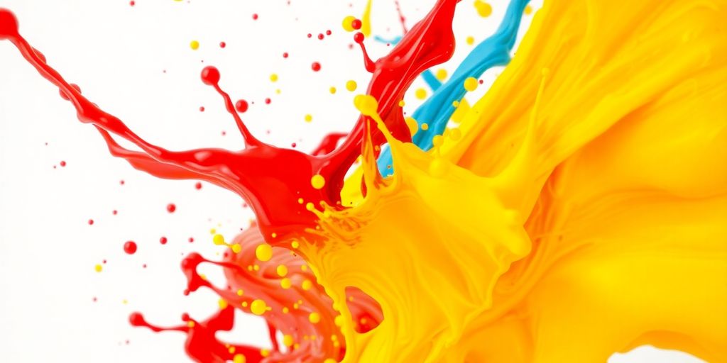
Let’s talk about the absolute rockstars of the color world: red, yellow, and blue. These three are the foundation, the OG’s, the ones that started it all. You can’t mix other colors to get them, which is pretty wild when you think about it. They’re the building blocks for pretty much everything else we see in color. Understanding these basic color relationships is key to getting a handle on how colors work together. Think of them as the starting point for your creative journey, the first step in learning about color theory.
Red’s Fiery Spirit: Passion and Power
Red is a color that just grabs you, right? It’s all about energy, passion, and making a statement. When an artist uses red, they’re often tapping into feelings of excitement, love, or even a bit of danger. It’s a color that demands attention and can really make a piece pop.
Yellow’s Sunny Disposition: Joy and Optimism
Then there’s yellow, the color of sunshine and happiness! It’s like a burst of pure joy. Yellow brings a sense of optimism and can really lift the mood of a piece. It’s often used to convey cheerfulness and a bright outlook, making things feel light and positive.
Blue’s Calm Embrace: Serenity and Trust
And finally, we have blue. This color feels like a deep breath, bringing a sense of calm, serenity, and trust. It’s often associated with stability and peace, like looking out at a vast ocean or a clear sky. Blue can create a really tranquil atmosphere in artwork.
Beyond the Basics: How Primary Colors Shape Perception
Primary colors are more than just building blocks; they’re the secret sauce that makes art pop and grab our attention. Think about how a splash of red can make you feel energized, or how a sunny yellow just brightens your whole mood. These colors have a way of talking directly to our feelings, making us feel things without us even realizing it. They’re also super handy for guiding your eyes around a piece. By playing with how bright or dark colors are, or how they sit next to each other, artists can create a sense of depth, making a flat surface look like it goes on forever. It’s like a visual trick that pulls you into the artwork.
Creating Emotional Resonance with Color
Colors have this amazing ability to tap into our emotions. Red might make you feel passionate or even a little angry, while blue can bring on feelings of calm or sadness. Yellow is almost always linked to happiness and energy. Artists use this connection to make you feel a certain way when you look at their work. It’s a powerful way to tell a story or convey a mood.
Guiding the Eye: Depth and Contrast
Ever notice how some parts of a painting just draw your eye? That’s often thanks to how colors are used. Bright colors tend to come forward, while darker or cooler colors recede. This contrast helps create a sense of space and dimension. It’s like using light and shadow, but with pure color! This technique is key to making a piece feel dynamic and engaging, drawing viewers into the scene.
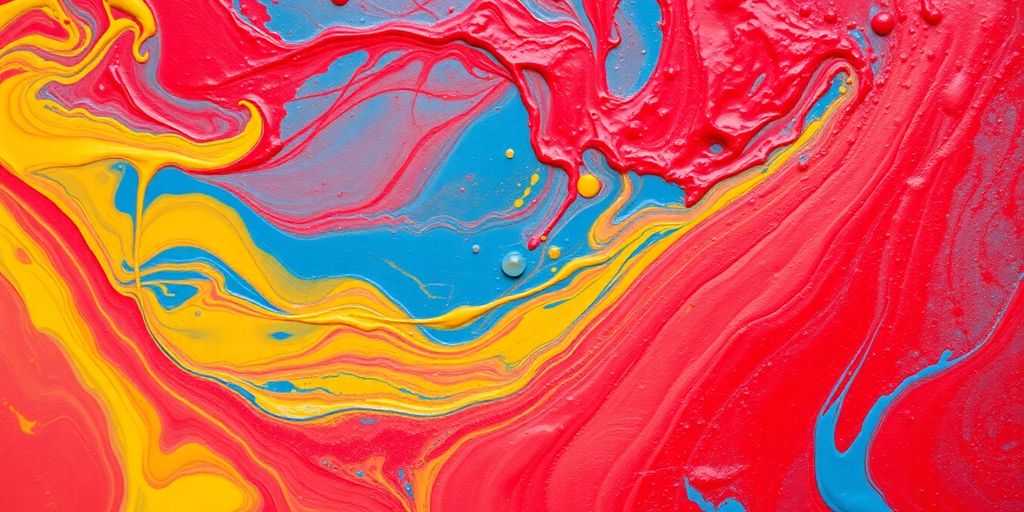
The Power of Color Combinations
When you put colors together, something magical happens. Mixing a primary color with another, or even with a secondary color, can create entirely new feelings and visual effects. Think about how a bright yellow next to a deep blue can create a really vibrant contrast, or how a soft red next to a muted green might feel more peaceful. Understanding these relationships, like those shown on a basic color wheel, helps artists build complex and interesting palettes that really speak to the viewer.
Unlocking Your Creative Potential with Primary Hues
Primary colors are like the building blocks of your artistic world. They’re not just simple shades; they’re packed with energy and meaning that can really help you express yourself. Think of them as your starting point for creating something truly special.
Letting Colors Speak Your Story
Every color has a voice. Red might shout passion, yellow could whisper joy, and blue might calmly explain trust. When you use these primary hues, you’re not just filling a space; you’re telling a story. What do you want your art to say? Are you feeling bold and energetic, or perhaps peaceful and thoughtful? Letting the inherent feelings of red, yellow, and blue guide your choices can add a whole new layer to your message. It’s about finding the right shade to match the emotion you’re trying to share.
Experimenting for Expressive Results
Don’t be afraid to play around! Mixing these colors, or using them side-by-side, can create all sorts of interesting effects. You might discover that a bright yellow next to a deep blue makes the blue feel even more intense, or that a touch of red can liven up a whole composition. The key is to try different combinations and see what happens. You can learn a lot about how colors work together by just messing around with them. It’s a great way to find your own unique style and make your art truly yours. Check out some basic color theory to get a better feel for how they interact color theory basics.
Adding Depth Through Color Choices
Even with just red, yellow, and blue, you can create a surprising amount of depth. Think about how light and shadow affect colors in the real world. You can mimic this by using lighter or darker versions of your primaries, or by placing them next to each other in ways that make them pop. For instance, using a vibrant yellow against a muted blue can make both colors stand out more. It’s all about how you arrange them and what you want to emphasize.
The simple act of choosing which primary color to use, and how, can dramatically change the feeling of your artwork. It’s a powerful way to communicate without saying a single word.
The Cultural Echoes of Primary Colors
Colors aren’t just pretty to look at; they carry a whole lot of meaning that changes depending on where you are in the world. It’s pretty amazing how a simple hue can spark such different feelings and ideas across cultures.
Red’s Global Significance
Think about red. In many Western countries, it’s all about passion, love, or even a warning sign. But head over to many Asian cultures, and red is the color of good luck, celebration, and prosperity. It’s used in weddings, festivals, and New Year celebrations to bring good fortune. This difference really shows how much our backgrounds shape how we see the world, and how artists can use this to connect with different audiences. It’s a powerful way to communicate without even saying a word, and understanding this can really help your art speak to more people. For instance, using red in a design for a Chinese New Year event would be a no-brainer, but you might think twice about using it as the main color for a spa aiming for calm. It’s all about context!
Blue’s Universal Appeal
Blue, on the other hand, often has a more consistent vibe globally. It’s frequently linked to feelings of calm, stability, and trust. Think about how often you see blue in corporate logos, especially for banks or tech companies – they want to convey reliability. It’s also tied to the sky and the ocean, giving it a sense of vastness and peace. In some spiritual traditions, blue can represent divinity or the heavens. This widespread association makes blue a go-to color for creating a sense of tranquility and order in art and design. It’s a color that many people find naturally soothing, making it a safe bet for creating a peaceful atmosphere in your work. It’s like a visual deep breath.
Yellow’s Shared Vibrancy
Yellow is another color with a pretty consistent positive association. It’s almost universally seen as a happy, optimistic color, reminding us of sunshine and warmth. It’s often used to convey cheerfulness, energy, and creativity. While it can sometimes be associated with caution (like traffic signs), its primary meaning leans towards brightness and joy. This makes it a fantastic color for bringing a sense of light and positivity into your artwork. Imagine a painting that just feels sunny – yellow is probably a big part of that. It’s a color that naturally lifts spirits and can make a piece feel more inviting and alive. It’s like bottling sunshine for your artistic creations.
The way colors are perceived and the meanings we attach to them are deeply woven into our cultural fabric. What might be a symbol of mourning in one place could be a sign of celebration elsewhere. This rich tapestry of meaning is a fantastic resource for artists looking to add layers of communication to their work.
Primary Colors in Action Across Art Forms
Primary colors are the building blocks for so much of what we see and feel in art, and it’s fascinating to see how they pop up across different creative fields. It’s not just about painting; these bold hues have a big impact everywhere.
Painting with Primary Power
In painting, red, yellow, and blue are like the ultimate starting point. Artists use them to mix a whole spectrum of other colors, but they also use them straight up to create really strong feelings. Think about a vibrant red to show passion or a bright yellow for pure happiness. They’re the foundation for creating mood and atmosphere, whether it’s a calm blue landscape or a fiery abstract piece. It’s amazing how just these three colors can set the whole tone for a painting.
Sculpting with Bold Strokes
Even in sculpture, primary colors make a statement. While many sculptures are left in their natural material, adding color can totally change how we see them. A bright blue sculpture might feel playful and modern, while a bold red could give it a sense of power or urgency. Color can highlight the form, emphasize texture, and really make a piece stand out. It’s a way to add another layer of meaning and visual interest to three-dimensional art.
Graphic Design’s Primary Impact
Graphic design relies heavily on the immediate impact of colors, and primaries are often front and center. They’re used to grab attention, convey messages quickly, and build brand identities. A strong red can signal excitement or importance, a clear blue can suggest reliability, and a sunny yellow can make something feel friendly and accessible. These colors are super effective for creating memorable visuals that communicate clearly. They’re the go-to for making designs that are both eye-catching and meaningful, helping to shape how we perceive everything from logos to posters. You can find great examples of how to use color effectively in primary school art lessons, which often start with these basic hues.
The Meaning of Primary Colors in Art: A Deeper Dive
Let’s get a bit more into what makes these primary colors so special in the art world. It’s not just about mixing paint; it’s about understanding the core ideas they represent and how they connect with us on a deeper level. Think of the color wheel as the starting point for so much artistic exploration. It shows us how red, yellow, and blue are the parents of all other colors, and understanding their relationships is key to creating really impactful art.
Understanding the Color Wheel’s Core
The color wheel is like a map for colors. It shows us the primary colors – red, yellow, and blue – and how they relate to each other and to the secondary and tertiary colors we get when we mix them. It’s the foundation for knowing why certain color combinations just work and others don’t. Learning about the color wheel is a great first step for anyone wanting to get better with color.
The Psychology Behind the Hues
Each color has a way of making us feel things, and the primaries are no exception. Red can make us feel energetic or even a bit intense, while yellow often brings a sense of happiness and warmth. Blue, on the other hand, can feel calming and stable. These feelings aren’t random; they’re part of how our brains process color, and artists use this to their advantage to guide our emotions when we look at their work.
Symbolism That Connects Us All
Beyond just feelings, colors carry meanings that have been passed down through generations and across different cultures. For example, red might mean good luck in one place and passion in another. Blue can represent trust or even sadness depending on the context. These shared meanings are a big part of why art can feel so universal; it taps into symbols that many of us understand without even realizing it. It’s fascinating how these simple colors can carry so much weight and meaning, connecting us all through shared visual language. Learning about these connections can really change how you see art and how you use color yourself. You can find out more about how colors convey messages on ArtfulSpaces.
Colors are powerful communicators. They can set a mood, tell a story, or even convey complex ideas without a single word. Understanding the basic building blocks of color, like the primary hues, gives you a fantastic starting point for expressing yourself visually.
Keep Painting!
So, there you have it. Primary colors are way more than just basic shades; they’re like the building blocks for all the cool stuff we see in art. Thinking about how red, yellow, and blue make us feel, or how they mix to create new shades, really changes how you look at a painting. It’s pretty neat how these simple colors can tell such big stories and bring out so many emotions. Don’t be afraid to play around with them yourself – grab some paint, a canvas, and just see what happens. You might surprise yourself with what you create. Happy making!
Frequently Asked Questions
What exactly are primary colors in art?
Primary colors are the basic colors that can’t be made by mixing other colors. Think of them as the building blocks for all other colors. In art, these are usually red, yellow, and blue.
What feelings do primary colors usually bring?
Each primary color has its own feeling. Red often means passion or energy. Yellow usually brings happy, sunny vibes. Blue tends to feel calm and peaceful.
Can you make other colors by mixing primary colors?
Yes! When you mix primary colors, you get secondary colors like green (blue + yellow), orange (red + yellow), and purple (red + blue). Mixing them in different amounts creates even more colors.
How do artists use primary colors in their work?
Artists use primary colors to grab attention, show strong feelings, or create a certain mood. They can make a painting feel exciting, calm, or happy, depending on which colors are used and how.
Are primary colors only used in paintings?
Primary colors are important everywhere! They are used in paintings, graphic design, and even in everyday things like logos and flags. They are a simple but powerful way to communicate.
How does knowing about primary colors help my own art?
Absolutely! Understanding primary colors helps you choose colors that show what you want to say. It’s like learning a secret language that lets your art connect with others more deeply.