The Profound Emotional Effects of Color: How Art Evokes Feeling
Imagine stepping into a room painted a vibrant, sunshine yellow. Does it lift your spirits? Or picture a space cloaked in deep, somber blues. Do you feel a sense of calm, or perhaps a touch of melancholy? Color, a fundamental element of art and design, possesses an extraordinary power to evoke a wide range of emotions, influencing our perceptions, and shaping our experiences. This article dives deep into the psychology of color, exploring how artists harness its emotional potential to create works that resonate with us on a profound level.
The Psychology of Color: A Universal Language?
While individual experiences certainly play a role, certain color associations appear surprisingly consistent across cultures. This consistency hints at a deeper, possibly biological, basis for our emotional responses to color.
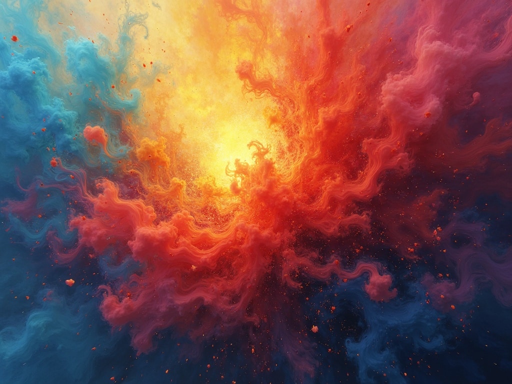
**Red:Often associated with passion, energy, excitement, and even danger. Think of a fiery sunset, a racing car, or a stop sign. Red can stimulate the senses and increase heart rate.
**Blue:Typically linked to tranquility, peace, stability, and trust. The vastness of the ocean and the clarity of the sky are potent examples. Blue can promote relaxation and reduce stress.
**Yellow:Generally perceived as cheerful, optimistic, and energetic. It can also symbolize caution or cowardice. Imagine sunflowers in a field or a child’s sunny drawing.
**Green:Frequently associated with nature, growth, harmony, and balance. It can also represent envy or jealousy. Think of lush forests, rolling hills, and springtime’s vibrant rebirth.
**Orange:A blend of red and yellow, orange evokes feelings of warmth, enthusiasm, creativity, and playfulness. It can also be associated with affordability and appetite, as seen in many fast-food brands.
**Purple:Often linked to royalty, luxury, spirituality, and mystery. Historically, purple dyes were expensive and rare, contributing to its association with wealth and power.
**Black:Commonly associated with sophistication, elegance, power, and mystery. It can also symbolize death, mourning, or negativity.
**White:Typically perceived as pure, innocent, clean, and peaceful. It can also represent sterility or coldness.
However, it’s crucial to remember that these are general tendencies. Cultural context, personal experiences, and even the specific shade of a color can significantly alter its perceived meaning and emotional impact. For instance, in some cultures, white is the color of mourning, a stark contrast to its Western association with weddings and new beginnings.
How Artists Use Color to Evoke Emotion
Artists understand the potent emotional effects of color and skillfully employ it to enhance their narratives, create specific moods, and connect with viewers on a deeper level. Here are some examples of how different color palettes and techniques can influence our emotional response:
Warm vs. Cool Color Palettes
**Warm Palettes:Dominated by reds, oranges, and yellows, warm palettes tend to create feelings of energy, excitement, passion, and optimism. They can also evoke feelings of discomfort or anxiety if used excessively or in jarring combinations.
**Cool Palettes:Featuring blues, greens, and purples, cool palettes generally promote feelings of calmness, serenity, peace, and contemplation. They can also evoke feelings of sadness, loneliness, or detachment if not balanced with warmer tones.
Color Contrast and Harmony
The way colors interact with each other also plays a crucial role in shaping our emotional response.
**High Contrast:Juxtaposing highly contrasting colors (e.g., red and green, blue and yellow) can create a sense of energy, excitement, and visual tension. This technique can be used to draw attention to specific elements or to create a dynamic and stimulating composition.
**Color Harmony:Using colors that are close together on the color wheel (e.g., blues and greens, yellows and oranges) can create a sense of harmony, balance, and tranquility. This technique is often used to create a calming and aesthetically pleasing effect.
Saturation and Value
Beyond hue (the pure color itself), saturation (the intensity of the color) and value (the lightness or darkness of the color) also contribute to the emotional impact.
**High Saturation:Vivid, highly saturated colors tend to evoke stronger emotional responses than muted or desaturated colors. They can create feelings of excitement, energy, and passion.
**Low Saturation:Muted or desaturated colors often create feelings of calmness, tranquility, and nostalgia. They can also evoke feelings of sadness or melancholy.
**High Value:Light values (tints) tend to evoke feelings of optimism, hope, and joy.
**Low Value:Dark values (shades) often evoke feelings of seriousness, mystery, or sadness.
Famous Examples of Color Emotion in Art
Throughout art history, countless artists have masterfully employed color to evoke specific emotions and enhance their storytelling.
**Vincent van Gogh:Van Gogh’s use of vibrant, often clashing, colors in paintings like The Starry Night conveys a sense of emotional intensity and inner turmoil. His bold use of yellow, in particular, adds a layer of both beauty and unsettling energy. [internal_link]
**Pablo Picasso:Picasso’s Blue Period is a prime example of how a limited color palette can evoke powerful emotions. Dominated by blues and blue-greens, these paintings convey a sense of melancholy, loneliness, and despair.
**Mark Rothko:Rothko’s color field paintings are designed to evoke a purely emotional response through the interaction of large blocks of color. His subtle variations in hue, saturation, and value create a sense of depth, luminosity, and spiritual contemplation.
**Frida Kahlo:Kahlo’s self-portraits often incorporate vibrant, symbolic colors that reflect her personal struggles and cultural identity. Her use of red, in particular, often symbolizes pain, passion, and resilience.
Beyond Art: Color in Everyday Life
The emotional effects of color extend far beyond the realm of art. Color plays a significant role in our everyday lives, influencing our choices, shaping our perceptions, and affecting our moods.
**Marketing and Branding:Companies carefully consider color psychology when designing logos, websites, and marketing materials. They use color to create specific associations and to appeal to their target audiences. For example, blue is often used by tech companies to convey trust and reliability, while red is often used by food companies to stimulate appetite.
**Interior Design:The colors we choose for our homes can have a profound impact on our mood and well-being. Calming blues and greens are often used in bedrooms and bathrooms to promote relaxation, while energizing yellows and oranges are often used in kitchens and living rooms to create a sense of warmth and vitality.
**Fashion:The colors we wear can also affect how we feel and how others perceive us. Wearing bright, bold colors can make us feel more confident and energetic, while wearing muted, neutral colors can make us feel more calm and understated.
Conclusion: The Enduring Power of Color
The emotional effects of color are undeniable. Whether we are consciously aware of it or not, color shapes our perceptions, influences our moods, and affects our behavior. Artists have long understood this power and have skillfully employed color to create works that resonate with us on a deep and emotional level. By understanding the psychology of color, we can gain a greater appreciation for the art around us and make more informed choices about the colors we incorporate into our own lives. So, the next time you encounter a work of art, take a moment to consider the colors used and how they make you feel. You might be surprised by the depth and complexity of your emotional response.