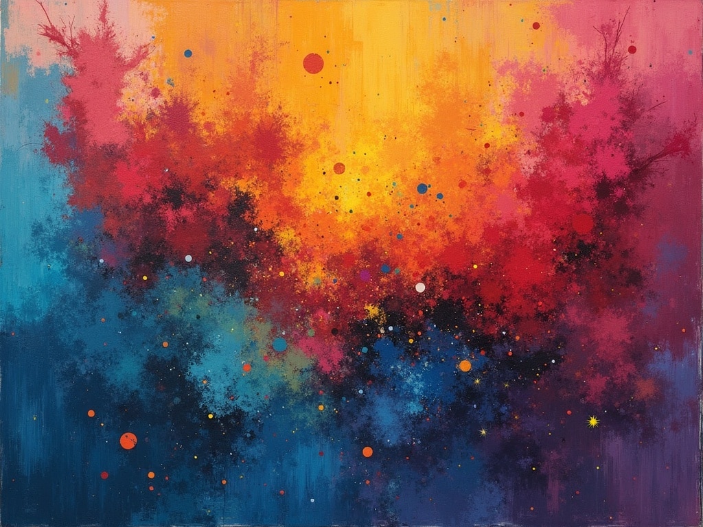
The Emotional Palette: How Artwork Color Shapes Our Feelings
Does a canvas drenched in crimson spark passion, while a sea of blues evokes tranquility? The answer, as any artist will tell you, is a resounding yes. Color is far more than just a visual element in art; it’s a powerful language that speaks directly to our emotions, often bypassing conscious thought. From the vibrant strokes of Van Gogh to the subdued washes of Monet, artists have long understood and harnessed the influence of artwork color on emotions, and the effects are profound.
The Psychology of Color: A Foundation for Artistic Expression
Before diving into specific artworks, it’s crucial to understand the psychological underpinnings of color perception. Color psychology explores how different hues affect our minds and bodies. These associations are both culturally learned and biologically ingrained.
- Red: Often associated with energy, passion, excitement, and sometimes anger or danger. It can raise heart rate and stimulate the senses.
- Blue: Frequently linked to calmness, serenity, peace, and stability. It can also evoke feelings of sadness or melancholy.
- Yellow: Typically represents happiness, optimism, and warmth. However, it can also signify caution or anxiety in certain contexts.
- Green: Commonly associated with nature, growth, harmony, and balance. It can also symbolize wealth or envy.
- Orange: A blend of red and yellow, it evokes enthusiasm, creativity, and warmth. It’s often seen as inviting and playful.
- Purple: Historically linked to royalty, spirituality, and mystery. It can also represent creativity, luxury, and imagination.
- Black: Often associated with power, elegance, and sophistication. It can also symbolize mourning, darkness, or fear.
- White: Typically represents purity, innocence, and cleanliness. It can also signify peace, simplicity, or emptiness.
These associations are not static. They can vary across cultures and even individual experiences. However, they provide a foundational understanding of how color can be used intentionally within art to elicit specific emotional responses.
Masterful Manipulation: Artists Who Understood Color’s Power
Throughout art history, numerous artists have demonstrated a profound understanding of the influence of artwork color on emotions. Let’s examine a few notable examples:
Vincent van Gogh: Expressing Turmoil Through Color
Van Gogh’s paintings are renowned for their intense emotionality, largely achieved through his bold and expressive use of color. In The Starry Night, the swirling blues and yellows create a sense of both wonder and unease. The vibrant [internal_link] yellows of the stars and moon offer a flicker of hope amidst the vast, turbulent blue sky, mirroring Van Gogh’s own internal struggles. Similarly, in his self-portraits, Van Gogh often used contrasting colors to convey his psychological state.
Mark Rothko: Abstracting Emotion with Color Fields
Mark Rothko’s color field paintings are perhaps the most direct exploration of color’s emotional impact. These large-scale canvases, composed of simple rectangular blocks of color, aim to evoke profound emotional experiences in the viewer. Rothko believed that color could communicate emotions directly, without the need for representational imagery. His darker, more somber color palettes, particularly in his later works, are often interpreted as expressions of grief and existential angst.
Claude Monet: Capturing the Fleeting Moods of Light and Color
While often associated with tranquility and beauty, Monet’s Impressionistic paintings also demonstrate a keen awareness of color’s emotional nuance. His series of paintings depicting the Rouen Cathedral, for example, capture the changing moods of the building under different lighting conditions. The subtle shifts in color convey a range of emotions, from the cheerful optimism of a sunlit morning to the somber stillness of a cloudy afternoon.
Beyond the Primary Hues: Exploring Color Combinations and Context
The emotional impact of artwork color extends beyond individual hues. The way colors are combined and the context in which they are presented also play a crucial role.
Complementary Colors: Creating Vibrancy and Tension
Complementary colors, such as red and green or blue and orange, are located opposite each other on the color wheel. When placed next to each other, they create a strong visual contrast and can evoke feelings of excitement or tension. Artists often use complementary colors to draw attention to specific areas of a painting or to create a sense of dynamism.
Analogous Colors: Harmony and Serenity
Analogous colors are those that are located next to each other on the color wheel, such as blue, blue-green, and green. When used together, they create a sense of harmony and visual unity. Artists often employ analogous color schemes to evoke feelings of calmness and serenity.
The Influence of Context: How Surrounding Colors Alter Perception
The way we perceive a color is also influenced by the colors that surround it. A red patch will appear more vibrant when placed against a neutral background than when placed against a busy, colorful background. Artists often manipulate these contextual relationships to create specific effects, such as making a color appear brighter or more subdued.
The Subjective Experience: Personal Reactions to Color in Art
While color psychology provides a general framework for understanding the influence of artwork color on emotions, it’s important to acknowledge the subjective nature of individual responses. Personal experiences, cultural background, and individual preferences can all influence how we perceive and react to color.
For example, someone who associates the color blue with a childhood trauma may experience feelings of sadness or anxiety when viewing a blue painting, even if blue is generally considered a calming color. Similarly, cultural associations can shape our perceptions of color. In some cultures, white is associated with mourning, while in others, it represents purity and joy.
Color as a Tool for Connection: Understanding the Artist’s Intent
Ultimately, the influence of artwork color on emotions is a complex interplay between the artist’s intent, the inherent psychological properties of color, and the viewer’s individual experiences. By understanding the language of color, we can gain a deeper appreciation for the emotional power of art and connect more meaningfully with the artist’s vision. Whether it’s the fiery passion of a red flamenco dress or the tranquil stillness of a blue seascape, color has the remarkable ability to transport us to another realm, evoking a symphony of emotions that resonate deep within our souls.