The Effect of Colors on Mood: How Art Evokes Emotion
Have you ever walked into a room and immediately felt a certain way? Perhaps a wave of calm washed over you in a spa, or a burst of energy ignited your spirit in a vibrant marketplace? While many factors contribute to our emotional states, color plays a surprisingly powerful, often subconscious, role. Artists have long understood and harnessed the effect of colors on mood, using palettes to evoke specific emotions and connect with viewers on a deeper level. But how exactly do colors influence our feelings, and what makes certain hues so evocative?
The Psychology of Color: A Primer
The study of color psychology explores how different colors affect human behavior and feelings. While individual responses to color can be subjective, influenced by personal experiences and cultural associations, some universal trends have emerged. These trends are rooted in biology, evolution, and deeply ingrained cultural symbolism. [internal_link]
Warm Colors: Energy and Excitement
Red, orange, and yellow, often associated with sunlight and heat, are considered warm colors. They tend to evoke feelings of:
- Energy: Red is often linked to excitement, passion, and even anger.
- Happiness: Yellow is cheerful, optimistic, and associated with joy and playfulness.
- Enthusiasm: Orange combines the energy of red and the happiness of yellow, creating a sense of enthusiasm and creativity.
However, the intensity and context matter. A bright red might signal danger, while a soft yellow can feel comforting. In art, warm colors are often used to draw attention, create a focal point, or convey a sense of dynamism.
Cool Colors: Calm and Serenity
Blue, green, and purple, reminiscent of water, nature, and twilight, are considered cool colors. They generally evoke feelings of:
- Calm: Blue is often associated with peace, tranquility, and stability.
- Growth: Green represents nature, health, and harmony. It can also symbolize growth and renewal.
- Luxury: Purple traditionally symbolizes royalty, spirituality, and creativity.
Like warm colors, the specific shade and its application are crucial. A dark blue might feel somber, while a vibrant green can be invigorating. Artists often use cool colors to create a sense of depth, distance, or serenity.
Neutral Colors: Balance and Harmony
Black, white, gray, brown, and beige are considered neutral colors. They often serve as a backdrop for other colors, allowing them to stand out and create contrast.
- Black: Can represent sophistication, power, or mystery, but also sadness or mourning.
- White: Often associated with purity, innocence, and cleanliness.
- Gray: Can be seen as neutral and calming, but also boring or depressing.
- Brown: Represents earthiness, stability, and comfort.
- Beige: Offers a sense of calm and simplicity.
Neutral colors can be incredibly versatile in art, providing balance and harmony, or creating a sense of drama when used in contrast with brighter hues.
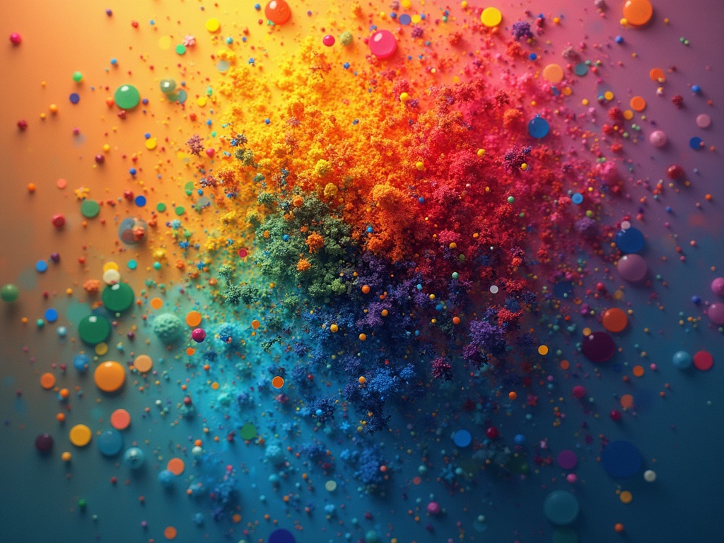
Color Combinations and Their Emotional Impact
The effect of colors on mood isn’t solely determined by individual hues, it is significantly influenced by how they are combined. Certain color pairings create specific emotional responses:
- Complementary Colors: Colors opposite each other on the color wheel (e.g., red and green, blue and orange) create high contrast and can evoke excitement and energy.
- Analogous Colors: Colors that are next to each other on the color wheel (e.g., blue, blue-green, and green) create a sense of harmony and tranquility.
- Triadic Colors: Three colors equally spaced on the color wheel (e.g., red, yellow, and blue) offer a balanced and vibrant feel.
Understanding these color relationships allows artists to carefully craft the emotional impact of their work. A painting dominated by complementary colors might feel dynamic and stimulating, while one featuring analogous colors could evoke a sense of peace and serenity.
Examples in Art History: Masters of Mood
Throughout art history, countless artists have masterfully used color to evoke specific emotions. Here are a few notable examples:
Vincent van Gogh: The Torment of Yellow
Van Gogh’s use of intense yellows, particularly in paintings like The Starry Night and Sunflowers, is often interpreted as reflecting his inner turmoil and passionate nature. While yellow is typically associated with joy, Van Gogh’s application often hints at a deeper, more complex emotional state.
Pablo Picasso: The Blue Period’s Melancholy
During his Blue Period, Picasso primarily used shades of blue and blue-green to depict themes of poverty, loneliness, and despair. The monochromatic palette effectively conveyed a sense of melancholy and sorrow, reflecting the artist’s personal struggles and observations of society.
Mark Rothko: Abstract Expressionism’s Emotional Depth
Mark Rothko’s abstract expressionist paintings, characterized by large blocks of color, aimed to evoke profound emotional responses in viewers. His careful selection and layering of colors created a sense of depth, spirituality, and contemplation. The viewer is invited to immerse themselves in the colors and experience their own emotional journey.
Beyond the Canvas: Color in Everyday Life
The effect of colors on mood extends far beyond the realm of art. From the clothes we wear to the design of our homes, color constantly influences our feelings and behaviors:
- Clothing: Wearing bright colors like red or yellow can boost confidence and energy, while wearing calming colors like blue or green can create a sense of peace and relaxation.
- Interior Design: The colors we choose for our homes can significantly impact our mood and well-being. Warm colors can create a cozy and inviting atmosphere, while cool colors can promote relaxation and focus.
- Marketing and Branding: Companies carefully select colors for their logos and marketing materials to evoke specific emotions and associations in consumers.
Conclusion: The Enduring Power of Color
The effect of colors on mood is a complex and multifaceted phenomenon. While individual experiences and cultural contexts can influence our responses to color, the fundamental associations between certain hues and emotions remain remarkably consistent. From the masterpieces of art history to the everyday choices we make, color plays a vital role in shaping our perceptions, influencing our feelings, and enriching our lives. By understanding the psychology of color, we can become more aware of its power and harness it to create more meaningful and emotionally resonant experiences, both in our art and in our daily lives.