How Color Bends Reality: The Influence of Color on Perception
Imagine walking into a room bathed in a soft, warm yellow light. You likely feel a sense of comfort, maybe even a touch of happiness. Now, picture the same room flooded with stark, clinical white. Suddenly, the atmosphere shifts – perhaps to sterile, clean, or even cold. This is the power of color at play, subtly shaping our perceptions and influencing our emotions in ways we often don’t even realize. The influence of color on perception is a profound and multifaceted phenomenon that artists, designers, and psychologists have explored for centuries. It is a fundamental aspect of how we experience the world, shaping our emotions, influencing our decisions, and even altering our sense of time and space.
The Psychology of Color: More Than Just Preferences
Color psychology delves into the emotional and psychological effects colors have on people. It’s not about individual preferences (although those certainly play a role), but rather about the universal and culturally conditioned responses we have to different hues. Understanding these responses is crucial for anyone working with visual communication, from painters to marketers.
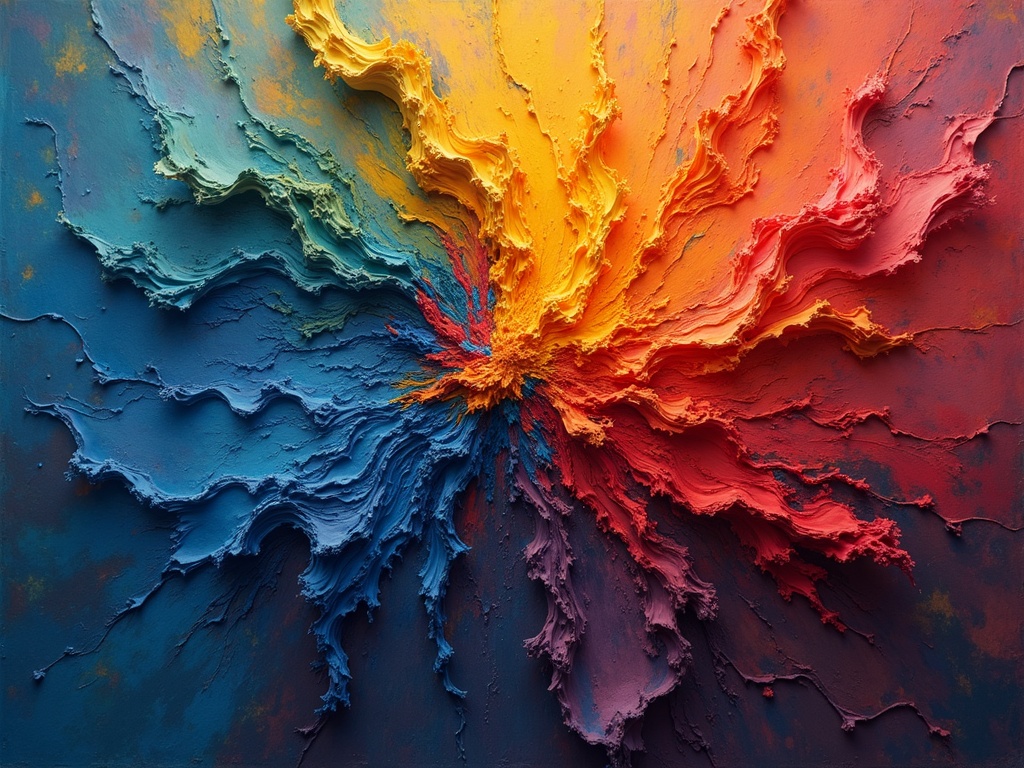
- Red: Often associated with energy, passion, excitement, and danger. It can increase heart rate and stimulate appetite.
- Blue: Evokes feelings of calmness, serenity, stability, and trust. It is often used in corporate settings to convey reliability.
- Yellow: Represents happiness, optimism, and warmth. However, in some contexts, it can also signify caution or deceit.
- Green: Linked to nature, growth, harmony, and health. It often creates a sense of balance and tranquility.
- Orange: Combines the energy of red with the happiness of yellow. It represents enthusiasm, creativity, and adventure.
- Purple: Associated with royalty, luxury, spirituality, and mystery. It can also evoke feelings of creativity and imagination.
Cultural Considerations
It’s crucial to remember that color associations are not always universal. The meaning of a particular color can vary significantly across different cultures. For example, white is often associated with purity and mourning in Western cultures, while in many Eastern cultures, it is primarily a symbol of mourning. Similarly, red, which symbolizes passion and good fortune in many Western cultures, can represent anger or danger in others. These cultural nuances highlight the importance of understanding the target audience when using color in design or art.
The perception of color isn’t solely based on psychological influence. Our brains interpret color within a context, which impacts how we understand it.
Color in Art: A Deliberate Language
Artists throughout history have masterfully manipulated color to evoke specific emotions, create depth, and guide the viewer’s eye. Color is one of the most fundamental tools in an artist’s arsenal.
Creating Depth and Dimension
Color can be used to create the illusion of depth and dimension on a flat surface. Warm colors (reds, oranges, yellows) tend to advance, making objects appear closer to the viewer. Cool colors (blues, greens, purples) recede, creating a sense of distance. By strategically placing warm and cool colors, artists can create a convincing illusion of three-dimensionality.
Evoking Emotion
Perhaps the most powerful use of color in art is its ability to evoke emotion. A painting dominated by somber blues and grays might convey a sense of sadness or melancholy, while a vibrant canvas filled with warm, saturated colors could radiate joy and optimism. Artists carefully consider the emotional impact of their color choices to enhance the narrative and meaning of their work.
Examples in Art History
Vincent van Gogh: Known for his expressive use of color, particularly his vibrant yellows and blues, to convey his emotional state. His Starry Night is a prime example of how color can be used to create a sense of awe and wonder.
Mark Rothko: His color field paintings, featuring large blocks of color, aimed to evoke profound emotional responses in the viewer through the sheer power of hue.
Claude Monet: A master of Impressionism, Monet explored the changing effects of light and color in nature, capturing fleeting moments in his landscape paintings. [internal_link]
Optical Illusions and Color Perception
Our perception of color is also influenced by various optical illusions and the way our brains process visual information.
Simultaneous Contrast
Simultaneous contrast refers to the phenomenon where the perceived color of an area is affected by the colors surrounding it. For instance, a gray patch will appear lighter when placed against a dark background and darker when placed against a light background. This effect can be used by artists to create a sense of vibrancy and contrast in their work.
Color Constancy
Color constancy is the ability of our brains to perceive the color of an object as relatively constant under varying lighting conditions. Even though the actual color of light reflected from an object changes depending on the illumination, our brains compensate for these changes, allowing us to perceive the object’s color as stable. This is why we recognize a red apple as red whether we see it indoors under artificial light or outdoors in direct sunlight.
The Bezold Effect
The Bezold effect is an optical illusion that occurs when a color appears different depending on the colors surrounding it. For example, a red color will appear brighter and more saturated when surrounded by black than when surrounded by white. This effect can be used by designers and artists to create visual interest and emphasize specific colors.
Color and Branding: Influencing Consumer Behavior
The influence of color on perception extends beyond the realm of art and psychology; it plays a crucial role in branding and marketing. Companies carefully select colors for their logos, packaging, and advertising campaigns to evoke specific emotions and influence consumer behavior.
Building Brand Recognition
Colors can be powerful tools for building brand recognition. Certain brands become closely associated with specific colors, making it easier for consumers to identify and remember them. For example, Coca-Cola is instantly recognizable by its signature red color.
Targeting Specific Demographics
Different colors appeal to different demographics. For example, younger audiences may be more drawn to bright, vibrant colors, while older audiences may prefer more subdued and sophisticated hues. Marketers consider these preferences when designing campaigns targeting specific age groups or demographics.
Creating a Mood
The colors used in a brand’s visual identity can create a specific mood or feeling. For example, a brand that wants to convey a sense of luxury and sophistication might use colors like gold, silver, or deep purple. A brand that wants to appear friendly and approachable might use warm, inviting colors like yellow or orange.
The Future of Color Perception Research
Our understanding of the influence of color on perception continues to evolve. Researchers are exploring the neurological basis of color perception, investigating how different colors activate specific brain regions. They’re also examining the impact of color on various cognitive functions, such as memory, attention, and decision-making.
Advancements in Neuroscience
Advances in neuroscience are providing new insights into how the brain processes color information. Brain imaging techniques, such as fMRI, allow researchers to observe which brain regions are activated when people perceive different colors. This research is helping to unravel the complex neural mechanisms underlying color perception.
Applications in Virtual Reality
The influence of color on perception is also being explored in the context of virtual reality (VR). VR developers are experimenting with different color schemes to create immersive and engaging experiences. Colors can be used to enhance the realism of VR environments, evoke specific emotions, and even influence users’ behavior within the virtual world.
Conclusion: A World Painted with Meaning
The influence of color on perception is undeniable. From the artwork that stirs our souls to the brands that shape our choices, color plays a vital role in how we experience and understand the world around us. By understanding the psychology of color, the power of visual context, and the impact of cultural associations, we can harness the transformative potential of color to communicate, create, and connect with others on a deeper level. The next time you encounter a powerful color, take a moment to consider its subtle, yet profound influence on your perception. You might be surprised by what you discover.