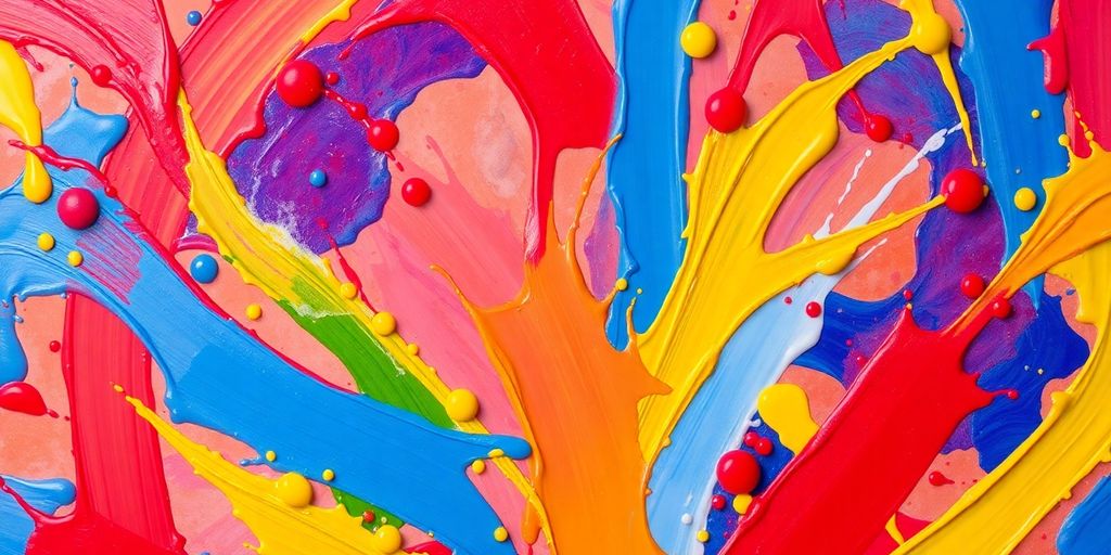
Color plays a huge role in how we feel and think, especially in art. Artists have been using colors to express emotions for centuries, and it’s fascinating to see how different shades can evoke various feelings. From the bright yellows of happiness to the deep blues of sadness, the connection between color and emotion in art is something worth exploring. Let’s take a look at how color choices impact our emotions and how artists have mastered this connection throughout history.
Key Takeaways
- Colors can significantly affect our mood and feelings.
- Different color schemes create different emotional responses.
- Cultural backgrounds influence how we perceive colors.
- Famous artists have used color to express deep emotions in their work.
- Art therapy uses color to help people heal and express themselves.
The Psychology Behind Color Choices
Understanding Color Theory
Okay, so color theory can sound intimidating, but it’s really just about how colors relate to each other. Think of it like a family of colors, each with its own personality. We’ve got primary colors – red, yellow, and blue – the OG colors that can’t be made by mixing others. Then there are secondary colors – green, orange, and purple – made by mixing those primaries. And finally, tertiary colors, which are a mix of primary and secondary. Understanding these relationships helps artists create harmonious color palettes and evoke specific feelings.
How Colors Influence Mood
Colors have a crazy power over our emotions. It’s not just a coincidence that we say things like "feeling blue" or "seeing red." Red, for example, is often associated with excitement, energy, and even anger. Blue, on the other hand, tends to bring feelings of calmness, peace, and sadness. Yellow is usually linked to happiness, optimism, and energy. Green often represents nature, growth, and tranquility. It’s wild how deeply ingrained these associations are!
The Role of Cultural Context
Color associations aren’t universal; they’re heavily influenced by culture. What one color means in one part of the world can be totally different somewhere else. For example, in Western cultures, white is often associated with purity and weddings, but in some Eastern cultures, it’s the color of mourning. Similarly, red can symbolize good luck and prosperity in China, while in some Western contexts, it can signify danger or warning. It’s important to be aware of these cultural differences when using color in art, especially if you’re trying to communicate with a global audience.
Color perception is a complex interplay of biology, psychology, and culture. Our brains are wired to respond to certain wavelengths of light, but our experiences and beliefs shape how we interpret those responses. This means that the same color can evoke different emotions and associations in different people, depending on their background and personal history.
Here’s a quick look at some common color associations, but remember, these can vary:
- Red: Passion, energy, anger
- Blue: Calmness, peace, sadness
- Yellow: Happiness, optimism, energy
- Green: Nature, growth, tranquility
Color Palettes and Their Emotional Impact
Color palettes are super important in art. They’re not just about picking pretty colors; they’re about how those colors make you feel. It’s like the artist is using a secret code to talk to your emotions.
Warm vs. Cool Colors
Okay, so you’ve probably heard about warm and cool colors. Warm colors—reds, oranges, yellows—they’re like sunshine and fire. They can make you feel energetic, happy, or even angry. Cool colors—blues, greens, purples—are more like water and sky. They tend to be calming, peaceful, or sometimes even a little sad. The trick is how you mix them.
Monochromatic vs. Complementary Schemes
Monochromatic schemes use different shades of just one color. Think of it like a blue painting with light blues, dark blues, and everything in between. It can create a really harmonious and unified feel. Complementary schemes use colors that are opposite each other on the color wheel, like red and green or blue and orange. These combos create a lot of contrast and can be super eye-catching. For example, saturated colors can elicit powerful emotional responses.
The Power of Contrast
Contrast is where things get really interesting. It’s all about how different colors play off each other. High contrast, like black and white, can be dramatic and bold. Low contrast, like pastels, can be soft and gentle. The amount of contrast can totally change the mood of a piece.
Think about how different movies use color. A horror movie might use a lot of dark, contrasting colors to create suspense, while a romantic comedy might use brighter, softer colors to make you feel happy and lighthearted. It’s all about using color to tell a story and evoke emotions.
Artists Who Mastered Color and Emotion
Van Gogh’s Vibrant Hues
Van Gogh, man, that guy knew how to use color. It’s like he wasn’t just painting what he saw, but what he felt. His use of color was so intense, so personal, that it practically screams off the canvas. Think about "Starry Night" – that swirling, almost chaotic sky, the bright yellows and blues. It’s not just a pretty picture; it’s a window into his soul. He wasn’t afraid to use color to express his inner turmoil, his joy, his everything. It’s what makes his work so captivating, even today. You can almost feel the energy radiating from the canvas.
Monet’s Soft Pastels
Monet, on the other hand, was all about subtlety. Where Van Gogh hit you over the head with color, Monet gently nudged you. He was a master of capturing light and atmosphere, and he did it with these incredibly soft, delicate pastels. Think of his water lilies – those dreamy, ethereal scenes. It’s like he was trying to capture a fleeting moment, a whisper of light. He used color to create a sense of peace and tranquility, a world away from the chaos of everyday life. It’s amazing how he could evoke so much emotion with such a restrained palette. His approach to color and light was truly unique.
Kandinsky’s Abstract Expressions
Kandinsky took things in a completely different direction. He was one of the pioneers of abstract art, and he believed that color could communicate directly with the soul, without the need for representational forms. He saw color as a language, a way to express emotions and ideas that words couldn’t capture. His paintings are these wild, chaotic explosions of color, shapes, and lines. It’s like he was trying to create a visual symphony, a feast for the eyes and the soul. Some people find it confusing, but for others, it’s incredibly liberating. He really pushed the boundaries of what art could be.
Kandinsky believed that certain colors evoked specific emotions. For example, he associated yellow with warmth and excitement, while blue represented depth and spirituality. He used these associations to create paintings that were intended to evoke specific emotional responses in the viewer.
Here’s a quick look at how these artists differed:
- Van Gogh: Intense, personal, expressive
- Monet: Subtle, atmospheric, tranquil
- Kandinsky: Abstract, spiritual, liberating
Color in Different Art Movements

Art movements? They’re like different bands, each with its own sound… or in this case, color palette. It’s wild how much the style of a period can affect how artists use color to express themselves. Let’s take a look at a few.
Impressionism and Emotional Light
Impressionism is all about capturing a moment, a feeling, the impression of light. Think Monet’s water lilies – soft, dreamy, and full of light. They weren’t trying to paint reality perfectly, but rather how reality felt. Colors were used to show the fleeting nature of light and atmosphere. It’s like they were chasing the sunset, trying to bottle that golden hour feeling.
Expressionism’s Bold Choices
Expressionism? Now that’s a whole different ballgame. Forget subtle; we’re talking bold, raw emotion splashed across the canvas. Artists like Munch used color to scream their feelings. It’s not about pretty pictures; it’s about visceral reactions. The colors are often jarring, clashing, and intense. It’s like turning up the volume on your emotions to eleven. You can see the influence of abstract paintings in this movement.
Surrealism’s Dreamlike Colors
Surrealism is where things get weird… in the best way possible. Think dreamscapes, illogical scenes, and colors that don’t quite belong. It’s like your brain on a Tuesday afternoon. Artists like Dalí used color to create a sense of unease, mystery, and the subconscious. It’s not about reality; it’s about what’s lurking beneath the surface. The colors can be vibrant, but also unsettling, creating a world that’s both familiar and alien.
Color in Surrealism often defies logic, creating a sense of the uncanny and the unexpected. It’s a visual representation of the subconscious mind, where anything is possible.
Personal Interpretation of Color in Art
Color, man, it’s like… totally personal. What screams "joy" to me might whisper "meh" to you. And that’s perfectly okay! Art isn’t about some universal code; it’s about what you feel when you look at it. It’s about the story it tells you, not the story someone else tells you it should tell.
Subjectivity in Color Perception
Okay, so, remember that blue dress/gold dress thing from a few years back? That’s basically color perception in a nutshell. Our brains are weird! They interpret light and color based on a whole bunch of factors, like our past experiences, our current mood, and even the lighting in the room. So, when you look at a painting and feel a certain way because of the colors, that’s your brain doing its thing. There’s no right or wrong answer. It’s all about your individual experience. It’s why some people love certain color combinations and others, not so much.
Creating Your Own Emotional Palette
Think about the colors that make you feel something. What colors make you happy? Sad? Energetic? Calm? Start building your own emotional palette. It’s like your personal set of tools for expressing yourself. Maybe it’s a bunch of bright, sunny yellows and oranges. Or maybe it’s a collection of deep, moody blues and purples. There’s no limit to what you can do. Experiment! Play around! See what happens when you mix different colors together.
- Start a color journal. Jot down colors you see and how they make you feel.
- Collect color swatches from magazines or paint stores.
- Experiment with different color combinations in your own art.
The Influence of Personal Experience
Our personal experiences play a huge role in how we perceive color. Maybe your grandmother always wore a certain shade of lavender, so that color makes you feel warm and nostalgic. Or maybe you had a bad experience with a bright red car, so that color makes you feel anxious. These associations are deeply personal and can have a powerful impact on your emotional response to art.
Color is more than just pigment; it’s a vessel for memories, emotions, and personal narratives. Embrace your unique perspective and allow your experiences to shape your interpretation of art.
The Role of Color in Modern Art
Digital Art and Color Manipulation
Digital art has totally changed how artists use color. With software, you can tweak colors in ways that were impossible before. Think about it: gradients that shift seamlessly, colors that react to sound, and palettes that you can change with a click. It’s like having a limitless supply of paint, brushes, and effects all in one place. This opens up a whole new world of possibilities for expressing emotions and ideas through color.
- Creating interactive installations
- Designing dynamic web interfaces
- Developing immersive video games
Street Art’s Vibrant Messages
Street art uses color to grab attention and make a statement. Murals explode with bright hues, stencils pop with contrasting shades, and even simple tags can stand out because of their color choices. Street artists often use color to convey messages about social issues, politics, or just to brighten up a neighborhood. It’s a way of making art accessible to everyone, and color plays a huge role in that.
Street art is a powerful medium because it’s immediate and in your face. The colors used are often bold and unapologetic, reflecting the urgency and passion of the artists.
Color in Contemporary Installations
Contemporary installations often use color to create immersive experiences. Artists might fill a room with a single color to evoke a specific mood, or they might use a combination of colors to create a sense of chaos or harmony. The goal is to engage the viewer on an emotional level and make them think about the relationship between color and space. You can see this in Color Field art, where the focus is on expansive areas of color and striking line work. Color becomes the main subject, not just an element.
Here’s a simple breakdown of how color is used in installations:
| Color | Effect |
|---|---|
| Red | Energy, passion, intensity |
| Blue | Calm, peace, serenity |
| Yellow | Optimism, happiness, creativity |
| Green | Nature, growth, harmony |
| Purple | Luxury, mystery, spirituality |
Exploring Color in Art Therapy
Art therapy is such a cool field, and it’s amazing how much color plays a part in it. It’s not just about making pretty pictures; it’s about using art to understand and work through emotions. Let’s look at how color fits into all of this.
Healing Through Color Expression
Color can be a powerful tool for healing. It allows people to express feelings that they might not be able to put into words. Think about it: sometimes, you just feel a certain color, right? Art therapy uses this to help people explore their inner world. It’s like unlocking a secret language within yourself. For example, someone dealing with anxiety might find comfort in cool blues and greens, while someone working through anger might be drawn to fiery reds and oranges. It’s all about what feels right for the individual.
Color Choices in Therapeutic Settings
In therapy, the colors someone chooses can offer insights into their emotional state. A therapist might notice patterns in the colors a client uses over time, which can indicate progress or challenges. It’s not about strict interpretations, but more about understanding the individual’s personal connection to color. The setting itself can also influence color choices. A calming, neutral room might encourage different expressions than a brightly colored one. It’s a delicate balance, and a good therapist is aware of these nuances.
Here are some common observations:
- Red: Often associated with energy, passion, or anger.
- Blue: Can represent calmness, sadness, or introspection.
- Yellow: Frequently linked to happiness, optimism, or anxiety.
- Green: May symbolize growth, healing, or envy.
The Emotional Release of Art Creation
Creating art, especially with color, can be incredibly cathartic. It’s a way to let go of pent-up emotions and find a sense of release. The act of choosing colors, mixing them, and applying them to a surface can be a very mindful and grounding experience. It’s not about creating a masterpiece; it’s about the process itself. It’s about giving yourself permission to feel and express, without judgment. The color symbolism is a big part of that.
Art therapy provides a safe space for individuals to explore their emotions through creative expression. It’s a journey of self-discovery, where color becomes a guide and a companion.
Wrapping It Up
So, there you have it! Color and emotion in art really go hand in hand. It’s wild how a simple shade can spark feelings or memories, right? Whether it’s the bright yellows that make you feel cheerful or the deep blues that bring a sense of calm, artists have a way of using color to connect with us. Next time you look at a painting or a piece of art, take a moment to think about what those colors are saying to you. It’s like a secret language that everyone can understand, even if we don’t realize it. Art is all about expression, and color is one of the coolest tools in that toolbox. So, get out there, explore some art, and see what emotions pop up for you!
Frequently Asked Questions
What is color theory?
Color theory is the study of how colors work together. It helps artists understand how to mix colors and how different colors can make people feel different emotions.
How do colors affect our feelings?
Colors can change our mood. For example, warm colors like red and orange can make us feel excited or happy, while cool colors like blue and green can make us feel calm or sad.
Why do different cultures see colors differently?
Different cultures have their own meanings for colors. For example, white is often seen as pure in Western cultures, but in some Eastern cultures, it can represent mourning.
What are warm and cool colors?
Warm colors include reds, oranges, and yellows. They feel energetic and inviting. Cool colors include blues, greens, and purples. They feel calm and relaxing.
How do artists use color to express feelings?
Artists choose colors carefully to show their emotions. For instance, Van Gogh used bright colors to show his passion, while Monet used soft colors to create a peaceful feeling.
Can color affect our health?
Yes, colors can influence our health and feelings. In art therapy, using colors can help people express their emotions and even heal from stress or sadness.