Does Your Art Have to Match Pillows? A Deep Dive into Decor Harmony
Have you ever stood in your living room, a newly acquired piece of art in hand, and wondered, Does this really go with the pillows? It’s a question that plagues homeowners, renters, and design enthusiasts alike. The pressure to create a cohesive, aesthetically pleasing space can feel immense, leading many to believe that a perfect match is the ultimate goal. But is it? Let’s unravel the myth of the matching mandate and explore how to harmoniously blend art with your existing décor.
The Allure of the Coordinated Look
There’s an undeniable appeal to a room where everything seems to belong. A coordinated look evokes a sense of calm, order, and meticulousness. When art echoes the colors, patterns, or themes found in your pillows, rugs, or other textiles, it creates a visual harmony that can be quite satisfying. This approach is particularly effective in minimalist or contemporary spaces, where clean lines and a limited color palette reign supreme. The seamless integration of art into the overall scheme can enhance the feeling of sophistication and deliberate design.
However, the desire for perfect coordination can also stifle creativity and lead to a bland, predictable environment. Imagine a living room where the artwork, pillows, and even the throw blankets are all variations of the same shade of blue. While undeniably matching, it lacks depth, personality, and that crucial element of surprise that makes a space truly engaging. The key is to understand the difference between coordination and suffocation.
Breaking Free from the Matching Mindset
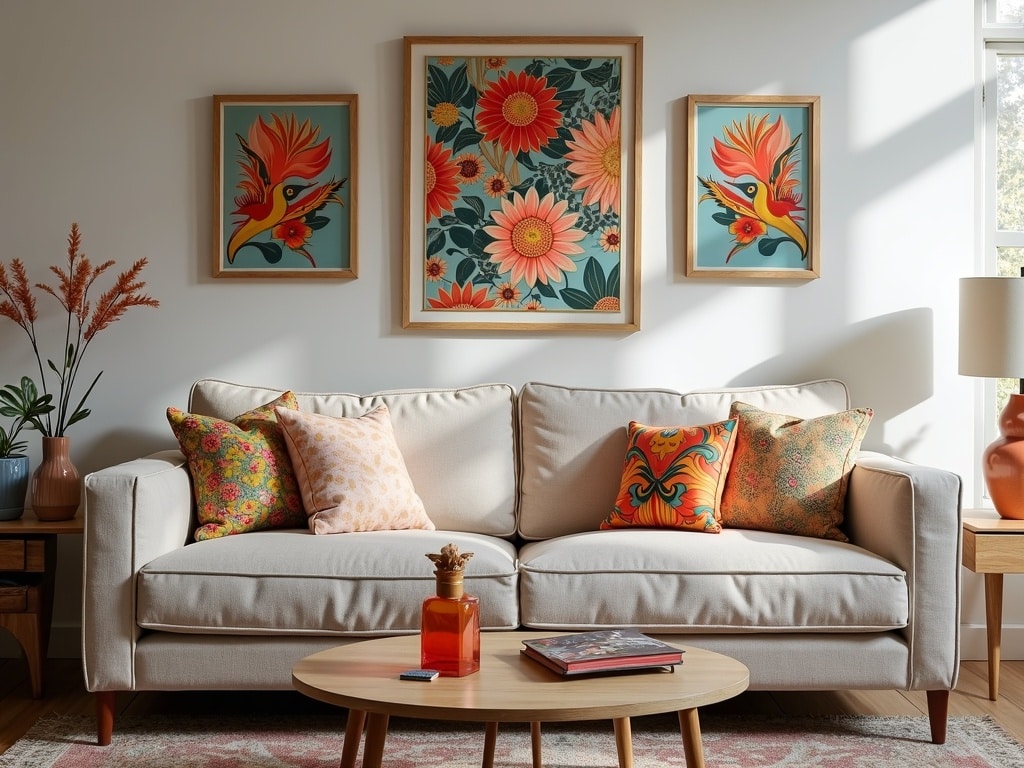
The truth is, your art doesn’t *haveto match your pillows. In fact, sometimes the most captivating spaces are those that embrace contrast and unexpected juxtapositions. Think of your room as a canvas and your art as a statement piece. It should complement your existing décor, yes, but it doesn’t necessarily need to be a carbon copy of it. Consider these empowering alternatives to the matching mandate:
Complementary Colors: A Harmonious Relationship
Instead of striving for an exact match, explore the world of complementary colors. These are colors that sit opposite each other on the color wheel, such as blue and orange, red and green, or yellow and purple. When used together, they create a vibrant and dynamic contrast that can add energy and visual interest to your space. For example, if your pillows are primarily blue, consider a piece of art that incorporates shades of orange or warm yellow to create a balanced and visually stimulating effect.
Analogous Colors: A Subtle Symphony
For a more subtle and refined approach, consider analogous colors. These are colors that are located next to each other on the color wheel, such as blue, blue-green, and green. Using analogous colors creates a sense of harmony and flow, as the colors naturally blend and complement each other. This approach is perfect for creating a calming and cohesive atmosphere, while still allowing your art to stand out as a unique element.
Texture and Dimension: Beyond Color
Don’t underestimate the power of texture and dimension to create visual interest. A piece of art with a tactile surface, such as an impasto painting or a mixed-media sculpture, can add depth and complexity to a room, even if its colors don’t perfectly match the pillows. Similarly, consider the scale and proportion of your art in relation to the other elements in the room. A large, abstract painting can serve as a focal point, drawing the eye and adding a sense of drama, while a smaller, more delicate piece can add a touch of intimacy and charm.
The Power of the Accent Color
Even if the primary colors of your art don’t directly align with your pillows, consider whether it shares an accent color that ties it into the room. Perhaps your pillows feature a small stripe of gold, and your artwork incorporates gold leaf or a gilded frame. This subtle connection can be enough to create a sense of cohesiveness without resorting to a literal match and helps to create a unified look for the room.
Curating a Personal Narrative
Ultimately, the most important consideration when choosing art is whether it resonates with you. Your home should be a reflection of your personality, your passions, and your experiences. Rather than slavishly adhering to design rules, focus on curating a collection of pieces that you genuinely love and that tell a story about who you are. This personal connection will make your home feel more authentic and inviting, regardless of whether your art perfectly matches your pillows.
Think about the emotions you want to evoke in your space. Do you want it to feel calm and serene, or vibrant and energetic? Choose art that reflects these emotions and that speaks to your soul. Don’t be afraid to mix and match different styles, genres, and mediums. The beauty of art is its ability to transcend trends and to connect with us on a deep, personal level. [internal_link] By embracing your unique taste and allowing your personality to shine through, you’ll create a space that is not only beautiful but also meaningful.
Practical Tips for Harmonizing Art and Décor
While breaking free from the matching mandate is liberating, it’s still important to approach the selection and placement of art with thoughtful consideration. Here are some practical tips to help you create a harmonious and visually appealing space:
- Start with the foundational elements: Before you even begin thinking about art, ensure that your walls, flooring, and furniture are in harmony. These foundational elements provide the backdrop against which your art will be displayed. Choose neutral colors for your walls and flooring to create a versatile canvas that allows your art to shine.
- Consider the lighting: Lighting plays a crucial role in how art is perceived. Natural light is ideal, but if you rely on artificial lighting, make sure it’s appropriate for the type of art you’re displaying. Avoid harsh, direct light, which can damage delicate artwork. Instead, opt for soft, diffused lighting that illuminates the art without overwhelming it.
- Pay attention to scale and proportion: The size of your art should be proportional to the size of the wall on which it’s displayed. A small piece of art can get lost on a large wall, while a large piece can overwhelm a small space. Consider the height of your ceilings and the dimensions of your furniture when choosing art.
- Create a focal point: Every room should have a focal point – a single element that draws the eye and anchors the space. Your art can serve as the focal point, but it should be balanced by other elements in the room, such as a fireplace, a large window, or a statement piece of furniture.
- Group art strategically: If you have multiple pieces of art, consider creating a gallery wall or grouping them together in a cohesive arrangement. Pay attention to the spacing between the pieces and the overall composition of the group. Experiment with different layouts until you find one that feels balanced and visually appealing.
- Use frames to enhance the art: The frame can be just as important as the art itself. Choose frames that complement the art and the overall décor of the room. Consider the color, material, and style of the frame. A simple, understated frame can allow the art to take center stage, while a more elaborate frame can add a touch of elegance and sophistication.
Embracing Imperfection: The Beauty of the Unexpected
In the world of interior design, perfection is often an illusion. The most captivating spaces are those that embrace imperfection and celebrate the beauty of the unexpected. Don’t be afraid to break the rules, experiment with different styles, and create a space that is authentically you. Your art is a reflection of your soul, and it should be displayed with pride, regardless of whether it perfectly matches your pillows. The most important thing is that you love your space and that it brings you joy. So, go ahead, hang that painting you’ve been eyeing, even if it clashes with your sofa. You might be surprised at the magic that unfolds.
In Conclusion: Art as a Conversation Starter
Ultimately, the question of whether your art has to match your pillows boils down to personal preference. While a coordinated look can be aesthetically pleasing, it’s not the only path to creating a beautiful and inviting space. By embracing contrast, curating a personal narrative, and paying attention to practical considerations, you can create a home that is both stylish and meaningful. So, let your art be a conversation starter, a reflection of your personality, and a source of inspiration. Forget the matching mandate and embrace the freedom to create a space that truly speaks to you.