Decoding the Rainbow: Understanding Color Impact on Mood
Imagine stepping into a room washed in vibrant yellow. Does it spark joy, energy, perhaps even a touch of anxiety? Or picture a space draped in calming blues – does it soothe, relax, or perhaps evoke a hint of melancholy? Color, seemingly a simple visual element, wields a profound influence on our emotions, behaviors, and overall well-being. But how does this chromatic magic work, and how can we harness it to shape our environments and artistic creations?
The Psychology of Color: More Than Just a Pretty Hue
The impact of color transcends mere aesthetics; it delves into the realm of psychology. For centuries, cultures around the world have associated specific colors with particular emotions and meanings. While individual experiences and cultural contexts can slightly alter these associations, some fundamental connections remain remarkably consistent.
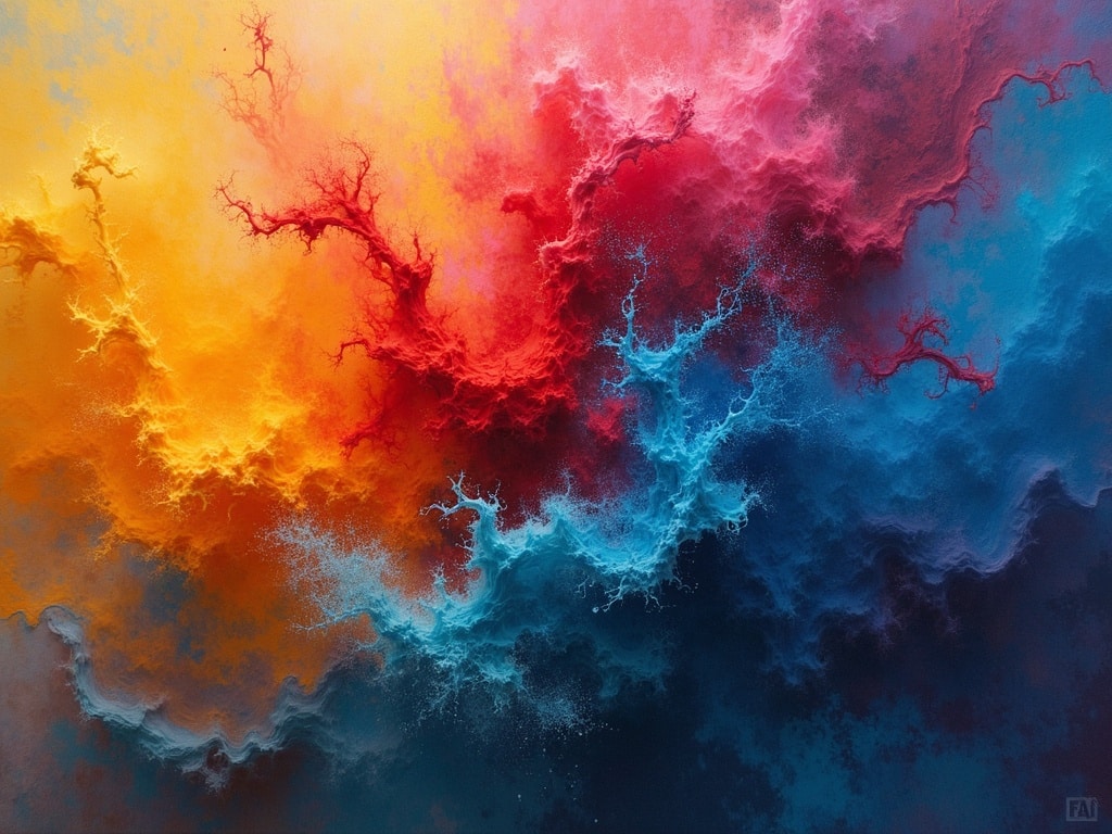
Warm Colors: Igniting Passion and Energy
Red, orange, and yellow, often referred to as warm colors, are generally associated with:
- Energy and Excitement: Think of red sports cars or the vibrant hues of a sunset.
- Happiness and Optimism: Yellow, in particular, is linked to sunshine, laughter, and positive feelings.
- Stimulation and Creativity: These colors can inspire action and encourage innovative thinking.
- Caution and Warning: Red can also signal danger or urgency, hence its use in traffic lights and emergency signs.
However, warm colors can also evoke less desirable emotions, such as anger (red) or anxiety (yellow), especially when used in excessive amounts or clashing combinations.
Cool Colors: Promoting Calm and Serenity
Blue, green, and purple, the cool color palette, tends to create a sense of:
- Calm and Relaxation: Blue is often associated with the ocean and sky, promoting a sense of tranquility.
- Peace and Harmony: Green represents nature, growth, and balance.
- Serenity and Spirituality: Purple, historically linked to royalty, can evoke feelings of peace and introspection.
- Sadness and Melancholy: In some contexts, blue can also be associated with feelings of sadness or loneliness.
Cool colors can sometimes feel cold or impersonal if not balanced with warmer accents.
Neutral Colors: Providing Balance and Sophistication
Black, white, gray, beige, and brown serve as a foundation for many color schemes. These neutral tones typically convey:
- Sophistication and Elegance: Black and white, especially in combination, exude a timeless style.
- Cleanliness and Simplicity: White is often associated with purity, innocence, and minimalism.
- Comfort and Stability: Brown and beige evoke feelings of warmth, earthiness, and security.
- Neutrality and Balance: Gray acts as a bridge between extremes, providing a sense of equilibrium.
While neutral colors can offer a sense of calm and grounding, they can also feel bland or uninspired if used without pops of color or interesting textures.
Color in Art: A Palette of Emotions
Artists throughout history have masterfully employed color to evoke specific emotions, tell stories, and express their inner worlds. From the vibrant landscapes of Van Gogh to the somber portraits of Rembrandt, color serves as a powerful tool for artistic expression.
Color Temperature: Hot vs. Cold
Artists often use color temperature to create contrast and depth in their paintings. Warm colors tend to advance, drawing the viewer’s eye forward, while cool colors recede, creating a sense of distance. This technique can be used to create a focal point or to manipulate the viewer’s perception of space.
Color Harmony: Creating Visual Appeal
Color harmony refers to the pleasing arrangement of colors within a composition. There are several basic color harmonies that artists commonly use:
- Complementary Colors: Colors opposite each other on the color wheel (e.g., red and green, blue and orange) create a vibrant contrast.
- Analogous Colors: Colors that are adjacent to each other on the color wheel (e.g., blue, blue-green, and green) create a harmonious and soothing effect.
- Triadic Colors: Three colors equally spaced on the color wheel (e.g., red, yellow, and blue) create a balanced and dynamic composition.
Understanding color harmonies can help artists create visually appealing and emotionally resonant artwork.
Color Symbolism: Cultural and Personal Meanings
Color symbolism varies across cultures and individual experiences. For example, white is often associated with purity in Western cultures, while in some Eastern cultures, it symbolizes mourning. Artists often use color symbolism to convey specific meanings or to create a deeper connection with their audience.
Harnessing the Power of Color in Everyday Life
The principles of color psychology can be applied not only to art but also to various aspects of our daily lives, from interior design to fashion to branding.
Interior Design: Creating Mood Through Color
The colors you choose for your home or workspace can significantly impact your mood and productivity.
- Bedrooms: Opt for calming blues, greens, and lavender to promote relaxation and restful sleep.
- Living Rooms: Use warm and inviting colors like orange, yellow, or earth tones to create a cozy and social atmosphere.
- Offices: Choose stimulating colors like yellow or green to boost creativity and focus, but avoid overusing them to prevent anxiety.
- Kitchens: Use bright and cheerful colors like yellow or orange to stimulate appetite and create an energetic atmosphere.
Fashion: Expressing Yourself Through Color
The colors you wear can communicate your personality, mood, and intentions.
- Red: Wearing red can project confidence, passion, and energy.
- Blue: Wearing blue can convey trustworthiness, calmness, and professionalism.
- Green: Wearing green can suggest harmony, growth, and environmental awareness.
- Black: Wearing black can project sophistication, power, and mystery.
Branding: Communicating Your Message Through Color
Colors play a crucial role in branding and marketing, as they can influence consumer perceptions and brand recognition.
- Blue: Often used by tech companies and financial institutions to convey trust, stability, and reliability.
- Green: Frequently used by eco-friendly brands and health organizations to represent nature, health, and sustainability.
- Yellow: Often used by brands that want to appear cheerful, optimistic, and affordable.
- Red: Frequently used by brands that want to convey excitement, energy, and passion.
The Subjectivity of Color Perception
While general associations exist, it’s crucial to acknowledge the subjective nature of color perception. Personal experiences, cultural backgrounds, and individual preferences can significantly influence how we perceive and react to different colors. What evokes feelings of joy in one person may trigger feelings of sadness in another.
Factors affecting color perception include:
- Age: Color perception can change with age, as the lens of the eye yellows and impacts the ability to distinguish certain hues.
- Gender: Studies suggest that men and women may perceive colors slightly differently, with women often being more sensitive to subtle variations in color.
- Culture: Cultural associations with specific colors can vary widely, influencing how people interpret their meaning.
- Personal Experiences: Past experiences and associations can shape our individual emotional responses to specific colors.
Conclusion: A World Painted in Emotion
Color’s impact on mood is undeniable, a silent language that speaks directly to our emotions and influences our behavior. Whether we’re consciously aware of it or not, color shapes our experiences in profound ways. By understanding the psychology of color and its applications in art, design, and everyday life, we can harness its power to create environments and express ourselves in ways that enhance our well-being and enrich our lives. So, embrace the rainbow, explore its nuances, and paint your world with intention and emotion.