Decoding the Canvas: Unveiling the Secret Language of Art Color Meanings
Imagine standing before a masterpiece, a symphony of hues swirling across the canvas. You’re drawn in, captivated, but do you truly understand what the artist is trying to communicate? Beyond the subject matter itself, lies a powerful, often subconscious language: the language of color. Colors aren’t just aesthetic choices; they are potent symbols, laden with meaning and capable of evoking a wide range of emotions and associations. Understanding the art color meanings can unlock a deeper appreciation for the artist’s intent and the artwork’s message.
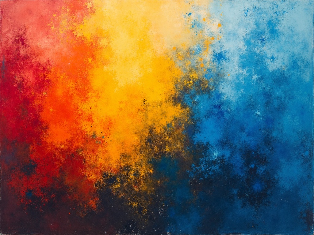
The Power of Primary Colors
The foundation of much of the color we perceive, the primary colors — red, yellow, and blue — each carry significant weight in the world of art.
Red: Passion, Power, and Danger
Red, the color of blood and fire, is perhaps the most emotionally charged of all hues. It screams passion, energy, and excitement. Think of the fiery reds in Delacroix’s Liberty Leading the People, igniting a sense of revolutionary fervor. But red also signifies danger, warning, and even violence. Its intensity can be both alluring and alarming. In many cultures, red is associated with power and royalty, demanding attention and respect.
Yellow: Joy, Intellect, and Treachery
Yellow is the color of sunshine, radiating optimism, happiness, and intellectual energy. It’s the color of enlightenment and creativity, often used to represent deities and wisdom. Think of Van Gogh’s sunflowers, bursting with vibrant yellow, conveying a sense of joy and the beauty of nature. However, yellow also has a darker side, sometimes associated with cowardice, deceit, and sickness. This duality makes yellow a complex and fascinating color in art.
Blue: Serenity, Sadness, and Spirituality
Blue, the color of the sky and sea, evokes feelings of peace, tranquility, and serenity. It’s often associated with spirituality, contemplation, and the infinite. Consider the calming blues in Monet’s water lilies, creating a sense of peaceful reflection. But blue can also represent sadness, melancholy, and isolation, giving rise to the term feeling blue. Its coolness and distance can create a sense of longing and introspection. [internal_link]
Secondary Colors: Blending Meanings
When primary colors intermingle, they give birth to secondary colors, each inheriting and transforming the meanings of their parent hues.
Green: Nature, Growth, and Envy
Born from the union of blue and yellow, green symbolizes nature, growth, and renewal. It represents life, fertility, and harmony. Think of the lush greens in Constable’s landscapes, conveying a sense of peace and connection to the natural world. But green also carries negative connotations, such as envy, jealousy, and inexperience, adding complexity to its symbolic representation.
Orange: Enthusiasm, Creativity, and Warning
A vibrant mix of red and yellow, orange exudes enthusiasm, creativity, and warmth. It’s a motivating color, often associated with energy, excitement, and optimism. Like red, however, orange can also serve as a warning signal, as seen in nature and cautionary signs, lending a touch of ambiguity to its otherwise cheerful persona.
Purple: Royalty, Mystery, and Spirituality
A blend of red and blue, purple has long been associated with royalty, power, and nobility. It also evokes feelings of mystery, spirituality, and intuition. Think of the regal purples in Byzantine mosaics, highlighting the divine power of the emperors. Purple can also represent mourning, wisdom and magic combining the passion of red with the serenity of blue to create a unique effect.
Beyond the Basics: Tertiary Colors and Nuances
The world of color extends far beyond the primary and secondary hues. Tertiary colors, created by mixing a primary color with a neighboring secondary color, add further depth and complexity to the artist’s palette. These subtle variations allow for an even more nuanced expression of emotion and meaning.
Warm vs. Cool: Emotional Temperature
Colors can be broadly divided into warm (reds, oranges, yellows) and cool (blues, greens, purples). Warm colors tend to be stimulating, exciting, and attention-grabbing, while cool colors are calming, soothing, and introspective. Artists often use this distinction to create a sense of emotional temperature within their work, guiding the viewer’s feelings and interpretations.
Light vs. Dark: Value and Contrast
The lightness or darkness of a color, known as its value, also plays a crucial role in conveying meaning. Light colors often represent purity, innocence, and hope, while dark colors can symbolize mystery, sadness, and even death. The contrast between light and dark, known as chiaroscuro, is a powerful technique used by artists to create depth, drama, and focus within their compositions.
Color Symbolism Across Cultures
It’s important to remember that color symbolism isn’t universal. Meanings can vary significantly across cultures and throughout history.
**White:In Western cultures, white is often associated with purity, innocence, and weddings. However, in some Eastern cultures, white is the color of mourning and death.
**Black:In the West, black is often associated with mourning, death, and evil. However, in some other contexts, it can represent sophistication, elegance, and power.
**Gold:Universally associated with wealth and luxury.
Understanding these cultural nuances is essential for accurately interpreting the artist’s intent and avoiding misinterpretations.
Decoding Color in Famous Artworks
Let’s examine some famous artworks and explore how color contributes to their overall meaning.
**The Starry Night by Vincent van Gogh:The swirling blues and yellows in this iconic painting evoke a sense of both wonder and turmoil, reflecting Van Gogh’s troubled state of mind. The vibrant yellows of the stars and moon offer a glimmer of hope amidst the overwhelming darkness of the night.
**Guernica by Pablo Picasso:The monochromatic palette of grays, blacks, and whites in this powerful anti-war painting creates a sense of bleakness, horror, and despair. The absence of color intensifies the emotional impact of the subject matter, emphasizing the tragedy of war.
**The Scream by Edvard Munch:The fiery red sky in this iconic painting symbolizes anxiety, fear, and existential dread. The distorted figure in the foreground, overwhelmed by the intensity of the color, expresses a profound sense of alienation and despair.
The Enduring Power of Color
The language of color in art is a complex and multifaceted system, capable of conveying a wide range of emotions, ideas, and cultural associations. By understanding the basic principles of color theory and the symbolic meanings of different hues, we can unlock a deeper appreciation for the artist’s intent and the artwork’s message. So, the next time you stand before a painting, take a moment to truly see the colors and consider the stories they are trying to tell. You might be surprised at what you discover. The power of color lies not just in its aesthetic beauty but also in its ability to communicate on a profound and often subconscious level, creating a powerful connection between the artist, the artwork, and the viewer.