Decoding the Art of Placement: How Artwork Size Should Harmonize with Your Furniture
Imagine this: you’ve finally found the *perfectpiece of art – a vibrant canvas bursting with color or a serene photograph that speaks to your soul. You rush home, eager to hang it above your sofa, only to realize… it looks utterly *wrong*. It’s either dwarfed by the expansive wall or awkwardly overpowering the furniture beneath it. The delicate balance between artwork size and furniture scale is often overlooked, but mastering this element is crucial for creating a cohesive and visually appealing space. Let’s unlock the secrets to achieving that perfect harmony.
The Importance of Scale and Proportion
Scale and proportion are fundamental principles of design, dictating how the size of objects relate to each other and to the overall space. When applied to interior design, these principles determine how well furniture and artwork complement one another. A mismatch in scale can lead to a jarring and unbalanced aesthetic, making a room feel either cramped and cluttered or cold and empty.
Think of it like this: a tiny postage stamp of a painting above a massive sectional sofa is visually lost, creating a feeling of emptiness and disproportion. Conversely, an enormous piece of art crammed above a petite loveseat can overwhelm the space and make the furniture feel insignificant. Getting the scale right is about finding that sweet spot where everything feels balanced and intentional.
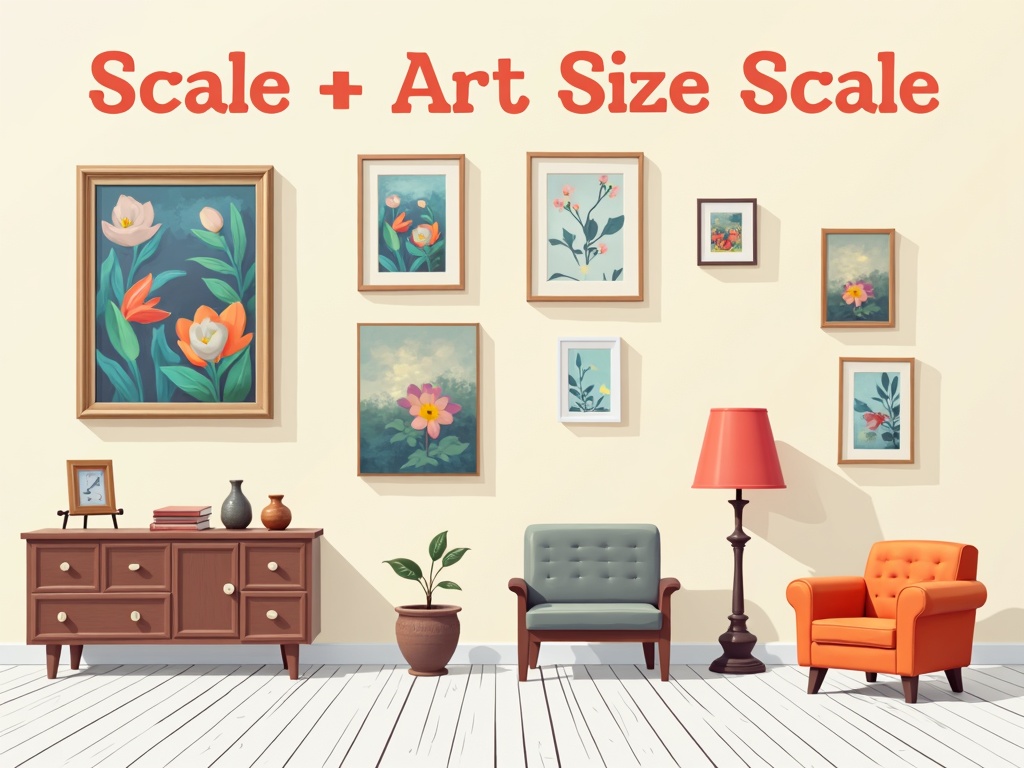
General Guidelines: Artwork Size Above Sofas and Consoles
While there are no hard-and-fast rules, these guidelines offer a solid starting point for determining the appropriate artwork size for placement above sofas and consoles:
- The 2/3 to 3/4 Rule: A common rule suggests that the width of the artwork (or grouping of artworks) should be approximately 2/3 to 3/4 the width of the furniture beneath it. For example, if your sofa is 84 inches wide, your artwork should ideally be between 56 and 63 inches wide.
- Consider the Height: Don’t just think about width. The height of the artwork should also be proportional to the height of the furniture and the ceiling height. A very tall and narrow piece might look awkward above a low, wide sofa.
- Leave Breathing Room: Allow some space between the edges of the artwork and the edges of the furniture. A gap of 6-12 inches on each side typically works well. This creates visual breathing room and prevents the arrangement from feeling cramped.
These guidelines are, of course, starting points. Ultimately, the best size will depend on your personal taste and the specific characteristics of your space.
Examples in Practice
Let’s consider some specific examples:
- Sofa: 90-inch wide sectional
- Ideal Artwork Width: 60-68 inches
- Console Table: 48-inch wide entry console
- Ideal Artwork Width: 32-36 inches
- Bed Headboard (Queen): Approximately 60 inches wide
- Ideal Artwork Width: 40-45 inches
Remember to adjust these measurements based on the height of the furniture and the overall scale of the room.
Artwork Size Above Beds: Creating a Bedroom Sanctuary
The bedroom is a space for relaxation and rejuvenation, so artwork should contribute to a sense of calm and balance. The principles for artwork size above beds are similar to those for sofas, but with a few subtle differences.
**Centered Placement: Typically, artwork is centered above the bed headboard.
**Consider the Headboard: A tall, ornate headboard may require a smaller piece of art than a low, minimalist headboard.
**Vertical Orientation: While horizontal pieces work well, a single vertical piece can add height and drama to the room.
A common mistake is hanging a very small piece of art above a large bed. This can make the bed feel disproportionately large and the artwork insignificant. Consider a diptych (two-panel piece) or triptych (three-panel piece) to fill the space more effectively.
Hanging Height: The Eye-Level Rule
Once you’ve determined the appropriate artwork size, the next crucial step is hanging it at the correct height. The general rule of thumb is to hang artwork so that its center is at eye level. This usually translates to about 57 to 60 inches from the floor.
However, there are exceptions to this rule:
- Above Furniture: When hanging artwork above a sofa, console, or bed, the bottom of the frame should typically be 6-12 inches above the top of the furniture. This creates a visual connection between the artwork and the furniture.
- Ceiling Height: In rooms with high ceilings, you may need to hang artwork slightly higher to maintain a sense of proportion.
- Personal Preference: Ultimately, the best hanging height is the one that looks and feels right to you. Don’t be afraid to experiment and adjust the height until you achieve the desired effect. [internal_link]
Grouping Artwork: Creating a Gallery Wall Effect
Instead of a single large piece, you might opt for a grouping of smaller artworks. This is a fantastic way to add visual interest and personality to a space. When creating a gallery wall, consider the following:
- Overall Shape: Before you start hammering nails, lay out the artwork on the floor to experiment with different arrangements. Aim for a cohesive overall shape, such as a rectangle, square, or organic form.
- Spacing: Maintain consistent spacing between the frames. A gap of 2-4 inches typically works well.
- Mix and Match: Don’t be afraid to mix different styles, sizes, and frame colors. This can create a more eclectic and visually dynamic display.
- Consider the Furniture: Adapt guidelines mentioned for single artworks to your group.
The cumulative width and height, when considering the grouping, must correspond to the width of the furniture, respecting the 2/3 to 3/4 rule.
Accounting for Room Size and Wall Space
The size of your room and the amount of available wall space will also influence your artwork choices. In a small room, a single, well-placed piece of art can be more effective than a cluttered gallery wall. In a large room, you may need a larger piece or a more expansive grouping to fill the space adequately.
**Large Rooms:Benefit from oversized artwork or multiple pieces to avoid feeling empty.
**Small Rooms: Require smaller-scale art to prevent overwhelming the space. Consider vertical pieces to draw the eye upward and create the illusion of height.
**Wall Color: Darker walls can make artwork appear smaller, while lighter walls can make it appear larger.
The Impact of Frame Size and Style
The frame around your artwork can significantly impact its overall size and visual presence. A thick, ornate frame will add more visual weight than a thin, minimalist frame.
**Frame Color:A frame that contrasts sharply with the artwork can make it stand out more, while a frame that blends in can create a more subtle effect.
**Frame Style:Consider the style of your furniture and décor when choosing a frame. A modern piece of art might look best in a simple, contemporary frame, while a traditional piece might benefit from a more ornate frame.
**Matting:The width of the matting around your artwork can also affect its perceived size. A wider matting can make a smaller piece of art feel more substantial.
Beyond the Rules: Trusting Your Eye
While guidelines and rules are helpful, ultimately, choosing artwork and determining its size is a matter of personal taste. Don’t be afraid to break the rules and experiment with different arrangements until you find something that you love.
**Visual Mockups:Use painter’s tape or paper cutouts to visualize how different sizes and arrangements will look on your wall before you commit to hanging anything.
**Take Photos:Snap photos of your room with different artwork options and arrangements. This can help you see the space with fresh eyes and identify any imbalances.
**Seek Feedback:Ask friends or family for their opinions. A fresh perspective can be invaluable.
The most important thing is to create a space that reflects your personality and style.
Common Mistakes to Avoid
Let’s make sure to side-step some common blunders. Keep an eye out for these potential misses:
**Hanging artwork too high:This is one of the most common mistakes. Your art should feel connected to the furniture beneath it, not floating awkwardly above it.
**Choosing artwork that is too small:A tiny piece of art above a large sofa will simply get lost.
**Ignoring the style of the room:Your artwork should complement the overall style of your décor.
**Hanging artwork in direct sunlight:This can cause the colors to fade over time.
**Using the wrong hanging hardware:Make sure you use appropriate hardware for the weight and size of your artwork. It is important to consider the wall type you are working with, and its weight capacity.
Final Thoughts: Creating Harmony Through Art
Achieving the perfect balance between artwork size and furniture scale is an art in itself. By understanding the principles of scale and proportion, following the guidelines outlined above, and trusting your own eye, you can create a space that is both visually appealing and personally meaningful. Remember, artwork is more than just decoration; it’s an expression of your personality and style. So, take your time, experiment with different options, and create a home that you truly love.