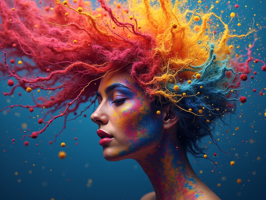
Color Psychology and Its Effect on Human Behavior
Imagine walking into a room and instantly feeling a sense of calm wash over you, or perhaps a surge of energy that invigorates your senses. Unbeknownst to many, this immediate reaction could be attributed to the pervasive influence of color. Color psychology delves into the profound impact that colors wield over our emotions, behaviors, and perceptions. It’s a field that artists, marketers, and designers alike leverage to evoke specific responses, shaping our experiences in subtle yet powerful ways.
The Basics of Color Psychology
At its core, color psychology explores how different hues can affect our mental state. It’s not an exact science, as individual responses to color can be highly subjective, influenced by personal experiences, cultural differences, and even age. However, there are certain universal trends that have been observed and documented, forming the foundation of this fascinating field.
What is Color Association?
Color association is the process by which we link colors to feelings, memories, or ideas. For instance, blue is often associated with tranquility and stability, while red might evoke feelings of excitement or passion. These associations are not arbitrary; they often stem from our experiences in the natural world – the blue of the ocean, the red of fire. As an example, a painter creating a serene landscape might emphasize blues and greens to foster a sense of peace and harmony. These associations play a pivotal role in how we interpret the world around us and react to it. [internal_link]
The Psychological Effects of Different Colors
Each color on the spectrum carries its own unique set of psychological effects. Understanding these effects is crucial for anyone looking to influence mood or behavior through visual means.
Red: Energy and Excitement
Red is a high-energy color that is associated with excitement, passion, and sometimes even anger. It can raise blood pressure and increase heart rate, making it a stimulating choice. In marketing, red is often used to grab attention and create a sense of urgency.
- Positive Associations: Passion, love, excitement, courage
- Negative Associations: Anger, danger, aggression
- Use Cases: Sales promotions, calls to action, energy drinks
Blue: Calm and Trust
Blue is widely recognized as a calming color, often associated with trust, stability, and peace. It can lower blood pressure and heart rate, creating a sense of tranquility. This makes blue a popular choice for corporate settings and healthcare environments.
- Positive Associations: Trust, peace, stability, intelligence
- Negative Associations: Sadness, coldness, aloofness
- Use Cases: Corporate branding, hospitals, spas
Green: Nature and Balance
Green is strongly linked to nature, growth, and balance. It evokes feelings of harmony, renewal, and well-being. Green is often used to represent health and eco-friendliness, making it a common choice for environmental organizations and natural products.
- Positive Associations: Nature, health, balance, growth
- Negative Associations: Envy, jealousy, inexperience
- Use Cases: Environmental branding, health products, relaxation areas
Yellow: Optimism and Happiness
Yellow is a bright and cheerful color associated with optimism, happiness, and energy. It can stimulate the mind and promote creativity. However, yellow can also be overwhelming if overused, potentially leading to feelings of anxiety.
- Positive Associations: Happiness, optimism, energy, creativity
- Negative Associations: Anxiety, impulsiveness, deceit
- Use Cases: Child-friendly products, creative spaces, highlighting information
Purple: Luxury and Wisdom
Purple is often associated with royalty, luxury, and wisdom. It evokes feelings of sophistication, creativity, and spirituality. Purple can also be mysterious and intriguing, making it a popular choice for high-end brands and artistic endeavors.
- Positive Associations: Luxury, wisdom, creativity, spirituality
- Negative Associations: Mystery, moodiness, arrogance
- Use Cases: Luxury brands, spiritual centers, artistic projects
Orange: Enthusiasm and Creativity
Orange combines the energy of red and the happiness of yellow. It it associated with enthusiasm, creativity, success, and encouragement.
- Positive Associations: Energy, happiness, creativity, success
- Negative Associations: Frustration, thoughtlessness
- Use Cases: Sport brands, children products
Black: Power and Elegance
Black is frequently linked with power, sophistication, and mystery. It is seen as an elegant and timeless color, often used in high-end fashion and design.
- Positive Associations: Elegance, power, sophistication
- Negative Associations: Death, evil, mystery
- Use Cases: High-end brands, fashion products
Color Psychology in Art
Artists have long understood the power of color to evoke emotions and convey meaning in their work. The strategic use of color can transform a painting from a simple representation of reality into a deeply moving and thought-provoking piece.
Color Temperature
Color temperature refers to the warmth or coolness of a color. Warm colors like red, orange, and yellow tend to evoke feelings of energy, excitement, and passion. Cool colors like blue, green, and purple, on the other hand, tend to evoke feelings of calm, peace, and serenity. Artists often use color temperature to create contrast and depth in their work.
Color Harmony
Color harmony refers to the way different colors interact with each other. Harmonious color combinations create a sense of balance and unity, while disharmonious combinations can create tension and conflict. Artists often use color theory principles like complementary colors, analogous colors, and triadic colors to create visually appealing and emotionally resonant compositions.
Examples in Art History
Throughout art history, numerous artists have masterfully employed color psychology to enhance the impact of their work:
- Vincent van Gogh: Known for his expressive use of color to convey emotion, Van Gogh used vibrant yellows and oranges in The Starry Night to evoke a sense of energy and passion, while the deep blues create a contrast of peace.
- Pablo Picasso: During his Blue Period, Picasso used predominantly blue tones to express feelings of melancholy and despair, reflecting his personal struggles at the time.
- Mark Rothko: Rothko’s abstract expressionist paintings often feature large blocks of color designed to evoke deep emotional responses in the viewer, using reds and oranges to stimulate different subconscious feelings.
Color Psychology in Marketing and Branding
In the world of marketing and branding, color psychology is a critical tool for shaping consumer perceptions and driving purchasing decisions. Companies carefully select colors for their logos, websites, and advertising campaigns to create a specific brand image and connect with their target audience.
Logo Design
The colors used in a logo can communicate a company’s values, personality, and mission. For example, a tech company might use blue to convey trust and reliability, while a food brand might use red or yellow to stimulate appetite and create a sense of excitement.
Website Design
The color scheme of a website can influence user behavior and engagement. A well-designed website uses color strategically to guide visitors through the site, highlight important information, and create a positive user experience. For example, using green for call-to-action buttons can encourage visitors to take a desired action.
Advertising Campaigns
The colors used in advertising campaigns can evoke specific emotions and associations in viewers. By understanding the psychological effects of different colors, marketers can create ads that resonate with their target audience and drive sales. For example, using warm colors like orange and yellow in a fast-food advertisement can stimulate appetite and create a sense of urgency.
The Cultural Context of Color
While some color associations are universal, others are highly influenced by cultural context. What one color symbolizes in one culture may be entirely different in another. It’s important to be aware of these cultural differences when using color in a global context.
Examples of Cultural Differences
- White: In Western cultures, white is often associated with purity and innocence, making it a popular choice for weddings. However, in some Eastern cultures, white is associated with mourning and is worn at funerals.
- Red: In Western cultures, red can symbolize passion and excitement. In China, red is considered a lucky color and is often used during celebrations like Chinese New Year.
- Purple: In Western cultures, purple is often associated with royalty and luxury. In Thailand, purple is a color of mourning and is worn by widows.
Conclusion: Harnessing the Power of Color
Color psychology offers a fascinating glimpse into the subtle yet profound ways that colors influence our emotions, behaviors, and perceptions. Whether you’re an artist seeking to evoke a specific mood in your work, a marketer aiming to connect with your target audience, or simply someone looking to create a more harmonious living space, understanding the psychological effects of color can be a powerful tool. By harnessing the power of color, we can shape our experiences and enhance our well-being in countless ways. So, the next time you choose a color, consider the message you’re sending and the impact it may have.