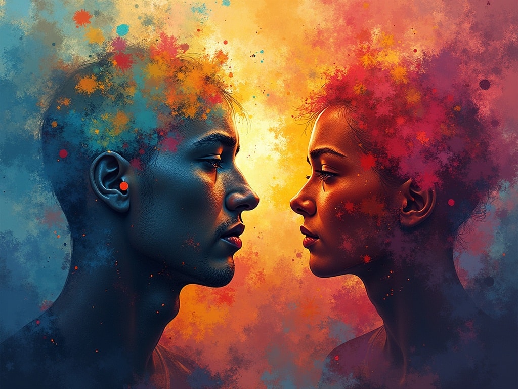
The Psychological Effects of Colors: How Art Evokes Emotion
Imagine stepping into a room washed in vibrant red. Does your heart rate quicken? Do you feel a surge of energy? Now picture a serene space bathed in cool blues and greens. Does a sense of calm wash over you? Colors, far from being mere aesthetic choices, wield significant power over our emotions and perceptions. In the world of art, understanding these psychological effects is paramount to crafting pieces that resonate deeply with viewers.
The Science Behind Color Psychology
Color psychology posits that colors have the ability to influence our feelings, behaviors, and even physiological reactions. While individual experiences and cultural backgrounds can play a role in how we perceive color, there are certain universal associations rooted in biology and evolution.
For example, the color red is often linked to passion, excitement, and even danger. This association likely stems from our ancestors’ primal understanding of blood as a warning sign. Conversely, blue is often associated with the sky and sea, evoking feelings of tranquility and openness. These inherent connections, while not absolute, form a foundation for how we experience color on a fundamental level.
The Role of Culture and Personal Experience
It’s important to recognize that color associations are not solely based on biology. Cultural factors and personal experiences can heavily influence our perception of color. In Western cultures, white is traditionally associated with purity and weddings, while in some Eastern cultures, it signifies mourning. Similarly, a person who had a traumatic experience involving a yellow car may develop a negative association with that color.
Decoding the Emotional Spectrum: A Color-by-Color Guide
Let’s delve into the specific psychological effects of individual colors and how they are often utilized in art:
Red: Passion, Energy, and Intensity
Red is a high-energy color that commands attention. It can evoke feelings of passion, excitement, and love, but also anger, danger, and aggression. In art, red can be used to create a sense of drama, urgency, or power. Think of the fiery landscapes of J.M.W. Turner or the passionate embraces in Gustav Klimt’s paintings.
Blue: Calm, Serenity, and Trust
Blue is often associated with peace, tranquility, and stability. It can evoke feelings of calmness, serenity, and trust. In art, blue is often used to create a sense of depth, space, or melancholy. Consider the vast, calming seascapes of Claude Monet’s Impressionist paintings or the introspective Blue Period of Pablo Picasso.
Yellow: Optimism, Joy, and Energy
Yellow is a cheerful, optimistic color that can evoke feelings of happiness, joy, and energy. However, it can also be associated with caution, jealousy, and anxiety. In art, yellow can be used to create a sense of warmth, light, or playfulness. Think of the radiant sunflowers of Vincent van Gogh or the vibrant, sunny landscapes of Impressionist painters.
Green: Nature, Growth, and Balance
Green is strongly associated with nature, growth, and harmony. It can evoke feelings of peace, tranquility, and renewal. In art, green is often used to represent the natural world, convey a sense of balance, or symbolize hope. Consider the lush landscapes of the Hudson River School painters or the tranquil garden scenes of Claude Monet.
Orange: Enthusiasm, Creativity, and Warmth
Orange is a vibrant and energetic color that combines the passion of red with the cheerfulness of yellow. It can evoke feelings of enthusiasm, creativity, and warmth. In art, orange can be used to create a sense of energy, excitement, or playfulness. Think of the bold, expressive use of orange in the works of the Fauvist painters or the fiery sunsets in the paintings of Frederic Church.
Purple: Royalty, Mystery, and Spirituality
Purple is often associated with royalty, luxury, and spirituality. It can evoke feelings of mystery, creativity, and wisdom. In art, purple can be used to create a sense of drama, intrigue, or spirituality. Consider the regal portraits of Queen Elizabeth I, often depicted in rich purple robes, or the mystical landscapes of the Symbolist painters.
Black: Power, Elegance, and Mystery
Black is a powerful and versatile color that can evoke a range of emotions, from sophistication and elegance to mystery and mourning. In art, black can be used to create a sense of drama, contrast, or depth. Think of the stark, powerful lines in the woodcuts of Albrecht Dürer or the dramatic shadows in the paintings of Caravaggio.
White: Purity, Innocence, and Cleanliness
White is often associated with purity, innocence, and cleanliness. It can evoke feelings of peace, serenity, and simplicity. In art, white can be used to create a sense of spaciousness, light, or purity. Consider the minimalist sculptures of Donald Judd or the serene, ethereal paintings of Agnes Martin.
Color Combinations and Their Psychological Impact
The psychological effects of color are not limited to individual colors alone. The way colors are combined can also significantly impact the overall mood and message of a piece of art.
Complementary Colors: Creating Contrast and Energy
Complementary colors, such as red and green, blue and orange, and yellow and purple, are opposite each other on the color wheel. When used together, they create a strong sense of contrast and energy. Artists often use complementary color schemes to draw attention to specific areas of their work or to create a dynamic and visually stimulating effect.
Analogous Colors: Harmony and Balance
Analogous colors are those that are adjacent to each other on the color wheel, such as blue, blue-green, and green. When used together, they create a sense of harmony and balance. Artists often use analogous color schemes to create a calming, serene, or unified effect.
Triadic Colors: Vibrant and Playful
Triadic colors are three colors that are equally spaced apart on the color wheel, such as red, yellow, and blue. When used together, they create a vibrant and playful effect. Artists often use triadic color schemes to create a dynamic and visually engaging composition.
Using Color Psychology in Art: Techniques and Considerations
Understanding the psychological effects of colors can be a powerful tool for artists, but it’s important to use this knowledge thoughtfully and intentionally. Here are some techniques and considerations to keep in mind:
- Consider the overall message: What emotions or ideas do you want to evoke with your artwork? Choose colors that align with your intended message.
- Think about the target audience: Who are you creating this art for? Consider their cultural background, personal experiences, and potential associations with different colors.
- Experiment with different color combinations: Don’t be afraid to try different color schemes and see how they affect the overall mood and impact of your work.
- Observe the effects of color in everyday life: Pay attention to how colors make you feel in different environments and situations. This can help you develop a deeper understanding of color psychology.
- Trust your intuition: While it’s helpful to understand the general principles of color psychology, ultimately, the best way to use color in your art is to trust your own instincts and creative vision [internal_link].
Examples of Color Psychology in Famous Artworks
Many famous artists have masterfully employed color psychology to enhance the emotional impact of their works. Here are a few examples:
- Vincent van Gogh’s The Starry Night: The use of deep blues and swirling yellows creates a sense of both tranquility and turmoil, reflecting Van Gogh’s own emotional state.
- Edvard Munch’s The Scream: The intense reds and oranges in the sky evoke feelings of anxiety, fear, and despair, mirroring the subject’s emotional distress.
- Pablo Picasso’s The Blue Period: The monochromatic blue palette conveys a sense of melancholy, sadness, and isolation, reflecting Picasso’s personal struggles during this period.
- Claude Monet’s Impression, Sunrise: The soft blues and oranges create a sense of tranquility and peace, capturing the fleeting beauty of a sunrise over the harbor.
The Enduring Power of Color
The psychological effects of colors are a powerful force that can shape our emotions, perceptions, and behaviors. By understanding these effects, artists can create works that resonate deeply with viewers, evoking a wide range of emotions and conveying complex ideas. As you continue to explore the world of art, pay close attention to the colors that surround you and the emotions they evoke. You’ll discover a whole new level of appreciation for the artistry and skill that goes into creating truly impactful works of art.