Painting Your Feelings: How Mood Enhancing Colors in Art Affect Us
Imagine stepping into a room washed in vibrant blues, instantly feeling a sense of calm wash over you. Or perhaps a space bursting with yellows, filling you with an irrepressible sense of joy and optimism. Color, an elemental force in art, possesses the remarkable power to evoke profound emotions and shape our perceptions. But how exactly do artists harness this power? And how can we, as viewers, become more attuned to the subtle language of [mood enhancing colors in art]?
This exploration delves into the fascinating world of color psychology and its profound impact on the emotional experience of art. We’ll uncover the secrets behind how different hues affect our moods, explore the techniques artists use to manipulate these effects, and learn how to consciously engage with color to enrich our own emotional landscape.
The Psychology of Color: A Primer
Color psychology is the study of how colors influence human behavior and emotions. It’s a complex field, fraught with nuances and cultural variations. However, certain fundamental associations tend to hold true across a broad spectrum of individuals.
Warm Colors: Invigorating and Energetic
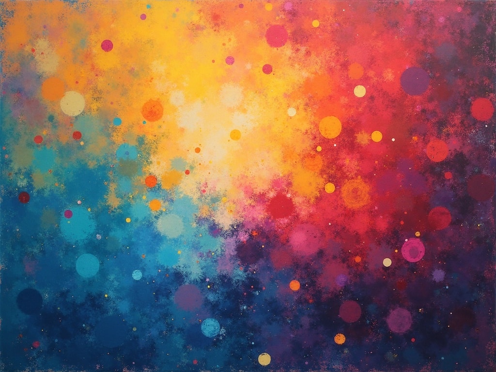
Red, orange, and yellow, often referred to as warm colors, are typically associated with energy, passion, joy, and excitement.
**Red:This bold color often signifies passion, love, anger, and excitement. It can also symbolize danger or warning. In art, red can be used to create a sense of urgency or to draw the viewer’s attention to a specific focal point.
**Orange:A blend of red and yellow, orange suggests enthusiasm, warmth, and creativity. It can be associated with autumn and harvest, evoking feelings of abundance and comfort.
**Yellow:Radiating optimism and happiness, yellow is linked to intellect, energy, and sunshine. However, it can also represent caution or deceit depending on the shade and context.
Cool Colors: Calming and Serene
Blue, green, and purple, the cool colors, generally evoke feelings of peace, tranquility, and harmony.
**Blue:Associated with the sky and the sea, blue is often linked to serenity, stability, and trust. It can promote feelings of calm and relaxation, but darker shades may also suggest sadness or melancholy.
**Green:Representing nature and growth, green symbolizes balance, harmony, and renewal. It can evoke feelings of peace, safety, and well-being.
**Purple:A color of royalty and spirituality, purple is often associated with creativity, wisdom, and mystery. Light shades of purple can evoke feelings of romance and nostalgia, while darker shades may suggest sophistication and power.
Neutral Colors: Balancing and Grounding
Black, white, gray, and beige serve as grounding elements, providing contrast and balance to bolder hues.
**Black:Associated with power, elegance, and mystery, black can also represent mourning or negativity. It is often used to create contrast and define shapes in art.
**White:Symbolizing purity, innocence, and cleanliness, white can also represent new beginnings and hope. In art, white is often used to create a sense of space and light.
**Gray:A neutral color, gray can represent neutrality, balance, and sophistication. It can also evoke feelings of boredom or detachment.
**Beige:A warm neutral, beige is often associated with comfort, simplicity, and practicality. It can create a sense of calm and understated elegance.
How Artists Use Mood Enhancing Colors in Art
Artists consciously manipulate color to create specific emotional responses in viewers. They achieve this through several key techniques:
Color Harmony and Contrast
The way colors are combined plays a crucial role in the overall mood of a piece. Harmonious color schemes, such as analogous colors (colors that are next to each other on the color wheel), create a sense of unity and peace. Complementary colors (colors that are opposite each other on the color wheel), on the other hand, create high contrast and can evoke feelings of excitement and energy.
Color Temperature
As mentioned earlier, warm and cool colors have distinct emotional associations. Artists can use these associations to create specific moods. A painting dominated by cool blues and greens will likely evoke a sense of calm and tranquility, while a painting filled with warm reds and oranges will likely evoke feelings of energy and passion.
Color Saturation and Value
Saturation refers to the intensity of a color. Highly saturated colors are vibrant and bold, while desaturated colors are muted and subtle. Value refers to the lightness or darkness of a color. Artists use saturation and value to create depth, contrast, and emotional emphasis. A painting with high saturation and strong value contrasts will likely feel more dynamic and intense than a painting with low saturation and subtle value gradations.
Color Symbolism
Colors often carry cultural and personal symbolic meanings. Artists may use these symbols to communicate specific ideas or emotions. For example, gold is often associated with wealth and divinity, while purple is often associated with royalty and spirituality. Understanding these symbolic associations can enhance our understanding of an artwork’s emotional message.
Examples of Mood Enhancing Colors in Art Throughout History
Throughout art history, many artists have masterfully manipulated color to evoke specific emotions. Here are a few notable examples:
Vincent van Gogh: Expressing Turmoil Through Color
Van Gogh was a master of using color to express his inner turmoil. His vibrant, emotionally charged paintings, such as *The Starry Night*, are a testament to the power of color to convey intense feelings. The swirling blues and yellows in *The Starry Nightevoke a sense of both wonder and anxiety, reflecting Van Gogh’s troubled state of mind.
Claude Monet: Capturing the Fleeting Nature of Light and Emotion
Monet, an impressionist painter, was fascinated by the way light and color interact. His series of paintings of water lilies at Giverny captures the ever-changing moods of nature through subtle variations in color. The soft blues, greens, and purples in these paintings evoke a sense of peace and tranquility for viewers.
Mark Rothko: Abstract Expressionism and the Power of Color Fields
Rothko’s abstract expressionist paintings are characterized by large fields of color that evoke profound emotional responses. He believed that color could communicate directly with the viewer, bypassing the need for representational imagery. His paintings often evoke feelings of awe, wonder, and even spiritual transcendence.
Frida Kahlo: Using Color to Convey Personal Pain and Resilience
Kahlo’s self-portraits often use bold and symbolic colors to convey her personal pain and resilience. The use of dark colors like black and brown highlights the serious tone of her pieces, helping to convey feelings of grief and suffering. At the same time, the contrast of warm and bright colors, such as gold, red and yellow help symbolize the resilience of her spirit.
Beyond the Canvas: Color’s Influence in Everyday Life
The principles of color psychology extend far beyond the realm of art. Color plays a significant role in our everyday lives, influencing our purchasing decisions, our moods, and even our physical health.
**Marketing and Branding:Companies use color strategically to create specific brand identities and influence consumer behavior. For example, fast-food restaurants often use red and yellow to stimulate appetite, while banks often use blue to convey trust and stability.
**Interior Design:The colors we choose for our homes and workplaces can significantly impact our moods and productivity. Cool colors like blue and green are often used in bedrooms to promote relaxation, while warm colors like yellow and orange are often used in living rooms and kitchens to create a sense of warmth and energy.
**Fashion:The colors we wear can influence how we feel and how others perceive us. Wearing bright colors can boost our mood and make us feel more confident, while wearing neutral colors can create a sense of professionalism and sophistication.
How to Cultivate Color Awareness
Becoming more attuned to the emotional language of color can enrich our experiences with art and enhance our understanding of ourselves. Here are a few tips for cultivating color awareness:
**Pay Attention to Your Reactions:Start noticing how different colors make you feel. Do certain colors evoke feelings of happiness, sadness, or anger? Keep a journal to record your observations.
**Explore Different Artworks:Visit museums and galleries and pay close attention to the colors used in different artworks. How do the colors contribute to the overall mood and message of the piece?
**Experiment with Color:Try painting, drawing, or even just playing with colored pencils. Explore different color combinations and see how they make you feel.
**Read About Color Theory:There are many excellent books and articles available on color theory and color psychology. Learning more about the technical aspects of color can deepen your understanding of its emotional impact. Explore color wheels, learn about hue, saturation and value, and become familiar with color schemes.
[internal_link]
**Consider Cultural Context:Remember that color associations can vary across cultures. Be mindful of these differences when interpreting the emotional meaning of color in art.
Conclusion: Embracing the Emotional Spectrum of Color
[Mood enhancing colors in art] are more than just aesthetic elements; they are powerful tools that artists use to communicate emotions and shape our perceptions. By understanding the psychology of color and cultivating our own color awareness, we can unlock a deeper appreciation for art and enrich our emotional landscapes. So, the next time you stand before a painting, take a moment to truly *seethe colors and let them speak to your soul. You might be surprised by what they reveal.