The Art of Harmony: Coordinating Art with Your Home Decor
Have you ever walked into a room and felt an instant sense of calm and harmony? Chances are, the art and decor were working together seamlessly. But achieving that perfect balance can feel like navigating an artistic minefield. How do you choose pieces that complement your existing furniture, color schemes, and personal style? Fear not! This guide will illuminate the path to creating a cohesive and visually stunning space where your art and decor sing in perfect harmony.
Understanding Your Style Foundation
Before diving into the world of art selection, it’s crucial to understand the existing style of your home. Ask yourself: What is the dominant aesthetic? Is it modern, minimalist, bohemian, traditional, or eclectic? Identifying your core style will serve as a guiding principle as you explore different art options.
Analyzing Your Existing Decor
Take a close look at your furniture, textiles, and accessories. Consider the following:
- Color Palette: What are the primary and secondary colors in your space? Are they warm and inviting, cool and calming, or bold and energetic?
- Materials and Textures: Are your furniture pieces made of wood, metal, glass, or a combination? Do you have plush velvet sofas, rustic linen curtains, or sleek leather chairs?
- Patterns and Prints: Are there any recurring patterns or prints in your rugs, wallpaper, or throw pillows?
- Architectural Style: Does your home have modern, clean lines or ornate, traditional details?
By answering these questions, you’ll gain a clearer understanding of your existing decor’s personality and be better equipped to choose art that complements it.
The Color Connection: Harmonizing Hues
Color is a powerful tool when it comes to coordinating art with decor. There are several approaches you can take:
- Complementary Colors: Choose artwork that features colors opposite each other on the color wheel (e.g., blue and orange, red and green). This creates a vibrant and dynamic contrast.
- Analogous Colors: Opt for artwork with colors that sit next to each other on the color wheel (e.g., blue, blue-green, and green). This creates a harmonious and soothing effect.
- Monochromatic Colors: Select artwork that utilizes different shades and tints of a single color. This creates a sophisticated and understated look.
- Neutral Colors: Introduce artwork with neutral colors like black, white, gray, and beige to balance out a bold and colorful space.
Consider the undertones of your existing decor when choosing artwork. For example, if your walls are painted with a warm gray, opt for artwork with warm undertones (e.g., earth tones, reds, oranges) to create a cohesive look.
Scale and Proportion: Finding the Right Fit
The size and scale of your artwork are crucial to consider. A piece that’s too small will get lost in a large space, while a piece that’s too large can overwhelm a small room. Here are some guidelines:
- Wall Size: As a general rule, artwork should take up about two-thirds to three-quarters of the available wall space.
- Furniture Placement: When hanging artwork above a sofa or console table, the bottom of the frame should be approximately 6-12 inches above the furniture.
- Ceiling Height: In rooms with high ceilings, consider using larger, vertical pieces of art to visually fill the space.
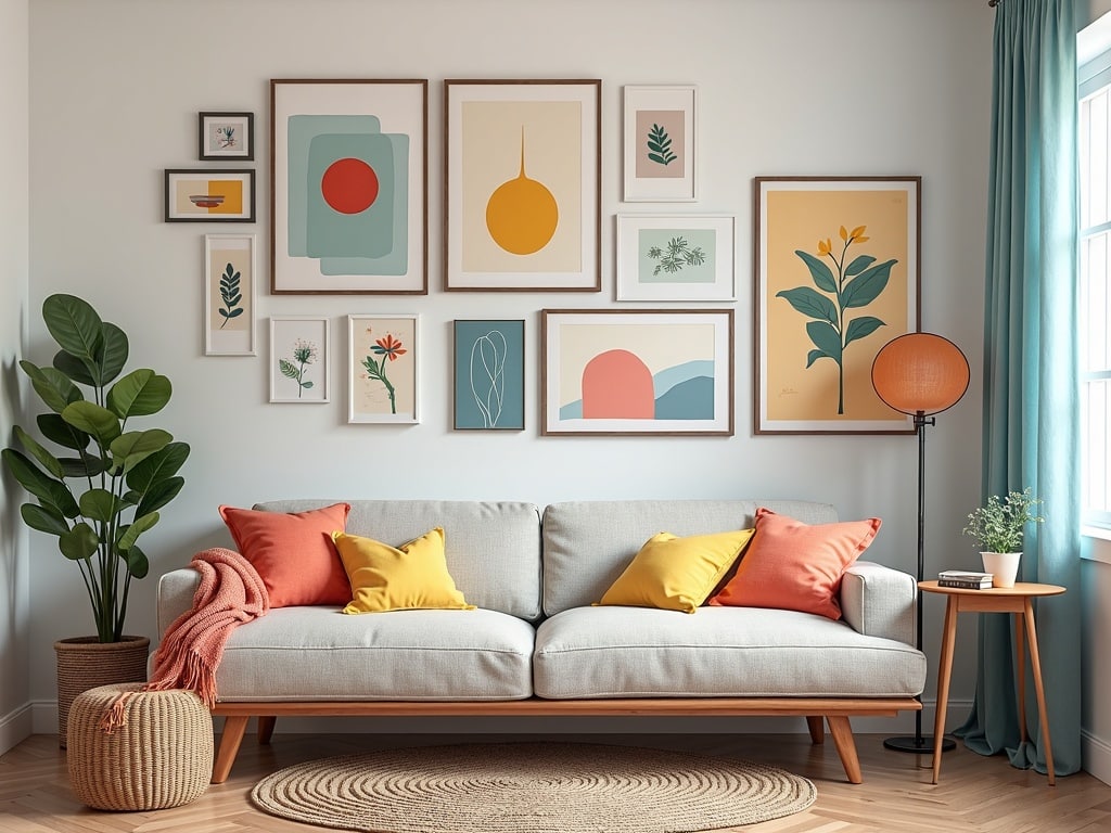
Don’t be afraid to experiment with different sizes and arrangements. You can create a gallery wall with a collection of smaller pieces or make a statement with a single, oversized artwork.
Texture and Materiality: Adding Depth and Interest
Texture and materiality play a vital role in creating a visually rich and engaging space. Consider how the textures and materials in your artwork complement those in your existing decor.
- Wood Frames: Add warmth and natural texture to a space.
- Metal Frames: Introduce a touch of modernity and sleekness.
- Canvas Art: Offers a classic and timeless look.
- Mixed Media Art: Combines different materials and textures for a unique and tactile experience.
If your room features a lot of smooth, polished surfaces, consider adding artwork with more texture to create visual interest. Conversely, if your room is filled with rough and rustic textures, opt for artwork with smoother surfaces to provide a balance.
Framing Considerations: Completing the Look
The frame you choose for your artwork can significantly impact its overall appearance and how well it integrates with your decor. Consider the following:
- Frame Style: Choose a frame style that complements both the artwork and your existing decor. For example, a sleek, minimalist frame would be ideal for a modern space, while an ornate, gilded frame would be more appropriate for a traditional setting.
- Frame Color: Select a frame color that either complements or contrasts with the colors in the artwork and your decor. A neutral frame (e.g., black, white, silver) is a safe bet that will work in most spaces.
- Matting: Consider adding a mat to your artwork. A mat can help to separate the artwork from the frame and create a more polished look.
Think about the material of the frame as well. Wooden frames add warmth, while metal frames offer a more contemporary feel.
[internal_link]
Lighting: Illuminating Your Art’s Beauty
Proper lighting is essential for showcasing your artwork and enhancing its impact. Consider the following lighting options:
- Track Lighting: Provides flexible and adjustable lighting that can be directed at specific pieces of art.
- Picture Lights: Designed to be mounted above artwork and provide focused illumination.
- Recessed Lighting: Offers a clean and unobtrusive way to light artwork.
- Natural Light: Can be used to highlight artwork, but be mindful of potential fading from prolonged exposure to direct sunlight.
Experiment with different lighting angles and intensities to find what works best for your artwork. Avoid using harsh, direct lighting that can create glare and wash out the colors.
Personal Style: The Ultimate Deciding Factor
While these guidelines can be helpful, the most important factor in coordinating art with decor is your personal style. Choose artwork that you love and that reflects your unique personality and taste. After all, your home should be a reflection of you!
Breaking the Rules (Tastefully)
Don’t be afraid to break the rules and experiment with unexpected combinations. Sometimes, the most striking and memorable spaces are those that defy convention. If you love a particular piece of art but it doesn’t perfectly match your decor, find a way to make it work. You can tie it in by repeating a color or texture from the artwork in other elements of the room.
Creating a Cohesive Narrative
Think of your art and decor as pieces of a larger narrative. They should work together to tell a story and create a cohesive atmosphere. Consider the overall mood and feeling you want to evoke in your space. Do you want it to be calming and serene, or vibrant and energetic?
By carefully considering the color, scale, texture, and style of your art, you can create a space that is both visually stunning and deeply personal. So, go ahead and embrace the art of harmony and transform your home into a masterpiece!