Ever wonder how some artists make their work just pop with color, or how they get those super subtle shade changes? A lot of it comes down to understanding tertiary colors meaning in art. These aren’t just random shades; they’re a whole class of colors that can really change how your art looks and feels. If you’re ready to make your artwork more interesting and give it that extra something, getting a handle on tertiary colors is a great next step. Let’s dig in and see what they’re all about!
Key Takeaways
- Tertiary colors are made by mixing a primary color with a secondary color, like yellow and green making yellow-green.
- There are six main tertiary colors, and each one has its own vibe and can make people feel different things.
- Using tertiary colors can add a lot of depth and richness to your artwork, making it look more professional.
- You can use tertiary colors to create color schemes that just feel right together, making your art more pleasing to look at.
- Learning to mix and use tertiary colors well helps you control your art’s mood and overall look.
Unveiling the Magic of Tertiary Colors
Defining Tertiary Colors: A Colorful Blend
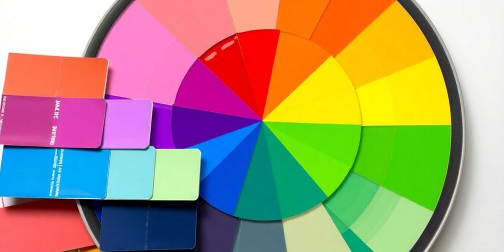
Okay, so you know primary colors, right? Red, yellow, blue. And you’re probably familiar with secondary colors – orange, green, violet – which you get by mixing two primaries. But what about those in-between shades? That’s where tertiary colors come in! They’re like the cool kids that show up when a primary and a secondary color decide to hang out. Think of it as a colorful blend, a mix of two worlds creating something totally new.
The Primary and Secondary Dance in Tertiary Creation
It’s all about the mix! You take one primary color and one secondary color, and boom, you’ve got a tertiary color. For example, if you mix red (a primary) with orange (a secondary), you get red-orange. Simple as that! Understanding how primary and secondary colors interact is key to unlocking the world of tertiary colors. It’s like they’re dancing together, creating a whole new vibe.
Meet the Six Stars: Examples of Tertiary Colors
There are six main tertiary colors, and each one has its own unique personality. They are:
- Red-orange: Fiery and bold.
- Yellow-orange: Warm and inviting.
- Yellow-green: Fresh and lively.
- Blue-green: Calm and serene.
- Blue-violet: Mysterious and sophisticated.
- Red-violet: Elegant and dramatic.
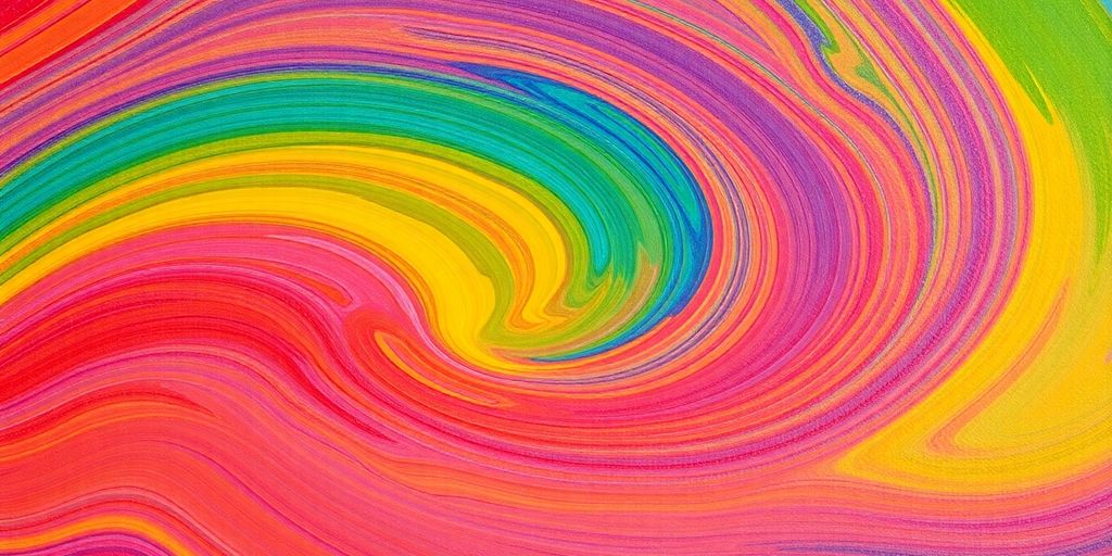
Tertiary colors are more than just mixes; they’re the secret ingredient to making your art pop. They add depth, complexity, and a touch of the unexpected. Don’t be afraid to experiment and see what magic you can create!
Bringing Tertiary Colors to Life in Your Art
Okay, so you know what tertiary colors are. Now, let’s get them onto the canvas! It’s time to see how these colors can seriously boost your artwork. We’re talking about adding depth, creating awesome color schemes, and just generally making your art pop. It’s easier than you think, and honestly, it’s a game-changer.
Adding Depth and Sparkle with Tertiary Hues
Tertiary colors are amazing for adding subtlety to your art. They fill in the gaps between the bolder primary and secondary colors, creating a more nuanced and interesting visual experience. Think of it like adding spices to a dish – a little bit of red-orange can make all the difference. They can create shadows, highlights, and all those little details that make a painting feel real and alive. It’s all about layering and blending to get that perfect depth.
Crafting Harmonious Color Stories with Tertiary Colors
Color harmony is key, and tertiary colors are your secret weapon. One way to achieve this is by using analogous colors – colors that are next to each other on the color wheel. For example, using a combination of blue-green, green, and yellow-green can create a really calming and cohesive feel. It’s like they’re all singing the same song.
- Analogous color schemes are super easy to work with.
- They create a sense of unity and flow.
- They’re great for landscapes and other natural scenes.
Using tertiary colors in your color schemes can make your art more interesting and engaging. It’s all about finding the right balance and creating a visual story that resonates with your audience.
Balancing the Palette: Tertiary, Primary, and Secondary Colors
Balancing your colors is super important. You don’t want one color to overpower everything else. Here’s the thing: tertiary colors often work best as accent colors. They add that extra oomph without taking over the show. Think of them as the supporting actors in your color movie. They make the stars (primary and secondary colors) shine even brighter. It’s all about finding that sweet spot where everything works together in harmony.
Here’s a simple guide:
- Use tertiary colors to soften the edges between primary and secondary colors.
- Balance warm and cool tones. For example, pair a red-orange with a cool blue or green.
- Don’t be afraid to experiment! The best way to learn is by trying different combinations and seeing what works for you.
Level Up Your Art with Advanced Tertiary Techniques
Playing with Shades: Exploring Tertiary Color Variations
Okay, so you’ve got your basic tertiary colors down. Now it’s time to really push things. Experimenting with different shades and tints of tertiary colors can seriously add depth to your work. Think about it: a light yellow-green feels totally different than a dark, almost mossy one. It’s all about playing around and seeing what you can create. For example, you can create a range of blue-green tertiary colors by mixing different shades of blue and green. Don’t be afraid to get messy and try new things!
Tertiary Colors Across Art Styles and Mediums
One of the coolest things about tertiary colors is how versatile they are. They aren’t just for painting, you know! You can use them in graphic design, digital art, even sculpture. Each medium will give the colors a slightly different feel. In painting, tertiary colors can be used to create subtle, nuanced shifts in color. In graphic design, tertiary colors can be used to create bold, eye-catching graphics. Try using them in different ways and see what happens. You might surprise yourself.
Painting Emotions: Using Tertiary Colors to Convey Meaning
Colors aren’t just pretty; they can also make you feel something. Tertiary colors are especially good at this because they’re a little more complex and nuanced than primary or secondary colors. Think about it: a red-orange might feel energetic and exciting, while a blue-violet could feel luxurious and creative. It’s all about understanding the emotional impact of each color and using it to your advantage.
Using tertiary colors to evoke emotions and convey meaning in your art by selecting colors that are associated with specific emotions or themes. By understanding the emotional and psychological impact of tertiary colors, you can create art that resonates with your audience.
The Power of Tertiary Colors in Artistic Expression
Why Tertiary Colors Are Your Secret Weapon
Okay, so you know primary and secondary colors, right? But tertiary colors? They’re where the real magic happens. They add depth and sophistication to your art that you just can’t get with simpler palettes. Think of them as the secret ingredient that elevates your work from good to amazing. They help create subtle shifts in color and make your art more engaging. It’s like adding a pinch of salt to a dish – it just brings out all the other flavors. Understanding tertiary hues can really transform your artistic expression.
Limiting Your Palette for Maximum Impact
It might sound counterintuitive, but limiting your color palette can actually make your art stronger. By focusing on a few carefully chosen tertiary colors, you can create a sense of harmony and unity in your work. It forces you to be more creative with the colors you have, exploring different shades and combinations.
Here’s why it works:
- Creates visual harmony.
- Forces creative color mixing.
- Makes your art more memorable.
Limiting your palette isn’t about restriction; it’s about focus. It’s about making deliberate choices that enhance the overall impact of your art.
Boosting Composition with Thoughtful Color Choices
Color isn’t just about making things look pretty; it’s a powerful tool for guiding the viewer’s eye and creating a sense of balance in your composition. Tertiary colors, with their subtle nuances, are perfect for creating depth and dimension. Use them to highlight focal points, create contrast, and lead the viewer through your artwork. Think about how you can use color mixing to create a visual journey for the viewer.
Discovering the Unique Charm of Each Tertiary Color
Yellow-Green: Growth and Good Vibes
Yellow-green is like that first day of spring – fresh and full of life! It’s a mix of the optimism of yellow and the grounding nature of green. Think of new leaves unfurling or a field of wheat just starting to ripen. This color brings a sense of balance and renewal to any artwork. It’s often associated with growth, harmony, and a general feeling of well-being. You can use it to depict nature scenes, convey a sense of peace, or even add a touch of freshness to an otherwise dull palette. It’s super versatile!
Blue-Violet: Luxury and Creative Spark
Blue-violet is where sophistication meets imagination. It’s a color that whispers of royalty, creativity, and a touch of mystery. Imagine twilight skies or the deep hues of amethyst. This color is often linked to luxury, wisdom, and the spark of creative genius. It can add a sense of depth and intrigue to your art. It’s not as in-your-face as some other colors, but it definitely makes a statement. For example, you can use color examples in art to see how blue-violet is used in different contexts.
Red-Orange: Energy and Excitement Unleashed
Red-orange is pure energy! It’s the color of sunsets, fire, and all things vibrant. It’s a bold and exciting hue that demands attention. Think of a roaring bonfire or a field of poppies in full bloom. This color is all about passion, enthusiasm, and a zest for life. If you want to inject some excitement into your artwork, red-orange is your go-to. It’s not for the faint of heart, but when used right, it can create a real impact.
Red-orange is a great way to add a pop of color and create a focal point in your artwork. It’s also a good choice for depicting scenes of action or adventure.
Mastering the Art of Tertiary Color Mixing
The Simple Formula for Tertiary Success
Okay, so mixing tertiary colors doesn’t have to be some crazy complicated thing. The basic idea is super simple: you’re just mixing a primary color with a secondary color. Think of it like this: you grab your red, then you grab your orange, and boom, you’re on your way to red-orange! It’s all about understanding that balance between the two colors you’re using. Don’t overthink it; just have fun experimenting!
Visualizing the Blend: A Color Wheel Journey
Imagine the color wheel as your roadmap to tertiary color glory. You’ve got your primaries evenly spaced, your secondaries right in between, and then those awesome tertiary colors snug between each primary and secondary pair. It’s like a visual guide that shows you exactly what happens when you mix yellow and green to get that vibrant yellow-green. Seriously, just glancing at the color wheel can give you a lightbulb moment about color relationships. It’s a game changer!
Avoiding Mud: Smart Mixing with Tertiary Colors
Nobody wants muddy colors, right? Here’s the deal: the closer your colors are on the color wheel, the cleaner your tertiary mix will be. If you start throwing in colors from opposite sides (like trying to mix a tertiary with its complementary color), things can get a little… well, brown. Also, clean your brush! Seriously, it makes a huge difference. Start with small amounts of each color and add gradually. You can always add more, but you can’t take it away!
Think of mixing colors like cooking. You wouldn’t throw every spice in the cabinet into one dish, would you? Same goes for paint. Start simple, taste (or in this case, look) as you go, and adjust until you get the flavor (color) you’re after.
Here are some tips to avoid muddy colors:
- Use high-quality pigments.
- Mix small amounts at a time.
- Clean your brush frequently.
Conclusion
So, we’ve talked all about tertiary colors, right? It’s pretty cool how mixing a primary with a secondary color gives you these awesome, unique shades. Knowing how they work can really make your art pop and help you get those color schemes just right. Don’t be shy about trying out different tertiary color mixes and seeing what happens. Play around with them in your paintings or designs. You’ll find they can add so much feeling and meaning to what you create. It’s all about having fun and seeing where these colors take your art!
Frequently Asked Questions
What are tertiary colors?
Tertiary colors are made by mixing a primary color (like red, yellow, or blue) with a nearby secondary color (like orange, green, or violet).
How many tertiary colors exist?
There are six main tertiary colors: red-orange, yellow-orange, yellow-green, blue-green, blue-violet, and red-violet.
What’s the connection between primary, secondary, and tertiary colors?
Primary colors are the basic building blocks, and secondary colors are made from two primaries. Tertiary colors then take one primary and one secondary to create a new shade. They all work together to make a full color wheel.
How can I use tertiary colors in my artwork?
You can use tertiary colors to make your art look deeper and more interesting. They help create nice color combinations and can even show feelings or ideas in your work.
Can tertiary colors have different shades?
Yes, you can make lighter or darker versions of tertiary colors by adding more of one of the original colors or by mixing in white or black.
Why are tertiary colors important for artists?
Tertiary colors help artists create a wider range of colors, add depth, and make their art more visually appealing and expressive. They’re a key part of understanding how colors work.